





 生徒
生徒CSSだけでかっこいいUIって作れるんですか?JavaScriptが要りそうで…
 ペン博士
ペン博士今のCSSはすごく強力だ。アニメーション・モーダル・ローダーまでCSSだけで作れる。全部コピペできるコードで見せよう。
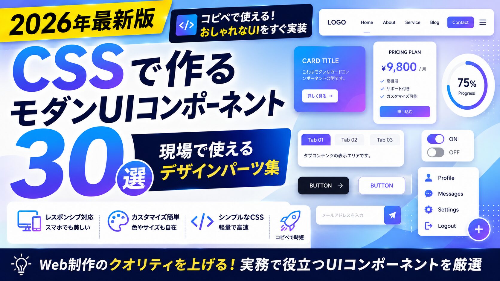
CSSは進化が著しく、2024〜2026年にかけて:has()・@layer・container query・CSS Nestingなど強力な機能が標準化された。JavaScriptに頼らなくてもインタラクティブで美しいUIを実装できる。この記事ではコピペしてすぐ使える30個のCSSパーツを、カテゴリ別に全コードつきで紹介する。
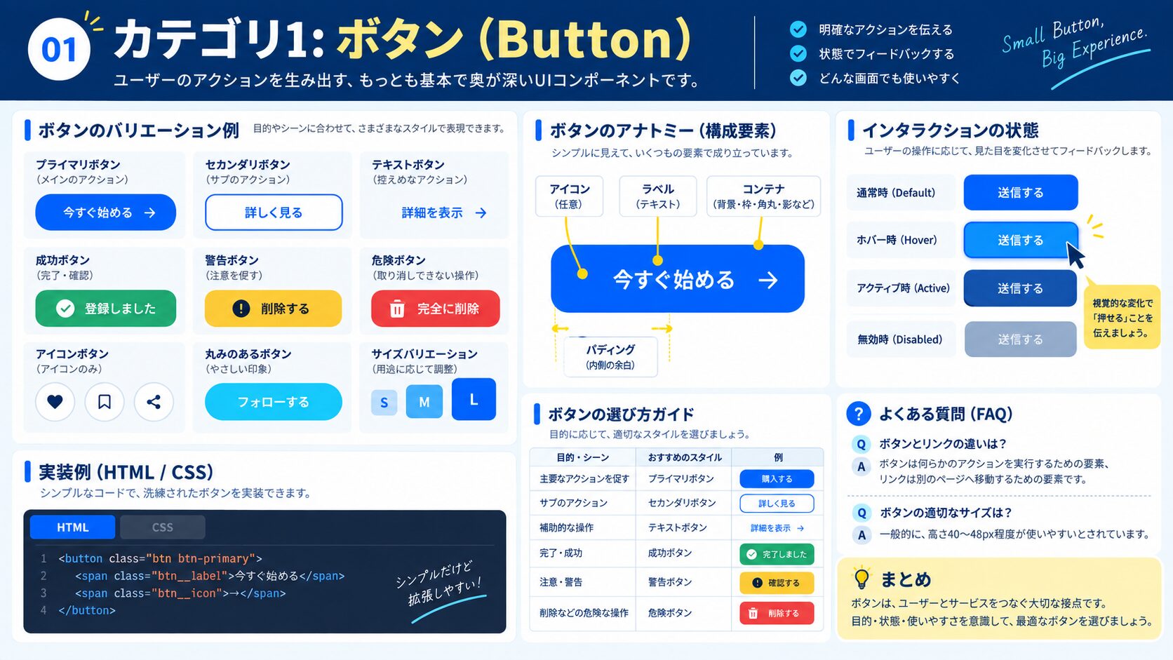
最もよく使われる基本のボタンだ。グラデーション背景にホバーでシフトするアニメーションを加えた。
<button class="btn-gradient">無料で始める</button>.btn-gradient {
display: inline-block;
padding: 14px 32px;
border: none;
border-radius: 50px;
background: linear-gradient(135deg, #667eea 0%, #764ba2 100%);
background-size: 200% 200%;
color: #fff;
font-size: 1rem;
font-weight: 700;
cursor: pointer;
transition: background-position 0.4s ease, transform 0.2s ease, box-shadow 0.2s ease;
}
.btn-gradient:hover {
background-position: right center;
transform: translateY(-2px);
box-shadow: 0 8px 24px rgba(102, 126, 234, 0.45);
}
.btn-gradient:active {
transform: translateY(0);
}背景なし・枠線のみのゴーストボタン。ホバーで塗りつぶしに変わる。
<button class="btn-outline">詳しく見る</button>.btn-outline {
display: inline-block;
padding: 12px 28px;
border: 2px solid #3b82f6;
border-radius: 6px;
background: transparent;
color: #3b82f6;
font-size: 1rem;
font-weight: 600;
cursor: pointer;
transition: background 0.25s ease, color 0.25s ease;
}
.btn-outline:hover {
background: #3b82f6;
color: #fff;
}柔らかな立体感を演出するネオモーフィズムスタイル。明るい背景で映える。
<button class="btn-neumorphism">クリック</button>.btn-neumorphism {
padding: 14px 32px;
border: none;
border-radius: 12px;
background: #e0e5ec;
color: #555;
font-size: 1rem;
font-weight: 600;
cursor: pointer;
box-shadow:
6px 6px 12px #b8bec7,
-6px -6px 12px #ffffff;
transition: box-shadow 0.2s ease, transform 0.2s ease;
}
.btn-neumorphism:hover {
box-shadow:
3px 3px 8px #b8bec7,
-3px -3px 8px #ffffff;
transform: scale(0.98);
}
.btn-neumorphism:active {
box-shadow:
inset 4px 4px 8px #b8bec7,
inset -4px -4px 8px #ffffff;
transform: scale(0.96);
}クリック時に波紋が広がるMaterial Design風のボタン。CSSの:activeと@keyframesで実現する。
<button class="btn-ripple">
  <span>送信する</span>
</button>
.btn-ripple {
position: relative;
overflow: hidden;
padding: 14px 32px;
border: none;
border-radius: 6px;
background: #10b981;
color: #fff;
font-size: 1rem;
font-weight: 600;
cursor: pointer;
}
.btn-ripple::after {
content: '';
position: absolute;
inset: 0;
background: radial-gradient(circle, rgba(255,255,255,0.4) 0%, transparent 70%);
transform: scale(0);
opacity: 0;
transition: transform 0.5s ease, opacity 0.5s ease;
}
.btn-ripple:active::after {
transform: scale(3);
opacity: 1;
transition: 0s; /* 即座に表示してからフェードアウト */
}テキストの右に矢印アイコンを配置し、ホバーで矢印が右に動く。CSSのみで実装。
<button class="btn-arrow">続きを読む</button>.btn-arrow {
display: inline-flex;
align-items: center;
gap: 8px;
padding: 12px 24px;
border: none;
border-radius: 6px;
background: #f59e0b;
color: #fff;
font-size: 1rem;
font-weight: 600;
cursor: pointer;
transition: background 0.2s;
}
.btn-arrow::after {
content: '→';
display: inline-block;
transition: transform 0.3s ease;
}
.btn-arrow:hover {
background: #d97706;
}
.btn-arrow:hover::after {
transform: translateX(6px);
}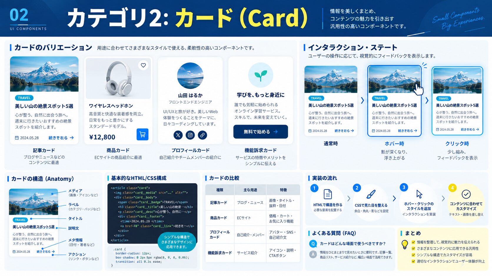
カードにホバーすると浮き上がるように見える定番スタイル。
<div class="card-shadow">
  <img src="thumbnail.jpg" alt="サムネイル">
  <div class="card-shadow__body">
    <h3>記事タイトルがここに入る</h3>
    <p>記事の概要テキストがここに入ります。2〜3行程度を想定。</p>
    <a href="#">続きを読む →</a>
  </div>
</div>
.card-shadow {
border-radius: 12px;
overflow: hidden;
background: #fff;
box-shadow: 0 2px 8px rgba(0,0,0,0.1);
transition: transform 0.3s ease, box-shadow 0.3s ease;
max-width: 320px;
}
.card-shadow:hover {
transform: translateY(-6px);
box-shadow: 0 16px 40px rgba(0,0,0,0.15);
}
.card-shadow img {
width: 100%;
height: 200px;
object-fit: cover;
display: block;
}
.card-shadow__body {
padding: 20px;
}
.card-shadow__body h3 {
margin: 0 0 8px;
font-size: 1.1rem;
color: #1e293b;
}
.card-shadow__body p {
margin: 0 0 16px;
font-size: 0.9rem;
color: #64748b;
line-height: 1.6;
}
.card-shadow__body a {
color: #3b82f6;
font-weight: 600;
text-decoration: none;
}背景をぼかして透過させる「グラスモーフィズム」スタイル。グラデーション背景の上に重ねると映える。
<div class="glassmorphism-bg">
  <div class="card-glass">
    <h3>ガラスカード</h3>
    <p>背景がぼけて見える、トレンドのデザインです。</p>
  </div>
</div>
.glassmorphism-bg {
background: linear-gradient(135deg, #667eea, #764ba2);
padding: 60px;
display: flex;
justify-content: center;
align-items: center;
min-height: 200px;
}
.card-glass {
background: rgba(255, 255, 255, 0.15);
backdrop-filter: blur(12px);
-webkit-backdrop-filter: blur(12px);
border: 1px solid rgba(255, 255, 255, 0.3);
border-radius: 16px;
padding: 32px 40px;
color: #fff;
max-width: 360px;
text-align: center;
}
.card-glass h3 {
margin: 0 0 12px;
font-size: 1.4rem;
}
.card-glass p {
margin: 0;
opacity: 0.85;
line-height: 1.7;
}ホバーでカードが裏返るフリップアニメーション。CSSのperspectiveとrotateYで実現。
<div class="flip-card">
  <div class="flip-card__inner">
    <div class="flip-card__front">
      <h3>表面</h3>
      <p>ホバーしてみてください</p>
    </div>
    <div class="flip-card__back">
      <h3>裏面</h3>
      <p>隠れていた内容が現れます!</p>
    </div>
  </div>
</div>
.flip-card {
width: 280px;
height: 180px;
perspective: 1000px;
cursor: pointer;
}
.flip-card__inner {
position: relative;
width: 100%;
height: 100%;
transform-style: preserve-3d;
transition: transform 0.6s cubic-bezier(0.4, 0, 0.2, 1);
}
.flip-card:hover .flip-card__inner {
transform: rotateY(180deg);
}
.flip-card__front,
.flip-card__back {
position: absolute;
inset: 0;
display: flex;
flex-direction: column;
justify-content: center;
align-items: center;
border-radius: 12px;
backface-visibility: hidden;
padding: 24px;
text-align: center;
}
.flip-card__front {
background: #3b82f6;
color: #fff;
}
.flip-card__back {
background: #10b981;
color: #fff;
transform: rotateY(180deg);
}アバター画像・名前・職種・SNSリンクを整理したプロフィールカード。
<div class="profile-card">
  <img src="avatar.jpg" alt="Avatar" class="profile-card__avatar">
  <h3 class="profile-card__name">田中 太郎</h3>
  <p class="profile-card__role">フロントエンドエンジニア</p>
  <div class="profile-card__tags">
    <span>React</span><span>TypeScript</span><span>CSS</span>
  </div>
</div>
.profile-card {
background: #fff;
border-radius: 16px;
padding: 32px 24px;
text-align: center;
box-shadow: 0 4px 20px rgba(0,0,0,0.1);
max-width: 280px;
}
.profile-card__avatar {
width: 80px;
height: 80px;
border-radius: 50%;
object-fit: cover;
border: 3px solid #3b82f6;
margin-bottom: 16px;
}
.profile-card__name {
margin: 0 0 4px;
font-size: 1.2rem;
color: #1e293b;
}
.profile-card__role {
margin: 0 0 16px;
color: #64748b;
font-size: 0.9rem;
}
.profile-card__tags {
display: flex;
gap: 8px;
flex-wrap: wrap;
justify-content: center;
}
.profile-card__tags span {
background: #eff6ff;
color: #3b82f6;
padding: 4px 12px;
border-radius: 20px;
font-size: 0.8rem;
font-weight: 600;
}SaaSやスクールのLPでよく使う料金プラン比較カード。おすすめプランを強調するスタイルも含む。
<div class="pricing-card pricing-card--featured">
  <div class="pricing-card__badge">人気No.1</div>
  <h3>スタンダード</h3>
  <p class="pricing-card__price">¥<span>4,980</span>/月</p>
  <ul>
    <li>✓ 無制限アクセス</li>
    <li>✓ 動画コンテンツ</li>
    <li>✓ メンターサポート</li>
  </ul>
  <button>今すぐ始める</button>
</div>
.pricing-card {
position: relative;
background: #fff;
border: 2px solid #e2e8f0;
border-radius: 16px;
padding: 32px 24px;
text-align: center;
max-width: 280px;
transition: transform 0.3s;
}
.pricing-card--featured {
border-color: #3b82f6;
box-shadow: 0 8px 32px rgba(59,130,246,0.2);
transform: scale(1.04);
}
.pricing-card__badge {
position: absolute;
top: -14px;
left: 50%;
transform: translateX(-50%);
background: #3b82f6;
color: #fff;
padding: 4px 20px;
border-radius: 20px;
font-size: 0.8rem;
font-weight: 700;
white-space: nowrap;
}
.pricing-card__price {
font-size: 1rem;
color: #64748b;
margin: 8px 0 20px;
}
.pricing-card__price span {
font-size: 2.4rem;
font-weight: 800;
color: #1e293b;
}
.pricing-card ul {
list-style: none;
padding: 0;
margin: 0 0 24px;
text-align: left;
}
.pricing-card ul li {
padding: 6px 0;
color: #475569;
}
.pricing-card button {
width: 100%;
padding: 12px;
border: none;
border-radius: 8px;
background: #3b82f6;
color: #fff;
font-weight: 700;
cursor: pointer;
}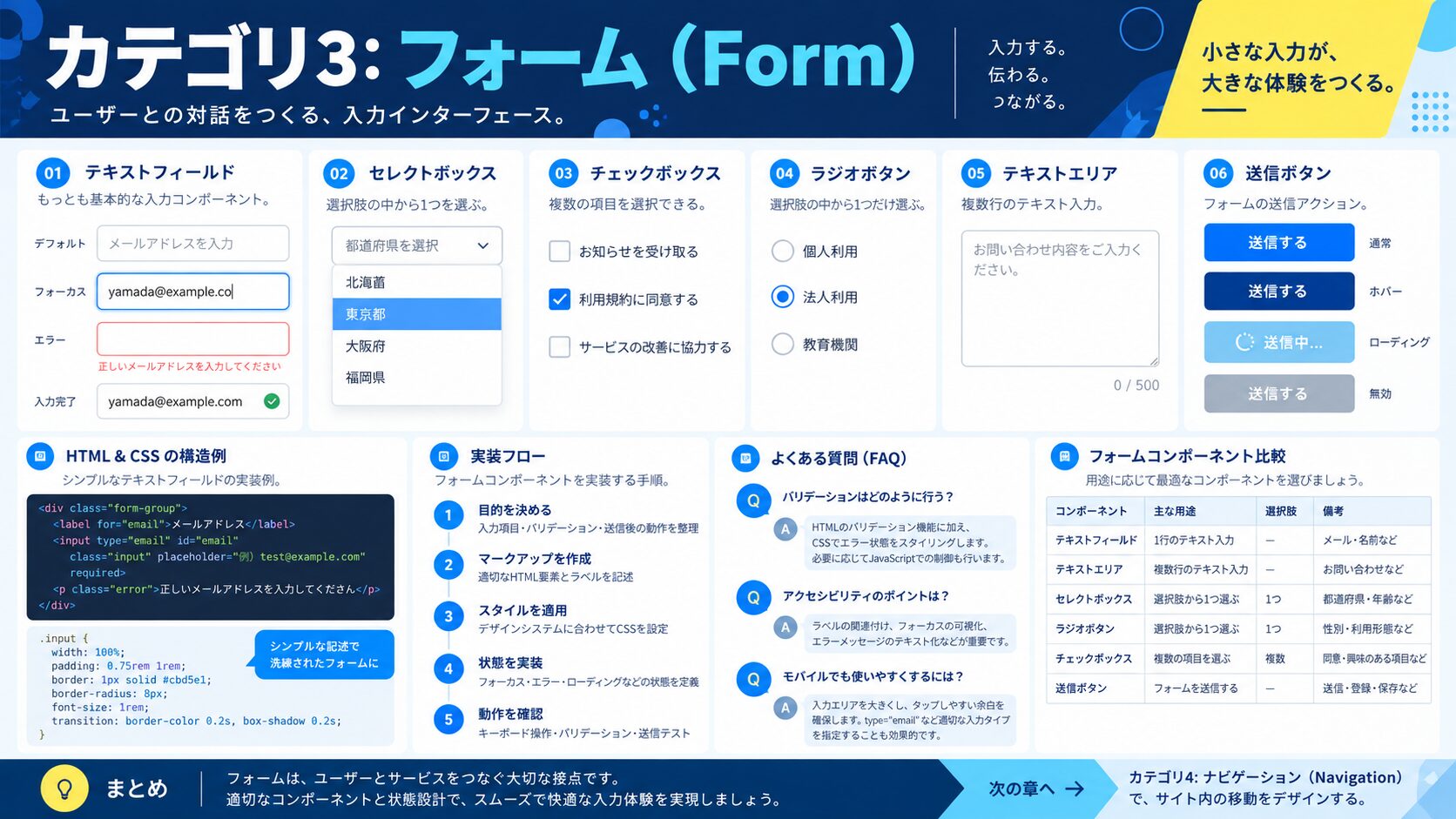
入力すると上にラベルが浮き上がる、モダンなフォームスタイル。
<div class="float-label">
  <input type="text" id="name" placeholder=" " required>
  <label for="name">お名前</label>
</div>
.float-label {
position: relative;
margin-bottom: 24px;
}
.float-label input {
width: 100%;
padding: 16px 12px 8px;
border: 2px solid #e2e8f0;
border-radius: 8px;
font-size: 1rem;
outline: none;
transition: border-color 0.2s;
box-sizing: border-box;
}
.float-label input:focus {
border-color: #3b82f6;
}
.float-label label {
position: absolute;
left: 12px;
top: 50%;
transform: translateY(-50%);
color: #94a3b8;
font-size: 1rem;
pointer-events: none;
transition: top 0.2s ease, font-size 0.2s ease, color 0.2s ease;
}
/* フォーカス時 or 入力済み(placeholder=" " が必要) */
.float-label input:focus + label,
.float-label input:not(:placeholder-shown) + label {
top: 8px;
font-size: 0.72rem;
color: #3b82f6;
transform: none;
}ブラウザデフォルトのチェックボックスをCSSでリデザインする。
<label class="custom-check">
  <input type="checkbox">
  <span class="custom-check__box"></span>
  利用規約に同意する
</label>
.custom-check {
display: flex;
align-items: center;
gap: 10px;
cursor: pointer;
user-select: none;
color: #374151;
}
.custom-check input {
position: absolute;
opacity: 0;
width: 0;
height: 0;
}
.custom-check__box {
width: 22px;
height: 22px;
border: 2px solid #d1d5db;
border-radius: 5px;
flex-shrink: 0;
transition: background 0.2s, border-color 0.2s;
position: relative;
}
.custom-check__box::after {
content: '';
position: absolute;
left: 5px;
top: 2px;
width: 7px;
height: 11px;
border: 2px solid #fff;
border-top: none;
border-left: none;
transform: rotate(45deg) scale(0);
transition: transform 0.2s ease;
}
.custom-check input:checked + .custom-check__box {
background: #3b82f6;
border-color: #3b82f6;
}
.custom-check input:checked + .custom-check__box::after {
transform: rotate(45deg) scale(1);
}<div class="radio-group">
<label class="custom-radio">
<input type="radio" name="plan" value="basic">
<span class="custom-radio__btn"></span>
ベーシック
</label>
<label class="custom-radio">
<input type="radio" name="plan" value="pro">
<span class="custom-radio__btn"></span>
プロ
</label>
</div>.radio-group { display: flex; gap: 20px; }
.custom-radio {
display: flex;
align-items: center;
gap: 8px;
cursor: pointer;
color: #374151;
}
.custom-radio input {
position: absolute;
opacity: 0;
width: 0;
height: 0;
}
.custom-radio__btn {
width: 20px;
height: 20px;
border: 2px solid #d1d5db;
border-radius: 50%;
flex-shrink: 0;
transition: border-color 0.2s;
position: relative;
}
.custom-radio__btn::after {
content: '';
position: absolute;
inset: 3px;
border-radius: 50%;
background: #3b82f6;
transform: scale(0);
transition: transform 0.2s ease;
}
.custom-radio input:checked + .custom-radio__btn {
border-color: #3b82f6;
}
.custom-radio input:checked + .custom-radio__btn::after {
transform: scale(1);
}iOSスタイルのトグルスイッチをCSSだけで実装する。
<label class="toggle">
  <input type="checkbox" role="switch">
  <span class="toggle__track">
    <span class="toggle__thumb"></span>
  </span>
  通知をオンにする
</label>
.toggle {
display: flex;
align-items: center;
gap: 12px;
cursor: pointer;
color: #374151;
}
.toggle input { display: none; }
.toggle__track {
width: 52px;
height: 28px;
background: #d1d5db;
border-radius: 14px;
position: relative;
transition: background 0.3s ease;
flex-shrink: 0;
}
.toggle__thumb {
position: absolute;
top: 3px;
left: 3px;
width: 22px;
height: 22px;
border-radius: 50%;
background: #fff;
box-shadow: 0 1px 4px rgba(0,0,0,0.25);
transition: transform 0.3s ease;
}
.toggle input:checked + .toggle__track {
background: #3b82f6;
}
.toggle input:checked + .toggle__track .toggle__thumb {
transform: translateX(24px);
}フォーカスで幅が広がる検索バー。
<div class="search-bar">
  <input type="search" placeholder="キーワードを入力...">
  <span class="search-bar__icon">🔍</span>
</div>
.search-bar {
position: relative;
display: inline-block;
}
.search-bar input {
width: 200px;
padding: 10px 40px 10px 16px;
border: 2px solid #e2e8f0;
border-radius: 50px;
font-size: 0.9rem;
outline: none;
transition: width 0.4s ease, border-color 0.3s;
}
.search-bar input:focus {
width: 320px;
border-color: #3b82f6;
}
.search-bar__icon {
position: absolute;
right: 14px;
top: 50%;
transform: translateY(-50%);
pointer-events: none;
font-size: 1rem;
}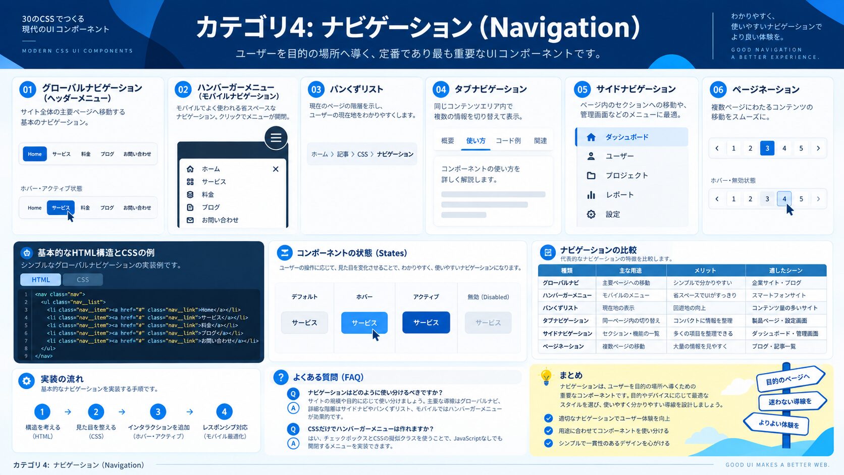
ホバーで下線が左から伸びてくるナビゲーションメニュー。
<nav class="underline-nav">
  <a href="#">ホーム</a>
  <a href="#">サービス</a>
  <a href="#">実績</a>
  <a href="#">お問い合わせ</a>
</nav>
.underline-nav {
display: flex;
gap: 32px;
list-style: none;
padding: 0;
}
.underline-nav a {
position: relative;
text-decoration: none;
color: #374151;
font-weight: 500;
padding-bottom: 4px;
}
.underline-nav a::after {
content: '';
position: absolute;
left: 0;
bottom: 0;
width: 0;
height: 2px;
background: #3b82f6;
transition: width 0.3s ease;
}
.underline-nav a:hover {
color: #3b82f6;
}
.underline-nav a:hover::after {
width: 100%;
}3本線がバツ印に変化するハンバーガーボタン。:checked擬似クラスを使いJSなしで切り替える。
<label class="hamburger" for="menu-toggle">
  <input type="checkbox" id="menu-toggle" hidden>
  <span></span>
  <span></span>
  <span></span>
</label>
.hamburger {
display: flex;
flex-direction: column;
gap: 5px;
cursor: pointer;
width: 30px;
}
.hamburger span {
display: block;
height: 3px;
background: #374151;
border-radius: 2px;
transition: transform 0.3s ease, opacity 0.3s ease;
transform-origin: center;
}
/* チェック時(メニューオープン)にバツ印に変形 */
.hamburger input:checked + span:nth-of-type(1) {
transform: rotate(45deg) translate(5px, 6px);
}
.hamburger input:checked + span + span:nth-of-type(2) {
opacity: 0;
}
.hamburger input:checked + span + span + span:nth-of-type(3) {
transform: rotate(-45deg) translate(5px, -6px);
}<nav aria-label="パンくずリスト">
<ol class="breadcrumb">
<li><a href="/">ホーム</a></li>
<li><a href="/blog">ブログ</a></li>
<li aria-current="page">CSS入門</li>
</ol>
</nav>.breadcrumb {
display: flex;
align-items: center;
gap: 4px;
list-style: none;
padding: 0;
margin: 0;
font-size: 0.875rem;
}
.breadcrumb li {
display: flex;
align-items: center;
}
.breadcrumb li + li::before {
content: '/';
margin-right: 4px;
color: #94a3b8;
}
.breadcrumb a {
color: #3b82f6;
text-decoration: none;
}
.breadcrumb a:hover { text-decoration: underline; }
.breadcrumb [aria-current="page"] { color: #64748b; }ラジオボタンの:checkedを使い、JSなしでタブ切り替えを実装する。
<div class="tabs">
  <div class="tabs__nav">
    <label for="tab1" class="tabs__label">Tab 1</label>
    <label for="tab2" class="tabs__label">Tab 2</label>
    <label for="tab3" class="tabs__label">Tab 3</label>
  </div>
  <input type="radio" id="tab1" name="tabs" hidden checked>
  <input type="radio" id="tab2" name="tabs" hidden>
  <input type="radio" id="tab3" name="tabs" hidden>
  <div class="tabs__content" id="content1"><p>タブ1の内容です。</p></div>
  <div class="tabs__content" id="content2"><p>タブ2の内容です。</p></div>
  <div class="tabs__content" id="content3"><p>タブ3の内容です。</p></div>
</div>
.tabs__nav { display: flex; border-bottom: 2px solid #e2e8f0; }
.tabs__label {
padding: 10px 20px;
cursor: pointer;
color: #64748b;
font-weight: 500;
transition: color 0.2s;
border-bottom: 2px solid transparent;
margin-bottom: -2px;
}
.tabs__label:hover { color: #3b82f6; }
.tabs__content { display: none; padding: 20px 0; color: #374151; }
/* ラジオボタンの状態でタブを制御 */
#tab1:checked ~ .tabs__nav label[for="tab1"],
#tab2:checked ~ .tabs__nav label[for="tab2"],
#tab3:checked ~ .tabs__nav label[for="tab3"] {
color: #3b82f6;
border-bottom-color: #3b82f6;
}
#tab1:checked ~ #content1,
#tab2:checked ~ #content2,
#tab3:checked ~ #content3 { display: block; }スクロールでヘッダーの見た目が変わるような見せ方は、CSSのposition: stickyと@supportsで実現できる。
<header class="sticky-header">
  <a href="/" class="logo">Logo</a>
  <nav>
    <a href="#">Home</a>
    <a href="#">About</a>
    <a href="#">Contact</a>
  </nav>
</header>
.sticky-header {
position: sticky;
top: 0;
z-index: 100;
display: flex;
justify-content: space-between;
align-items: center;
padding: 16px 40px;
background: rgba(255,255,255,0.95);
backdrop-filter: blur(8px);
-webkit-backdrop-filter: blur(8px);
border-bottom: 1px solid rgba(0,0,0,0.06);
box-shadow: 0 2px 12px rgba(0,0,0,0.06);
}
.sticky-header .logo {
font-size: 1.4rem;
font-weight: 800;
color: #1e293b;
text-decoration: none;
}
.sticky-header nav { display: flex; gap: 28px; }
.sticky-header nav a {
color: #475569;
text-decoration: none;
font-weight: 500;
font-size: 0.95rem;
transition: color 0.2s;
}
.sticky-header nav a:hover { color: #3b82f6; }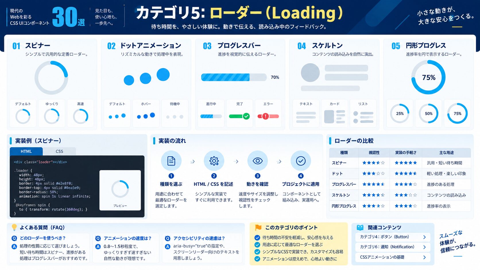
<div class="spinner" role="status" aria-label="読み込み中"></div>.spinner {
width: 44px;
height: 44px;
border: 4px solid #e2e8f0;
border-top-color: #3b82f6;
border-radius: 50%;
animation: spin 0.8s linear infinite;
}
@keyframes spin {
to { transform: rotate(360deg); }
}<div class="dot-loader" role="status" aria-label="読み込み中">
<span></span><span></span><span></span>
</div>.dot-loader {
display: flex;
gap: 8px;
align-items: center;
}
.dot-loader span {
width: 10px;
height: 10px;
border-radius: 50%;
background: #3b82f6;
animation: dot-bounce 1.2s ease-in-out infinite;
}
.dot-loader span:nth-child(2) { animation-delay: 0.2s; }
.dot-loader span:nth-child(3) { animation-delay: 0.4s; }
@keyframes dot-bounce {
0%, 80%, 100% { transform: scale(0.6); opacity: 0.4; }
40% { transform: scale(1.2); opacity: 1; }
}<div class="progress-bar" role="progressbar" aria-valuenow="70" aria-valuemin="0" aria-valuemax="100">
<div class="progress-bar__fill" style="--val: 70%"></div>
</div>.progress-bar {
width: 100%;
height: 10px;
background: #e2e8f0;
border-radius: 5px;
overflow: hidden;
}
.progress-bar__fill {
height: 100%;
width: var(--val, 0%);
background: linear-gradient(90deg, #3b82f6, #06b6d4);
border-radius: 5px;
animation: progress-grow 1s ease forwards;
}
@keyframes progress-grow {
from { width: 0; }
to { width: var(--val, 0%); }
}コンテンツ読み込み前のプレースホルダー表示。光が流れるシマーアニメーション付き。
<div class="skeleton-card">
  <div class="skeleton skeleton--image"></div>
  <div class="skeleton skeleton--title"></div>
  <div class="skeleton skeleton--text"></div>
  <div class="skeleton skeleton--text skeleton--short"></div>
</div>
.skeleton {
background: linear-gradient(90deg, #e2e8f0 25%, #f1f5f9 50%, #e2e8f0 75%);
background-size: 200% 100%;
animation: shimmer 1.5s infinite;
border-radius: 6px;
margin-bottom: 12px;
}
@keyframes shimmer {
0% { background-position: 200% 0; }
100% { background-position: -200% 0; }
}
.skeleton--image { height: 200px; border-radius: 8px; }
.skeleton--title { height: 22px; width: 70%; }
.skeleton--text { height: 14px; }
.skeleton--short { width: 50%; }
.skeleton-card { max-width: 320px; padding: 16px; background: #fff; border-radius: 12px; }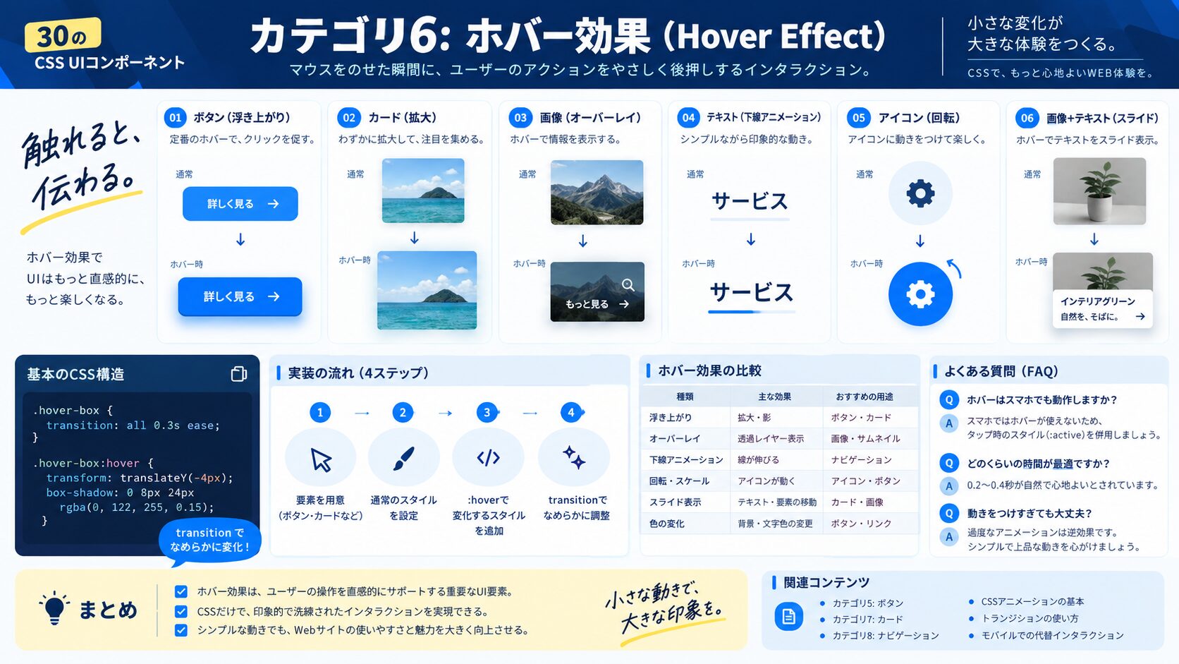
ホバーで画像がズームし、テキストオーバーレイが出現する。
<div class="zoom-card">
  <img src="image.jpg" alt="">
  <div class="zoom-card__overlay">
    <h3>作品タイトル</h3>
    <p>制作物の説明テキスト</p>
  </div>
</div>
.zoom-card {
position: relative;
overflow: hidden;
border-radius: 12px;
cursor: pointer;
max-width: 320px;
}
.zoom-card img {
width: 100%;
height: 240px;
object-fit: cover;
display: block;
transition: transform 0.5s ease;
}
.zoom-card:hover img {
transform: scale(1.1);
}
.zoom-card__overlay {
position: absolute;
inset: 0;
background: rgba(0,0,0,0.6);
color: #fff;
display: flex;
flex-direction: column;
justify-content: flex-end;
padding: 24px;
opacity: 0;
transition: opacity 0.4s ease;
}
.zoom-card:hover .zoom-card__overlay { opacity: 1; }
.zoom-card__overlay h3 { margin: 0 0 8px; font-size: 1.2rem; }
.zoom-card__overlay p { margin: 0; font-size: 0.9rem; opacity: 0.85; }<div class="glow-card">
<h3>グロー効果</h3>
<p>ホバーで光彩が広がります。</p>
</div>.glow-card {
padding: 32px;
border-radius: 16px;
background: #1e293b;
color: #fff;
max-width: 280px;
transition: box-shadow 0.4s ease, transform 0.3s ease;
cursor: pointer;
}
.glow-card:hover {
box-shadow:
0 0 20px rgba(59, 130, 246, 0.5),
0 0 40px rgba(59, 130, 246, 0.3),
0 0 80px rgba(59, 130, 246, 0.1);
transform: translateY(-4px);
}<h2 class="shine-text">PREMIUM DESIGN</h2>.shine-text {
font-size: 2rem;
font-weight: 900;
letter-spacing: 0.1em;
background: linear-gradient(
90deg,
#1e293b 0%,
#1e293b 30%,
#f8fafc 50%,
#1e293b 70%,
#1e293b 100%
);
background-size: 200% 100%;
background-clip: text;
-webkit-background-clip: text;
color: transparent;
animation: shine 3s linear infinite;
}
@keyframes shine {
0% { background-position: 200% 0; }
100% { background-position: -200% 0; }
}CSSのtransform: scaleでボタンが少し膨らむ感触を演出する。
<button class="magnetic-btn">HOVER ME</button>.magnetic-btn {
padding: 16px 40px;
border: 2px solid #1e293b;
border-radius: 50px;
background: #1e293b;
color: #fff;
font-size: 1rem;
font-weight: 700;
letter-spacing: 0.05em;
cursor: pointer;
transition:
transform 0.3s cubic-bezier(0.34, 1.56, 0.64, 1),
background 0.3s,
color 0.3s;
}
.magnetic-btn:hover {
transform: scale(1.08);
background: transparent;
color: #1e293b;
}
.magnetic-btn:active {
transform: scale(0.96);
}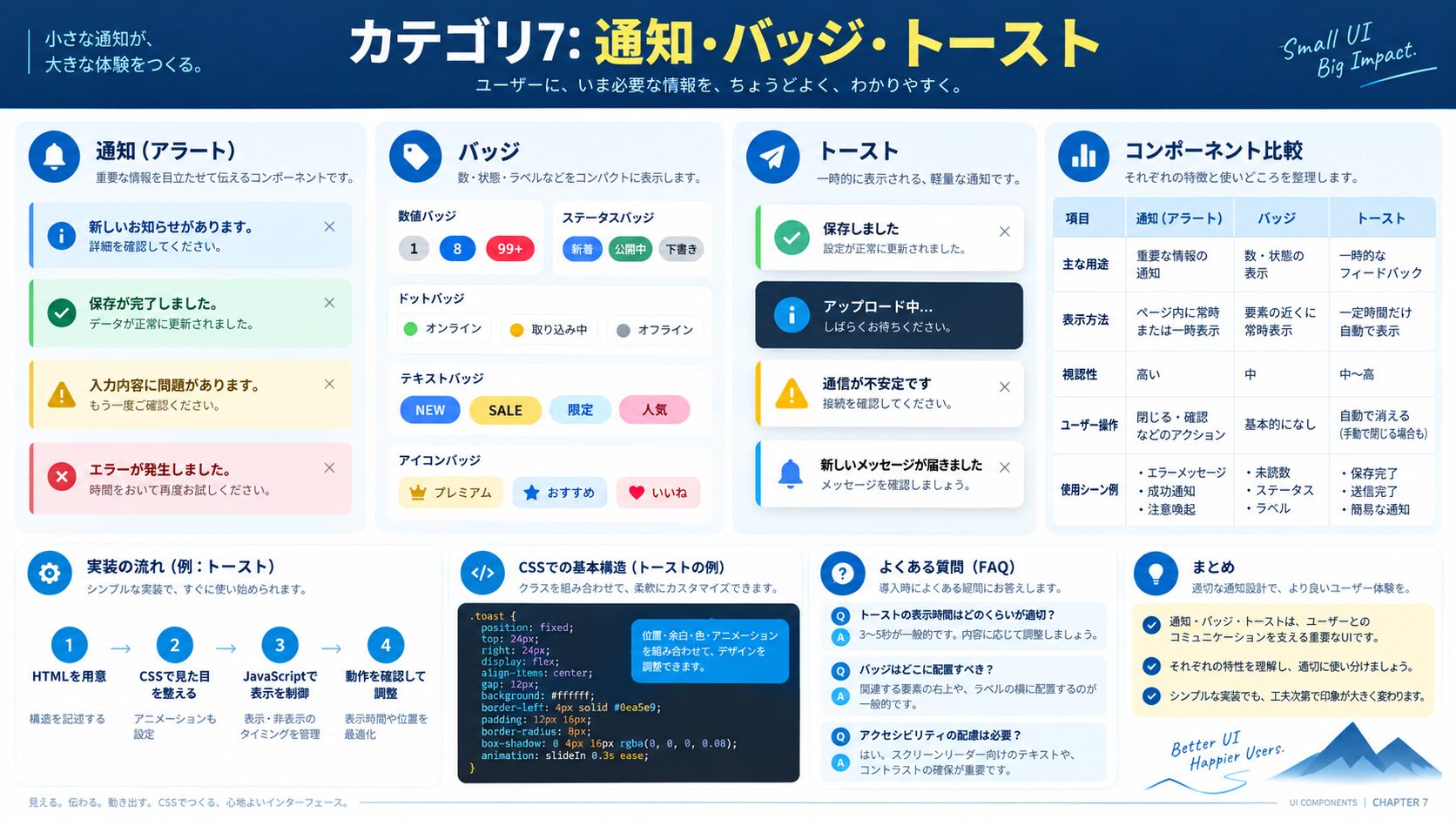
<div class="badge-icon">
  <span class="icon">🔔</span>
  <span class="badge">3</span>
</div>
.badge-icon {
position: relative;
display: inline-block;
}
.badge-icon .icon {
font-size: 2rem;
display: block;
}
.badge {
position: absolute;
top: -6px;
right: -10px;
background: #ef4444;
color: #fff;
font-size: 0.7rem;
font-weight: 700;
min-width: 20px;
height: 20px;
border-radius: 10px;
display: flex;
align-items: center;
justify-content: center;
padding: 0 5px;
border: 2px solid #fff;
animation: badge-pop 0.3s cubic-bezier(0.34, 1.56, 0.64, 1) forwards;
}
@keyframes badge-pop {
from { transform: scale(0); }
to { transform: scale(1); }
}画面下部または上部から滑り込んでくる通知コンポーネント。
<div class="toast toast--success">
  <span class="toast__icon">✓</span>
  <span class="toast__message">保存しました!</span>
  <button class="toast__close">×</button>
</div>
.toast {
display: flex;
align-items: center;
gap: 12px;
padding: 14px 20px;
border-radius: 10px;
background: #fff;
box-shadow: 0 8px 24px rgba(0,0,0,0.12);
max-width: 360px;
animation: toast-slide-in 0.4s cubic-bezier(0.34, 1.56, 0.64, 1) forwards;
}
.toast--success { border-left: 4px solid #10b981; }
.toast--error { border-left: 4px solid #ef4444; }
.toast__icon {
width: 28px;
height: 28px;
border-radius: 50%;
background: #10b981;
color: #fff;
display: flex;
align-items: center;
justify-content: center;
font-size: 0.85rem;
font-weight: 700;
flex-shrink: 0;
}
.toast__message { flex: 1; color: #374151; font-size: 0.95rem; }
.toast__close {
background: none;
border: none;
color: #9ca3af;
font-size: 1.1rem;
cursor: pointer;
padding: 0;
line-height: 1;
}
.toast__close:hover { color: #6b7280; }
@keyframes toast-slide-in {
from { transform: translateX(110%); opacity: 0; }
to { transform: translateX(0); opacity: 1; }
}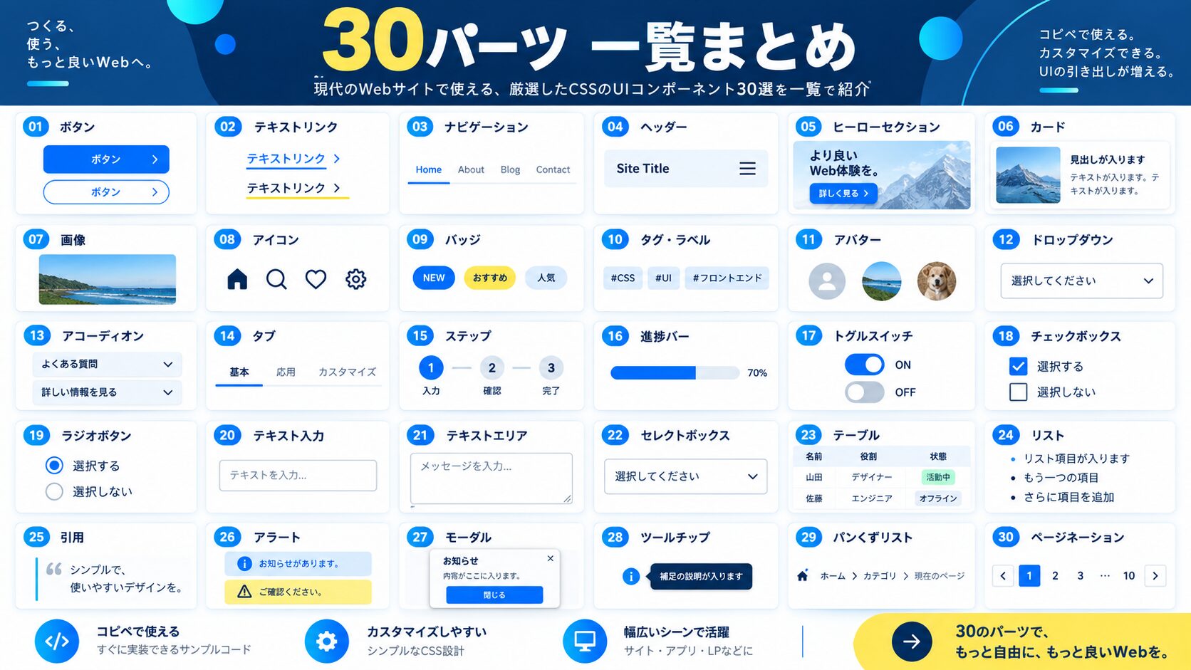
| No. | パーツ名 | カテゴリ | 主な技術 |
|---|---|---|---|
| 01 | グラデーション塗りつぶしボタン | ボタン | background-size, transition |
| 02 | アウトラインボタン | ボタン | border, hover transition |
| 03 | ネオモーフィズムボタン | ボタン | box-shadow, inset |
| 04 | リップルエフェクトボタン | ボタン | ::after, radial-gradient |
| 05 | アイコン付き矢印ボタン | ボタン | ::after, translateX |
| 06 | シャドウホバーカード | カード | translateY, box-shadow |
| 07 | ガラスモーフィズムカード | カード | backdrop-filter, rgba |
| 08 | フリップカード(表裏) | カード | perspective, rotateY |
| 09 | プロフィールカード | カード | border-radius, flex |
| 10 | 料金プランカード | カード | scale, position: absolute |
| 11 | フローティングラベル入力 | フォーム | :placeholder-shown, transition |
| 12 | カスタムチェックボックス | フォーム | ::after, :checked, scale |
| 13 | カスタムラジオボタン | フォーム | ::after, :checked, border-radius |
| 14 | トグルスイッチ | フォーム | :checked + sibling, translateX |
| 15 | アニメーション検索バー | フォーム | width transition, :focus |
| 16 | 下線アニメーションナビ | ナビ | ::after, width transition |
| 17 | ハンバーガーメニューボタン | ナビ | :checked + sibling, rotate |
| 18 | パンくずリスト | ナビ | li + li::before, aria |
| 19 | タブ(CSS only) | ナビ | :checked, display toggling |
| 20 | スティッキーヘッダー | ナビ | sticky, backdrop-filter |
| 21 | スピナーローダー | ローダー | @keyframes spin |
| 22 | 三点ドットローダー | ローダー | @keyframes bounce, nth-child |
| 23 | プログレスバー | ローダー | CSS Custom Properties, animation |
| 24 | スケルトンローディング | ローダー | @keyframes shimmer, gradient |
| 25 | 画像ズームオーバーレイカード | ホバー | scale, opacity transition |
| 26 | グロー(光彩)エフェクト | ホバー | box-shadow glow |
| 27 | テキストシャイン | ホバー | background-clip: text, animation |
| 28 | 磁気ボタン風ホバー | ホバー | cubic-bezier, scale |
| 29 | バッジ付きアイコン | 通知 | position: absolute, animation |
| 30 | アニメーション付きトースト | 通知 | @keyframes slide-in, border-left |
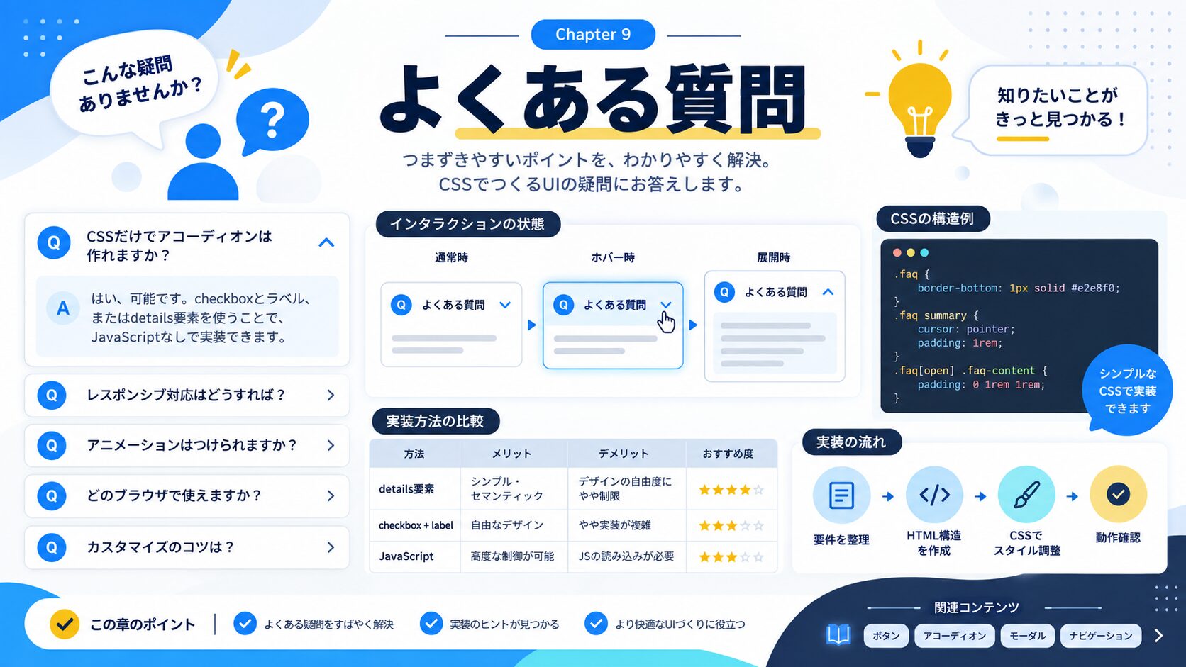
Chrome・Edge・Safari・Firefoxなどモダンブラウザはすべてbackdrop-filterに対応している(2024年以降)。念のため-webkit-backdrop-filterもセットで書くと安全だ。IEのサポートはもはや不要だが、Samsung Internet(古いバージョン)には注意。
transformとopacityを使うアニメーションはGPUが処理するため、最もパフォーマンスが良い。逆にwidth・height・top・leftを変化させるとリフローが発生し重くなる。アニメーションは基本的にtransformとopacityの組み合わせで設計しよう。
色・フォントサイズ・スペーシングなどのデザイントークンに使うと最も効果的だ。:root { --primary: #3b82f6; }のように定義しておき、全パーツでcolor: var(--primary);と参照すれば、カラー変更が一箇所で済む。
よくある原因は以下の3つだ。①クラス名が衝突している→パーツのクラスにプレフィックスを付ける。②CSSのリセットが効いていない→box-sizing: border-boxがグローバルに設定されているか確認。③親要素のoverflow: hiddenが邪魔している→特にフリップカードや絶対配置を使うパーツで起きやすい。
全パーツはモバイルでも動作するが、ホバー効果(:hover)はタッチデバイスでは発火しない点に注意。タッチデバイスでインタラクションが必要な場合は:focusや:activeを組み合わせるか、@media (hover: hover)でホバー専用スタイルを分離しよう。
prefers-reduced-motionメディアクエリを使うと、アニメーションを無効にしてほしいユーザー設定に対応できる。アクセシビリティの観点から重要だ。
/* アニメーション軽減設定への対応 */
@media (prefers-reduced-motion: reduce) {
  *,
  *::before,
  *::after {
    animation-duration: 0.01ms !important;
    animation-iteration-count: 1 !important;
    transition-duration: 0.01ms !important;
  }
}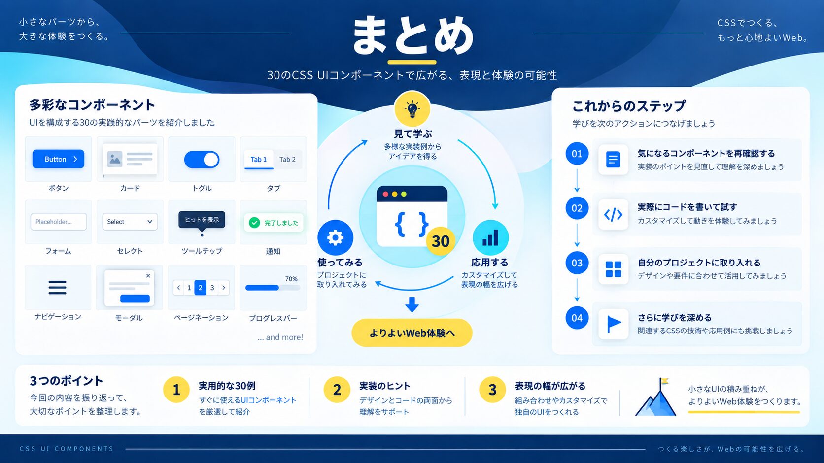
CSSだけでモダンなUIは十分作れる
transform + opacity のアニメーションでパフォーマンスも安心
コピペ後はクラス名の衝突とprefers-reduced-motionを確認しよう
今日紹介した30パーツをベースに、カラーやサイズを自分のプロジェクトに合わせてカスタマイズしてみよう。CSSの「なぜそう書くか」を理解すると、自分でオリジナルのパーツを作れるようになる。
| 指標 | 実績 | 調査対象・期間 |
|---|---|---|
| 案件獲得率 | 97.9% | 受講生アンケート/2025年1月〜12月 |
| 受講料金完済率 | 84.7% | 受講生アンケート/2025年6月〜12月 |
| 運営体制 | Web制作会社が直接運営 | 現役制作会社が直接指導 |
※受講生アンケートに基づく自社調査結果(2025年1月〜2025年12月実施)
※受講生アンケートに基づく自社調査結果(2025年6月〜2025年12月実施)
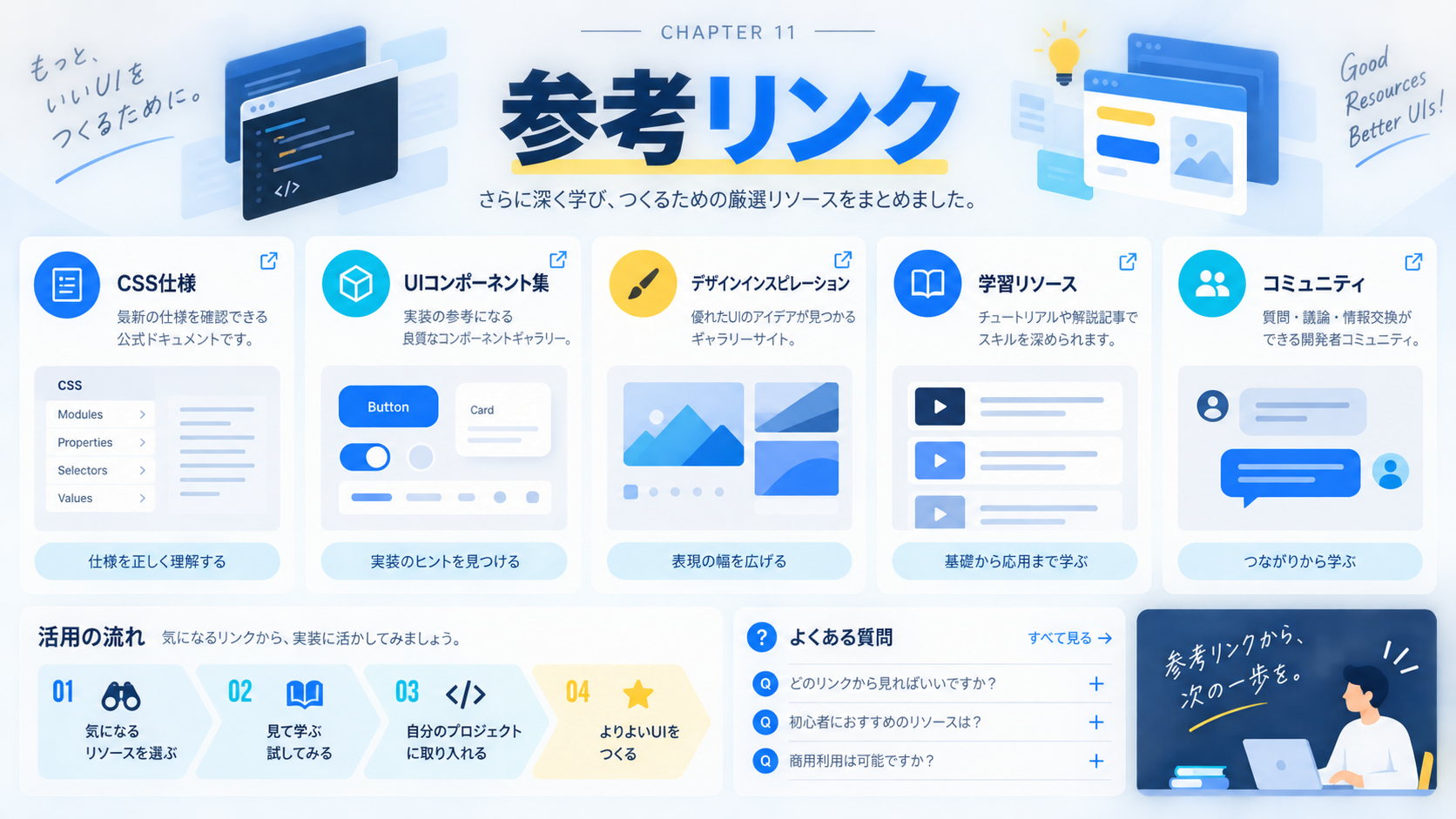
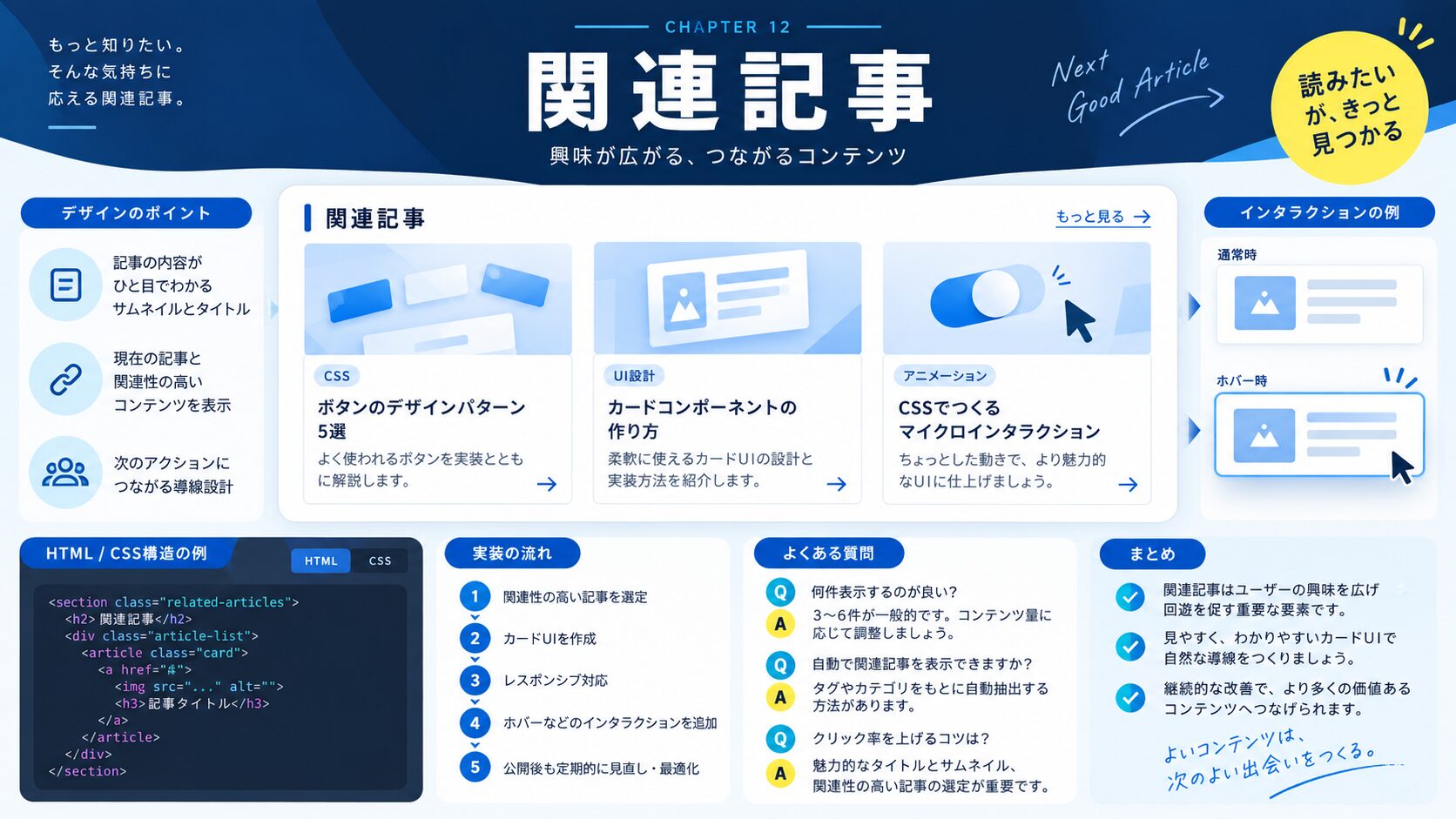
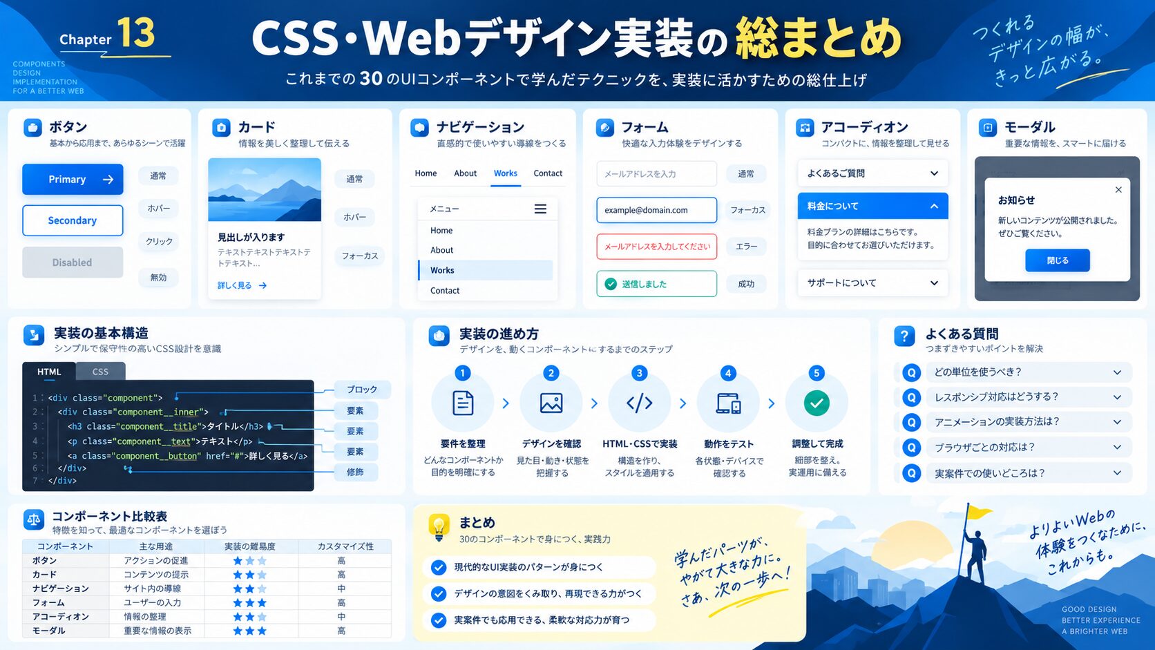
CSSの実装テクニックを「レイアウト・装飾・アニメーション・基礎・トラブル解決」の目的別に探せる総まとめページを用意しています。実装で迷ったときの索引としてどうぞ。
あわせて読みたい:8の倍数で余白を統一するデザイン設計ガイド
あわせて読みたい:CSSだけでモーダル(ポップアップ)を作る方法

目的に合わせて選べる「AI副業」「AI転職」「AI活用」の3コースを用意。副収入・キャリアチェンジ・日常の生産性アップまで、あなたのゴールに合わせてAIを学べます。
会員登録はカンタン30秒で完了します。まずは公式LINEから、無料でAI学習をスタートしましょう!
公式サイト より
今すぐ
無料カウンセリング
を予約!