










 生徒
生徒会社の沿革ページを作るんですが、縦線と丸で流れを見せるやつはどう作るんですか?
 ペン博士
ペン博士あれは擬似要素で線と丸を描くだけだよ。仕組みが分かれば、縦・横・交互配置ぜんぶ同じ考え方で作れる。順番に見ていこう。
会社の沿革、制作の流れ、学習ロードマップ。時間や順序のある情報は、箇条書きよりタイムライン形式のほうが圧倒的に伝わります。
実装は難しくありません。縦線を1本引き、各項目に丸印を置く。この2つを擬似要素で描けば完成します。画像もライブラリも不要です。
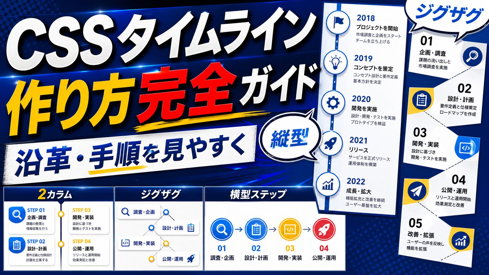
この記事では基本の縦型から、左右交互の配置、横型ステップ、スクロールで線が伸びる演出まで、コピペで使える形で紹介します。
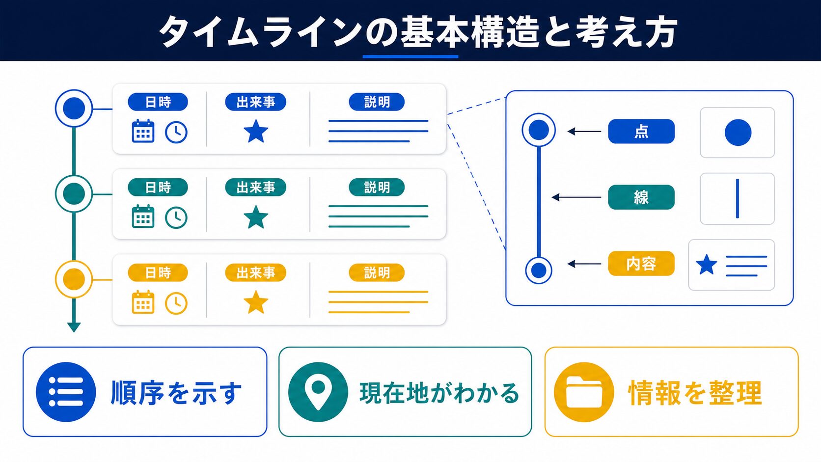
見た目は複雑ですが、分解すると要素は3つだけです。
::beforeで描く)::before)<ol class="timeline">
<li class="timeline__item">
<time class="timeline__date">2020年4月</time>
<h3 class="timeline__title">会社設立</h3>
<p class="timeline__text">Web制作事業を開始しました。</p>
</li>
<li class="timeline__item">
<time class="timeline__date">2022年10月</time>
<h3 class="timeline__title">オフィス移転</h3>
<p class="timeline__text">メンバー増員にともない移転しました。</p>
</li>
</ol>マークアップはol(順序付きリスト)が適切です。時系列という順序に意味があるため、支援技術にも構造が正しく伝わります。
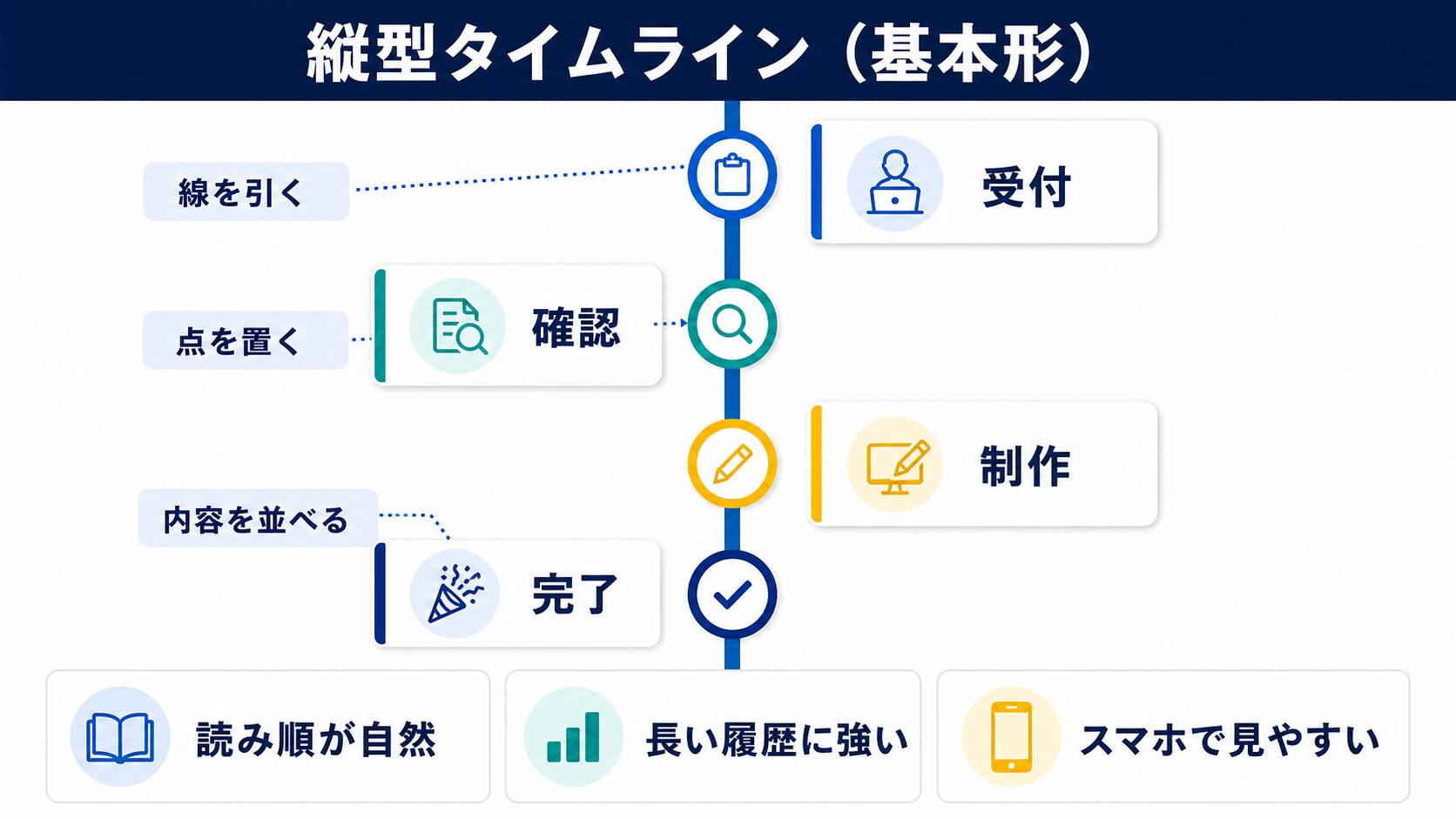
最もよく使う形です。左に線と丸、右に内容を置きます。
.timeline {
  position: relative;
  list-style: none;
  margin: 0;
  padding: 0 0 0 32px;      /* 線のぶんだけ内容を右へ寄せる */
}

/* 縦線 */
.timeline::before {
  content: "";
  position: absolute;
  top: 8px;
  bottom: 8px;
  left: 7px;
  width: 2px;
  background-color: #e5e7eb;
}

.timeline__item {
  position: relative;
  padding-bottom: 32px;     /* 項目同士の間隔 */
}

/* 丸印 */
.timeline__item::before {
  content: "";
  position: absolute;
  top: 6px;
  left: -32px;
  width: 16px;
  height: 16px;
  border-radius: 50%;
  background-color: #10b981;
  border: 3px solid #fff;
  box-shadow: 0 0 0 2px #10b981;
}

.timeline__date {
  display: block;
  margin-bottom: 4px;
  color: #10b981;
  font-weight: 700;
  font-size: 0.9em;
}

.timeline__item:last-child {
  padding-bottom: 0;
}線を親の::beforeで描くと、項目数が変わっても長さが自動で合います。topとbottomを少し内側にすると、端の丸から線がはみ出しません。
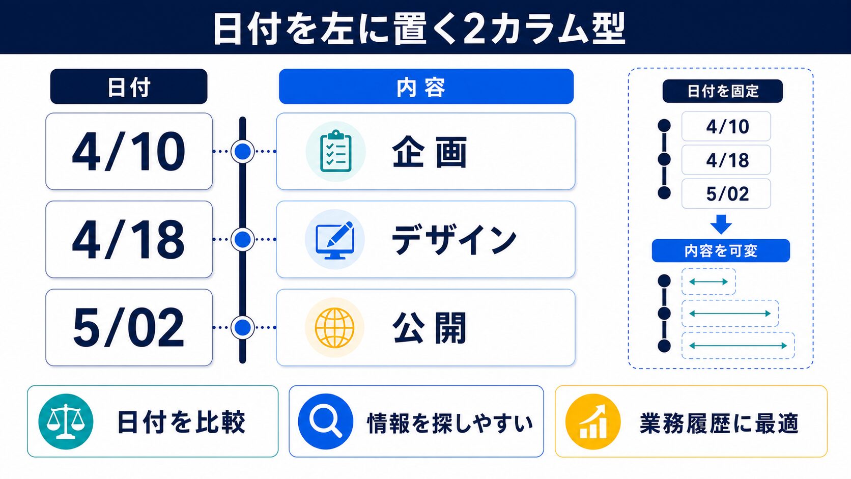
沿革ページでよく見る形です。日付を左カラムに揃えると、年ごとの間隔が読み取りやすくなります。
.timeline.-two-col .timeline__item {
  display: grid;
  grid-template-columns: 110px 1fr;
  gap: 0 28px;
}

.timeline.-two-col {
  padding-left: 0;
}

.timeline.-two-col::before {
  left: 130px;              /* 日付カラムの右端に線を置く */
}

.timeline.-two-col .timeline__item::before {
  left: 123px;
  top: 4px;
}

.timeline.-two-col .timeline__date {
  text-align: right;
  padding-top: 2px;
}日付カラムの幅は年月まで入る110px前後が目安です。文字が折り返すと丸の位置とずれるため、white-space: nowrapを足しておくと安全です。
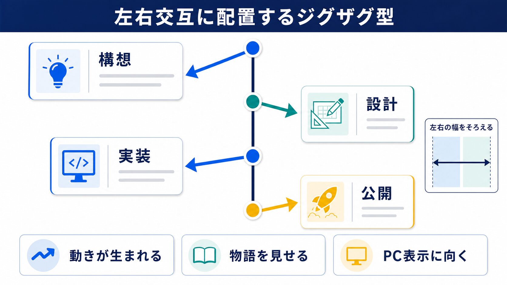
項目数が少ないランディングページなどで映える形です。中央に線を引き、奇数と偶数で左右に振り分けます。
.timeline.-alt {
  padding: 0;
}

.timeline.-alt::before {
  left: 50%;
  transform: translateX(-50%);
}

.timeline.-alt .timeline__item {
  width: 50%;
  padding: 0 32px 40px 0;
  text-align: right;
}

/* 偶数番目は右側へ */
.timeline.-alt .timeline__item:nth-child(even) {
  margin-left: 50%;
  padding: 0 0 40px 32px;
  text-align: left;
}

.timeline.-alt .timeline__item::before {
  left: auto;
  right: -9px;
}

.timeline.-alt .timeline__item:nth-child(even)::before {
  left: -9px;
  right: auto;
}

/* スマホでは片側に寄せる */
@media (max-width: 640px) {
  .timeline.-alt::before {
    left: 7px;
    transform: none;
  }
  .timeline.-alt .timeline__item,
  .timeline.-alt .timeline__item:nth-child(even) {
    width: 100%;
    margin-left: 0;
    padding: 0 0 32px 32px;
    text-align: left;
  }
  .timeline.-alt .timeline__item::before,
  .timeline.-alt .timeline__item:nth-child(even)::before {
    left: -1px;
    right: auto;
  }
}
ジグザグ型はスマホで必ず崩れます。640px以下では通常の縦型に戻す指定をセットで書いてください。
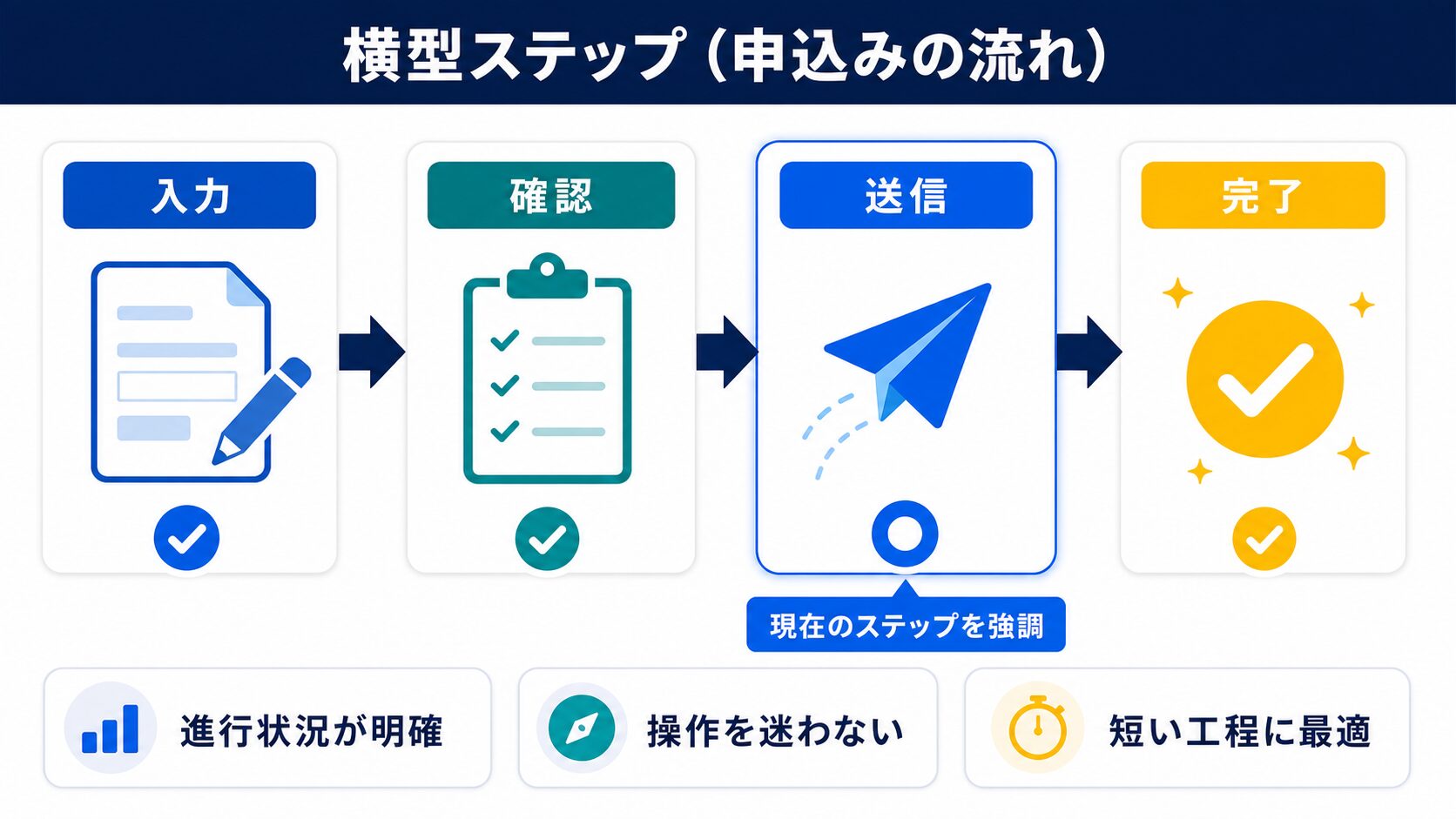
3〜5ステップの流れを見せるなら横型が向きます。Flexboxで等分し、項目の間に線を渡します。
.steps {
  display: flex;
  list-style: none;
  margin: 0;
  padding: 0;
  counter-reset: step;
}

.steps__item {
  position: relative;
  flex: 1;
  padding: 0 12px;
  text-align: center;
}

/* 項目の間をつなぐ線 */
.steps__item:not(:last-child)::after {
  content: "";
  position: absolute;
  top: 26px;
  left: 50%;
  width: 100%;
  height: 2px;
  background-color: #e5e7eb;
  z-index: 0;
}

/* 番号の丸 */
.steps__item::before {
  counter-increment: step;
  content: counter(step);
  position: relative;
  z-index: 1;
  display: grid;
  place-items: center;
  width: 52px;
  height: 52px;
  margin: 0 auto 12px;
  border-radius: 50%;
  background-color: #10b981;
  color: #fff;
  font-weight: 800;
  font-size: 1.15em;
}

@media (max-width: 640px) {
  .steps {
    display: block;
  }
  .steps__item:not(:last-child)::after {
    top: 52px;
    left: 26px;
    width: 2px;
    height: 100%;
  }
  .steps__item {
    display: grid;
    grid-template-columns: 52px 1fr;
    gap: 16px;
    text-align: left;
    padding-bottom: 24px;
  }
  .steps__item::before {
    margin: 0;
  }
}番号はcounter-incrementで自動採番すると、順番を入れ替えても番号が崩れません。HTMLに数字を書かない設計にしておくと運用が楽です。
丸の中に年号やアイコンを入れると、情報量を増やせます。擬似要素ではなく実体の要素で作るのがコツです。
<li class="timeline__item">
  <span class="timeline__mark">01</span>
  <div class="timeline__body">
    <time class="timeline__date">2024年</time>
    <h3 class="timeline__title">サービス開始</h3>
  </div>
</li>
.timeline.-mark .timeline__item {
display: grid;
grid-template-columns: 48px 1fr;
gap: 20px;
padding-bottom: 28px;
}
.timeline.-mark .timeline__item::before {
display: none; /* 擬似要素の丸は使わない */
}
.timeline__mark {
display: grid;
place-items: center;
width: 48px;
height: 48px;
border-radius: 50%;
background-color: #e7f8f1;
color: #0f9d6f;
font-weight: 800;
border: 2px solid #10b981;
}
.timeline.-mark::before {
left: 23px; /* 丸の中心に線を通す */
}丸を実体にすると、中にSVGアイコンや画像も置けます。線の位置は丸の幅の半分に合わせると中心を通ります。
スクロールに合わせて線が伸びる動きは、最新のCSSだけで実装できます。対応環境ではJavaScriptが不要です。
@supports (animation-timeline: view()) {
  .timeline::after {
    content: "";
    position: absolute;
    top: 8px;
    left: 7px;
    width: 2px;
    background-color: #10b981;
    height: 100%;
    transform-origin: top;
    animation: line-grow linear both;
    animation-timeline: view();
    animation-range: entry 20% cover 60%;
  }
}

@keyframes line-grow {
  from { transform: scaleY(0); }
  to   { transform: scaleY(1); }
}

@media (prefers-reduced-motion: reduce) {
  .timeline::after {
    animation: none;
    transform: scaleY(1);
  }
}@supportsで囲んでおけば、未対応ブラウザでは何も起きないので安全です。演出が無くても内容は読めるため、フォールバックとして成立します。
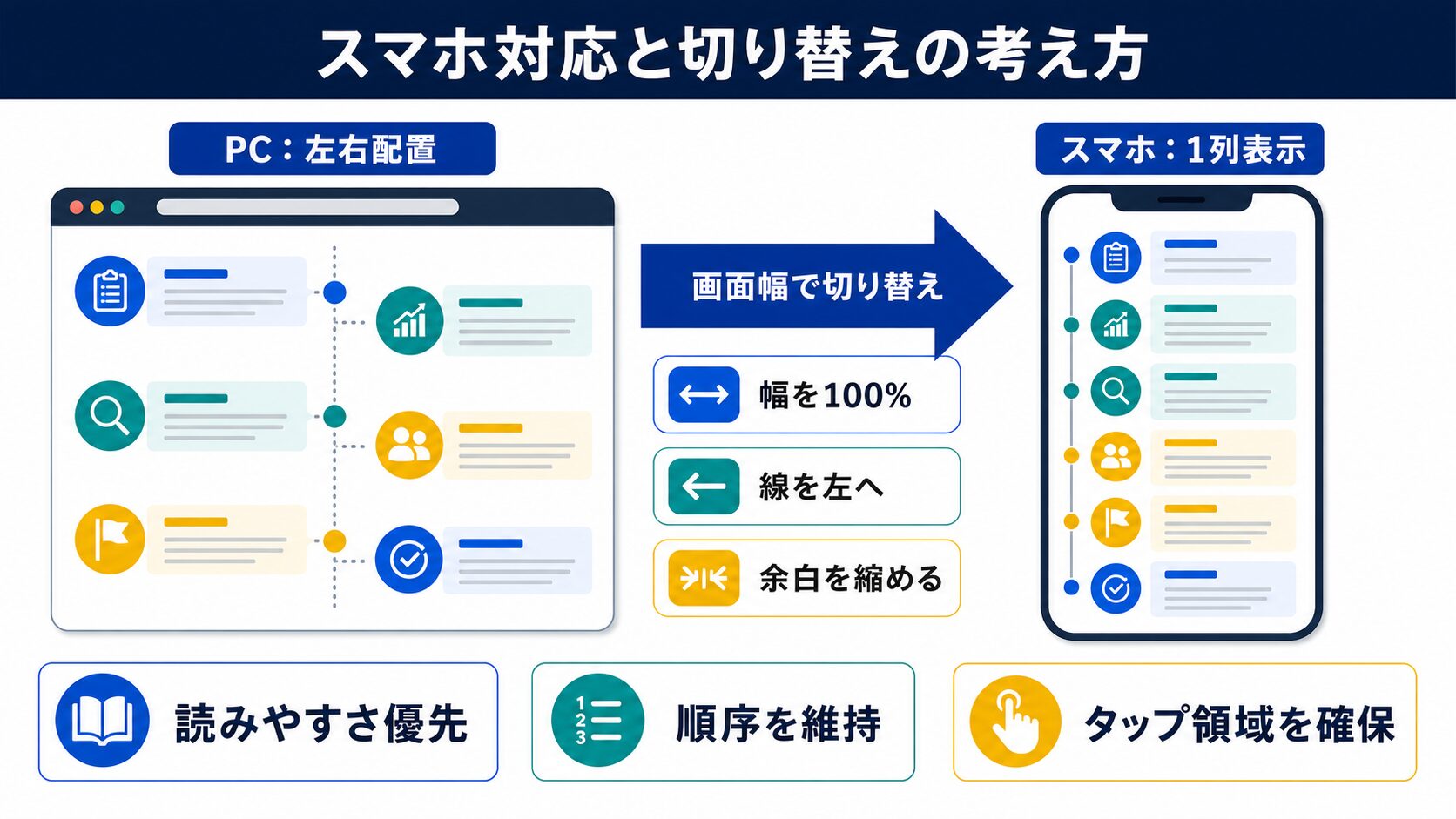
タイムラインは幅の影響を受けやすいパーツです。切り替え方針を決めておくと崩れません。
| PC表示 | スマホでの推奨 | 理由 |
|---|---|---|
| 縦型(基本) | そのまま | 幅の影響を受けにくい |
| 2カラム型 | 日付を上に重ねる | 110pxの列で本文が潰れる |
| ジグザグ型 | 片側寄せに戻す | 半分の幅では読めない |
| 横型ステップ | 縦積みに変える | 4つ以上は横に収まらない |
共通するのは「線は左端に寄せ、内容は全幅で読ませる」という形です。迷ったら基本の縦型に戻す、と決めておけば実装が単純になります。
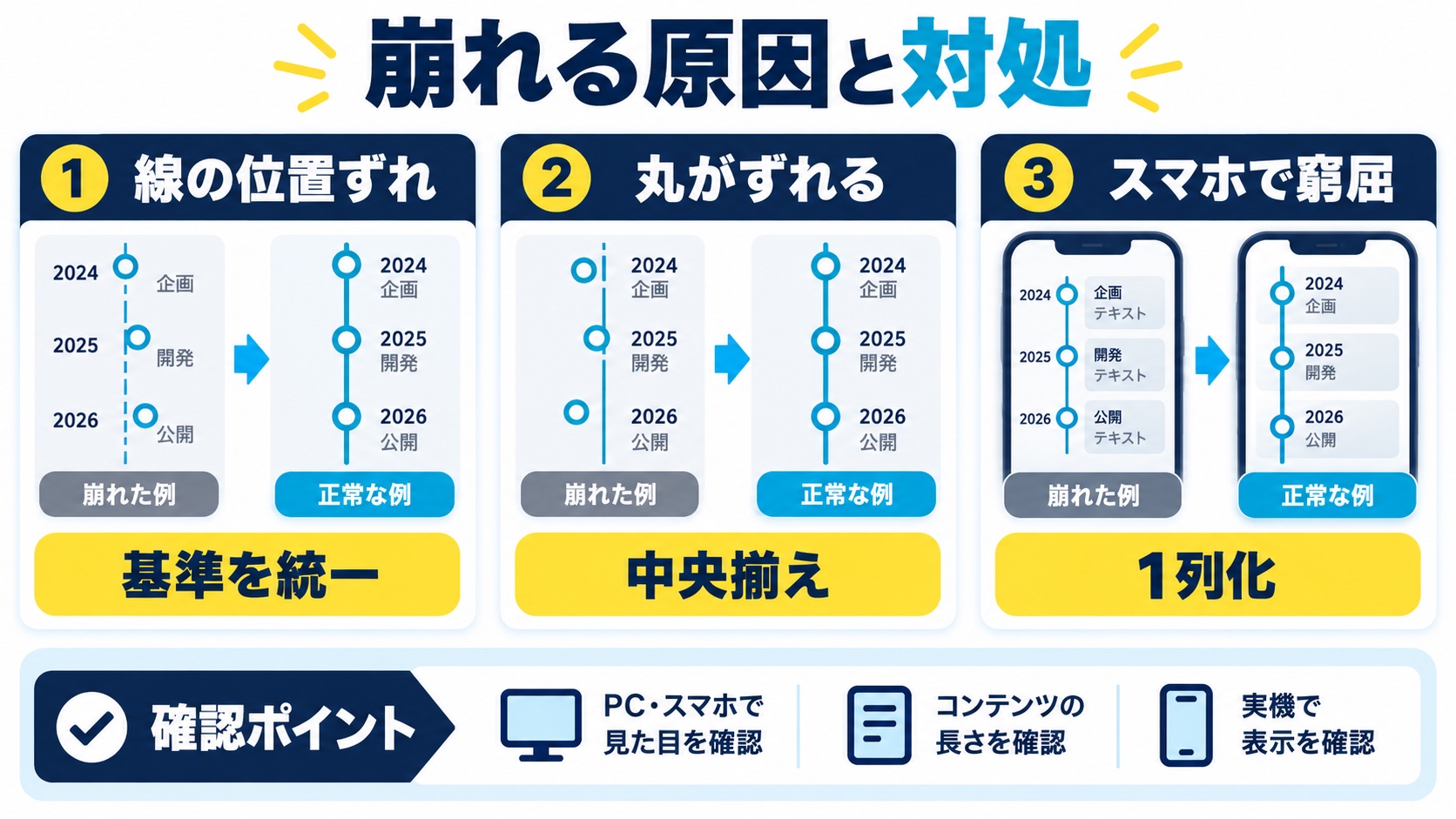
よくあるつまずきをまとめます。位置がずれる系は、ほぼ基準要素の指定漏れです。
| 症状 | 原因 | 対処 |
|---|---|---|
| 丸の位置がずれる | 項目にposition: relativeがない | 各項目に指定する |
| 線が最後まで伸びる | 親の高さいっぱいに描画 | bottomで内側に収める |
| 最後の項目の下に余白 | padding-bottomが残る | :last-childで0にする |
| 線と丸が重なって見える | 重なり順が同じ | 丸にz-indexを付ける |
| 日付が折り返して崩れる | 列幅が足りない | white-space: nowrap |
| スマホで左右がはみ出す | ジグザグのまま | 縦型に戻す指定を追加 |
最初に確認すべきは項目側の position: relativeです。これが無いと、丸印は項目ではなくページ全体を基準に配置されてしまいます。
縦型・2カラム・ジグザグをクラスで切り替えられる一式です。
.timeline {
  position: relative;
  list-style: none;
  margin: 0;
  padding: 0 0 0 32px;
  max-width: 800px;
}

.timeline::before {
  content: "";
  position: absolute;
  top: 8px;
  bottom: 8px;
  left: 7px;
  width: 2px;
  background-color: #e5e7eb;
}

.timeline__item {
  position: relative;
  padding-bottom: 32px;
}

.timeline__item:last-child {
  padding-bottom: 0;
}

.timeline__item::before {
  content: "";
  position: absolute;
  z-index: 1;
  top: 6px;
  left: -32px;
  width: 16px;
  height: 16px;
  border-radius: 50%;
  background-color: #10b981;
  border: 3px solid #fff;
  box-shadow: 0 0 0 2px #10b981;
}

.timeline__date {
  display: block;
  margin-bottom: 4px;
  color: #0f9d6f;
  font-weight: 700;
  font-size: 0.9em;
  white-space: nowrap;
}

.timeline__title {
  margin: 0 0 6px;
  font-size: 1.1rem;
}

.timeline__text {
  margin: 0;
  line-height: 1.8;
}同じ構造のまま、線と丸の見せ方を変えるだけで印象が大きく変わります。
.timeline.-dotted::before {
  width: 0;
  background: none;
  border-left: 2px dashed #cbd5e1;
}

.timeline.-dotted .timeline__item::before {
  background-color: #fff;
  border: 3px solid #10b981;
  box-shadow: none;
}
破線にすると「進行中」「予定」といった未確定の流れに合います。丸を白抜きにすると、さらに軽い印象になります。
.timeline.-grad::before {
  width: 3px;
  background-image: linear-gradient(to bottom, #10b981, #0ea5e9);
  border-radius: 999px;
}始点と終点で色が変わるので、時間の経過が視覚的に伝わります。ロードマップや成長過程の紹介に向く表現です。
.timeline__item.-done::before {
  background-color: #10b981;
  box-shadow: 0 0 0 2px #10b981;
}

.timeline__item.-current::before {
  background-color: #fff;
  box-shadow: 0 0 0 3px #0ea5e9, 0 0 0 8px rgba(14, 165, 233, .18);
}

.timeline__item.-todo::before {
  background-color: #e5e7eb;
  box-shadow: 0 0 0 2px #cbd5e1;
}
進行状況を示す場合は、完了・進行中・未着手の3状態を色で分けます。現在地の丸だけ外側に淡い輪を付けると、視線が集まります。
.timeline.-card .timeline__body {
  padding: 18px 20px;
  border-radius: 12px;
  background-color: #fff;
  box-shadow: 0 2px 10px rgba(15, 23, 42, .08);
}

.timeline.-card .timeline__body::before {
  content: "";
  position: absolute;
  top: 14px;
  left: -6px;
  width: 12px;
  height: 12px;
  background-color: #fff;
  transform: rotate(45deg);   /* 吹き出しの三角 */
}
内容をカードに載せると情報量の多い沿革でも読みやすくなります。左に小さな三角を出すと、線とカードがつながって見えます。
形が魅力的なので何にでも使いたくなりますが、向き不向きがあります。
| 内容 | 向き | 理由 |
|---|---|---|
| 会社の沿革 | 向く | 年ごとの間隔に意味がある |
| 申込みの流れ | 向く | 順序が理解の助けになる |
| 学習ロードマップ | 向く | 前後関係が伝わる |
| サービスの特徴 | 向かない | 順序がないため誤解を生む |
| 料金プラン比較 | 向かない | 並列比較は表のほうが速い |
判断基準は順序に意味があるかどうかだけです。並列の情報にタイムラインを使うと、読者は「上から順にやるもの」と誤解します。
タイムラインは「親の擬似要素で縦線」「各項目の擬似要素で丸印」の2つで作れます。項目側にposition: relativeを忘れずに指定するのが最大のポイントです。沿革なら日付を左に置く2カラム型、申込みの流れなら番号を自動採番する横型ステップが向きます。ジグザグ型と横型はスマホで必ず崩れるため、640px以下で縦型に戻す指定をセットで書いてください。スクロールで線が伸びる演出はanimation-timeline: view()を@supportsで囲めば、未対応環境でも安全に導入できます。
各項目にposition: relativeが指定されているか確認してください。指定がないと、丸印は最も近い位置指定済みの祖先要素、多くの場合ページ全体を基準に配置されてしまいます。位置の微調整はtopとleftの値で行います。
線を各項目ではなく親要素の::beforeで描き、topとbottomを指定してください。高さを固定値ではなく上下からの距離で決めることで、項目数に応じて自動で伸縮します。
親にcounter-reset: step、各項目にcounter-increment: stepとcontent: counter(step)を指定すれば自動採番されます。HTMLに数字を書かないため、順番を入れ替えても番号がずれません。
animation-timeline: view()を使えばCSSだけで実装できます。ただし対応ブラウザが限られるため、@supportsで囲んで未対応環境では静的に表示されるようにしてください。幅広い環境で確実に動かすならIntersection Observerを使います。
時系列という順序に意味があるためolを使い、日付はtime要素で示すのが適切です。timeにはdatetime属性で機械可読な日付を入れておくと、検索エンジンにも意図が伝わります。
CSSの実装テクニックを「レイアウト・装飾・アニメーション・基礎・トラブル解決」の目的別に探せる総まとめページを用意しています。実装で迷ったときの索引としてどうぞ。

目的に合わせて選べる「AI副業」「AI転職」「AI活用」の3コースを用意。副収入・キャリアチェンジ・日常の生産性アップまで、あなたのゴールに合わせてAIを学べます。
会員登録はカンタン30秒で完了します。まずは公式LINEから、無料でAI学習をスタートしましょう!
公式サイト より
今すぐ
無料カウンセリング
を予約!