









CSSでグラデーションを使いたいけれど、書き方がわからない。そう感じたことはないだろうか。linear-gradientとradial-gradientの違いがわからない、角度の指定がうまくいかない、文字にグラデーションをかけたいのにうまく表示されない——Webの現場では、こうした悩みが頻繁に起きる。
この記事はHTML・CSSの基礎をひととおり学んだ人を対象にしている。コードをコピーして自分のプロジェクトに貼り付けるだけで使えるサンプルを多数用意した。グラデーションの仕組みを理解しながら、実務でそのまま使える実装力を身につけてほしい。
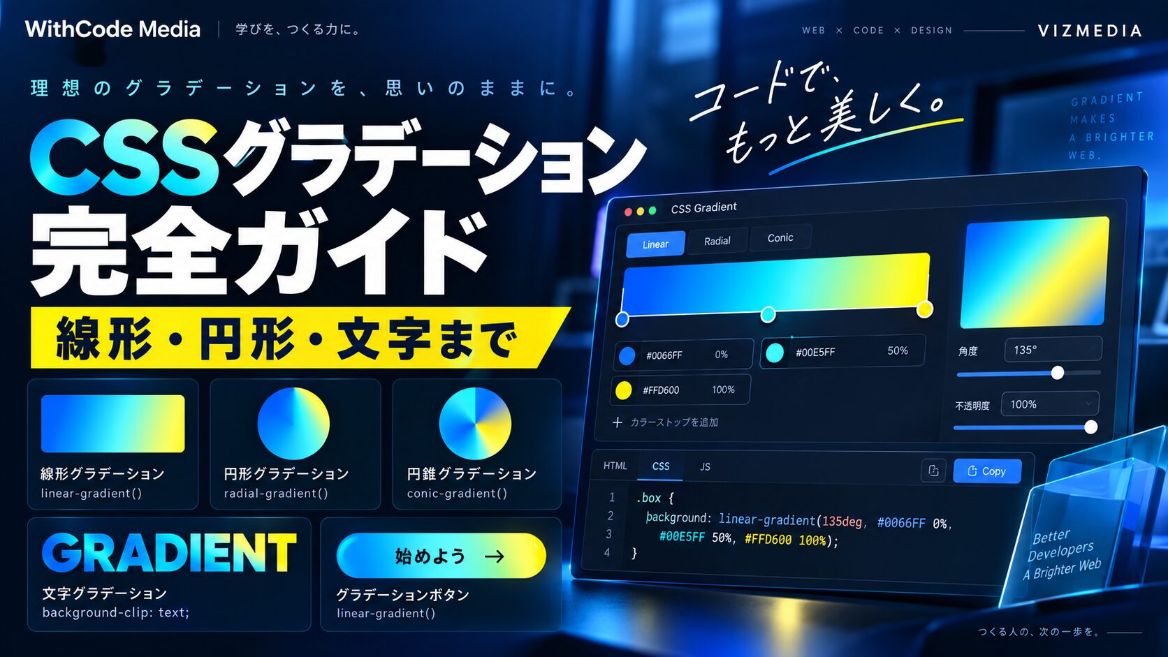
読み終えると、線形・円形・円錐の3種類のグラデーション関数を使い分けられるようになる。テキストへのグラデーション適用、おしゃれなボタンや背景の作り方、繰り返しグラデーションと透過グラデーション、さらにトラブルシューティングまで、CSSグラデーションに関することを一通り習得できる。
先に、この記事の結論をまとめます。
linear-gradient・radial-gradient・conic-gradientの3関数を使うbackground-clip: textと-webkit-text-fill-color: transparentを組み合わせるrepeating-linear-gradient・repeating-radial-gradientを使うbackgroundプロパティの上書きや単位の書き忘れを先に確認する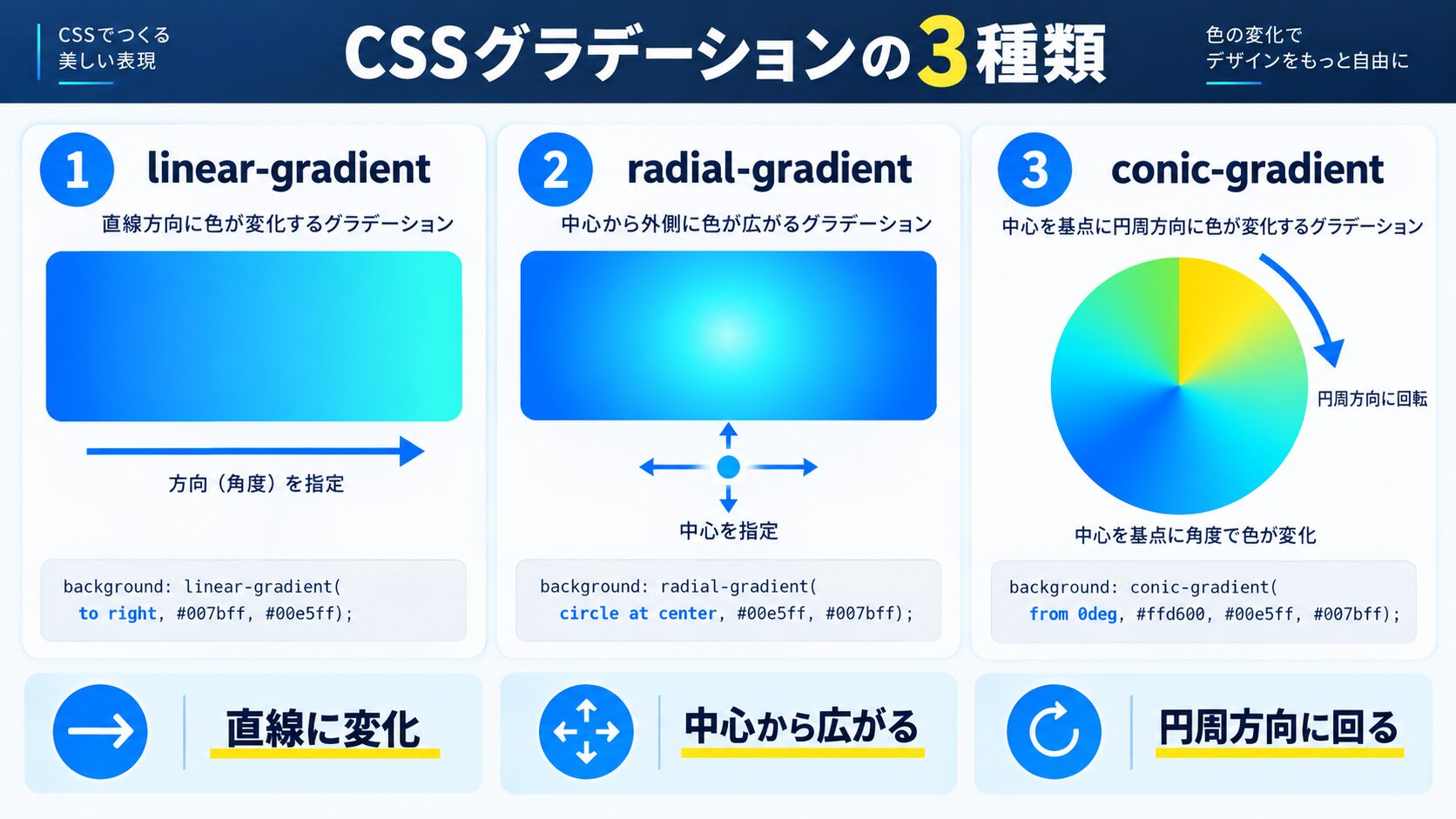
グラデーションとは、ある色から別の色へ滑らかに変化する表現のことだ。印刷物や写真では昔から使われてきた手法だが、CSSではブラウザが自動的に色の遷移を計算して描画する。画像ファイルを用意する必要がなく、ファイルサイズを増やさずに豊かなビジュアルを実現できる点が大きなメリットだ。
CSSでグラデーションを表現するための関数は大きく3つある。それぞれ用途と見た目が異なるので、目的に応じて選択する。
直線方向に色が変化するグラデーションだ。上から下、左から右、斜め——任意の角度で色を流せる。最もよく使われる基本形で、ボタンや背景に幅広く活用される。
中心から外側に向かって同心円状に色が広がるグラデーションだ。スポットライトのような表現や、背景に奥行き感を出したいときに使う。円(circle)と楕円(ellipse)の2形状を指定できる。
中心点を軸に、円周に沿って色が回転しながら変化するグラデーションだ。色相環やパイチャートのような表現に向いている。Chrome 69・Firefox 83・Safari 12.1以降でサポートされており、現在はほぼすべての主要ブラウザで使える。
| 関数名 | 変化の方向 | 主な用途 |
|---|---|---|
| linear-gradient | 直線 | ボタン・背景・区切り線 |
| radial-gradient | 中心から同心円 | スポットライト・背景装飾 |
| conic-gradient | 中心を軸に回転 | パイチャート・色相環 |
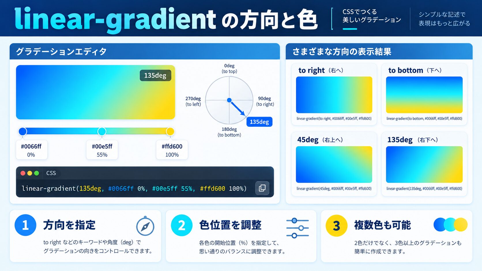
linear-gradientはCSSグラデーションの入門として最適だ。まず基本の書き方を押さえ、次に方向と角度の指定方法をマスターしよう。
最低限の書き方は「開始色」と「終了色」の2色を指定するだけだ。デフォルトでは上から下(to bottom)の方向で描画される。
/* 上から下へ:青からピンク */
.box {
  background-image: linear-gradient(#4A90D9, #d16176);
}
backgroundプロパティに直接書くこともできる。ただし、background-colorと同時に使う場合は記述順に注意が必要だ(後述のトラブルシューティング参照)。
/* background省略形でも書ける */
.box {
  background: linear-gradient(#4A90D9, #d16176);
}第1引数に方向を表すキーワードを指定できる。to rightで左から右、to bottom rightで左上から右下へ流れるグラデーションになる。
/* 左から右 */
.left-to-right {
  background: linear-gradient(to right, #4A90D9, #d16176);
}

/* 右から左 */
.right-to-left {
  background: linear-gradient(to left, #d16176, #4A90D9);
}

/* 左上から右下(斜め) */
.diagonal {
  background: linear-gradient(to bottom right, #EFBDB7, #51322b);
}キーワード指定では45度刻みの8方向しか表現できない。任意の角度には数値+degを使う。0degは下から上(to top)に相当し、時計回りに増加する。
/* 45度(右上方向) */
.angle-45 {
  background: linear-gradient(45deg, #d16176, #EFBDB7);
}

/* 135度(右下方向) */
.angle-135 {
  background: linear-gradient(135deg, #51322b, #d16176);
}

/* 270度(左方向) */
.angle-270 {
  background: linear-gradient(270deg, #EFBDB7, #4A90D9);
}2色だけでなく、3色以上のグラデーションも作れる。色の後にパーセントや長さを指定すると「どの位置でその色になるか」を細かくコントロールできる。
/* 3色グラデーション */
.three-color {
  background: linear-gradient(to right, #d16176, #EFBDB7, #51322b);
}

/* カラーストップ位置を指定 */
.custom-stop {
  background: linear-gradient(
    to right,
    #d16176 0%,
    #d16176 30%,
    #EFBDB7 60%,
    #51322b 100%
  );
}

/* ハードな色の境界(段階的な色変化なし) */
.hard-stop {
  background: linear-gradient(
    to right,
    #d16176 50%,
    #EFBDB7 50%
  );
}同じ位置に2色を並べると(例:#d16176 50%, #EFBDB7 50%)境界がシャープになり、ストライプ表現に使える。
グラデーションの色にはhex(#FF0000)以外にも、rgba・hsl・hslAなどすべての色記法が使える。透明度を含む表現はrgbaかhslaで指定する。
/* rgba で透明から色へ */
.fade-in {
  background: linear-gradient(
    to right,
    rgba(209, 97, 118, 0),
    rgba(209, 97, 118, 1)
  );
}

/* hsl指定 */
.hsl-gradient {
  background: linear-gradient(
    to bottom,
    hsl(350, 55%, 60%),
    hsl(20, 50%, 25%)
  );
}
linear-gradientを習得したら、次は形状の異なる2つのグラデーション関数を見ていこう。
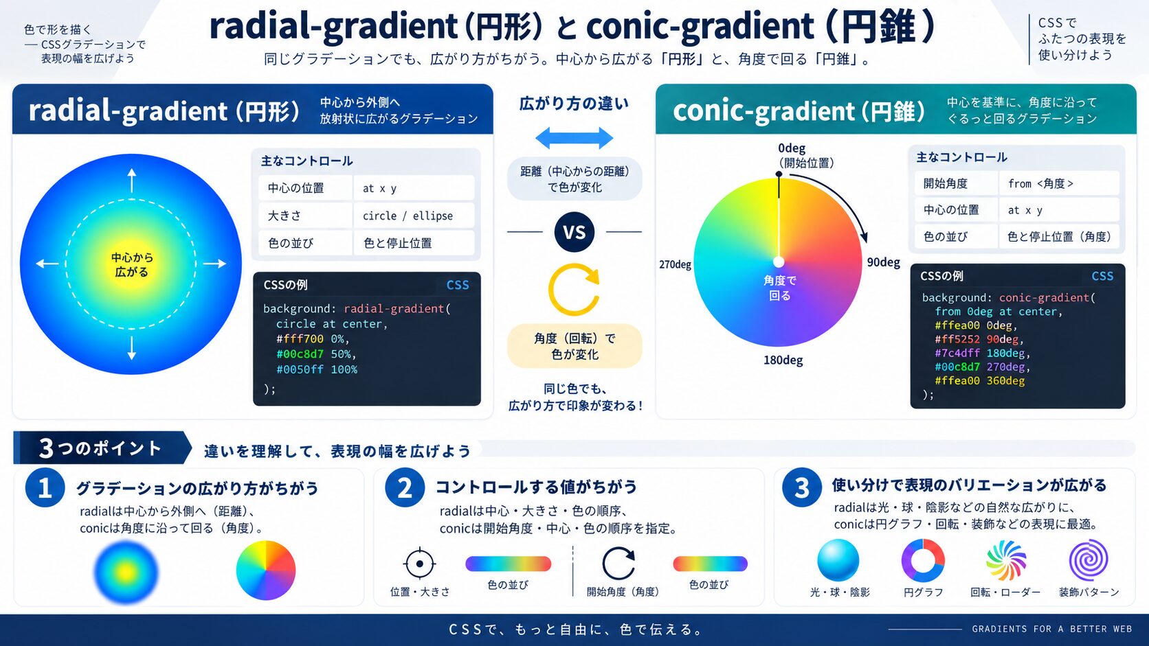
radial-gradientは中心から外側に向かって色が広がる。第1引数に形状(circle / ellipse)と中心位置を指定できる。省略時は要素のサイズに合わせた楕円(ellipse)になる。
/* 基本:楕円のグラデーション */
.radial-basic {
  background: radial-gradient(#EFBDB7, #51322b);
}

/* 円形に指定 */
.radial-circle {
  background: radial-gradient(circle, #EFBDB7, #51322b);
}

/* 中心位置を左上に変更 */
.radial-top-left {
  background: radial-gradient(circle at top left, #d16176, #51322b);
}

/* 中心位置をパーセントで指定 */
.radial-custom-pos {
  background: radial-gradient(ellipse at 20% 70%, #EFBDB7 0%, #d16176 50%, #51322b 100%);
}グラデーションが収まる範囲もキーワードで制御できる。特にfarthest-cornerとclosest-sideの違いを覚えておくと便利だ。
/* 最も近い辺まで広がる */
.closest-side {
  background: radial-gradient(circle closest-side at 30% 50%, #d16176, #51322b);
}

/* 最も遠いコーナーまで広がる(デフォルト) */
.farthest-corner {
  background: radial-gradient(circle farthest-corner at 50% 50%, #EFBDB7, #51322b);
}

/* 具体的なサイズを指定 */
.explicit-size {
  background: radial-gradient(circle 100px at center, #d16176, transparent);
}conic-gradientは中心を起点に色が角度で変化する。パイチャートや色相環の表現に使われるが、独特なパターン背景にも応用できる。
/* 基本のコニックグラデーション */
.conic-basic {
  background: conic-gradient(#d16176, #EFBDB7, #51322b, #d16176);
  border-radius: 50%;
  width: 200px;
  height: 200px;
}

/* 開始角度を指定(from 角度) */
.conic-from {
  background: conic-gradient(from 45deg, #d16176, #EFBDB7, #51322b);
}

/* 中心位置を変更 */
.conic-at {
  background: conic-gradient(from 0deg at 30% 50%, #d16176, #EFBDB7, #51322b);
}

/* ハードストップでパイチャート風 */
.pie-chart {
  background: conic-gradient(
    #d16176 0deg 120deg,
    #EFBDB7 120deg 240deg,
    #51322b 240deg 360deg
  );
  border-radius: 50%;
  width: 200px;
  height: 200px;
}conic-gradientをbackground-sizeと組み合わせると、市松模様(チェッカーボード)パターンをCSSだけで作れる。
/* チェッカーボードパターン */
.checker {
  background:
    conic-gradient(#d16176 25%, #EFBDB7 25% 50%, #d16176 50% 75%, #EFBDB7 75%);
  background-size: 40px 40px;
}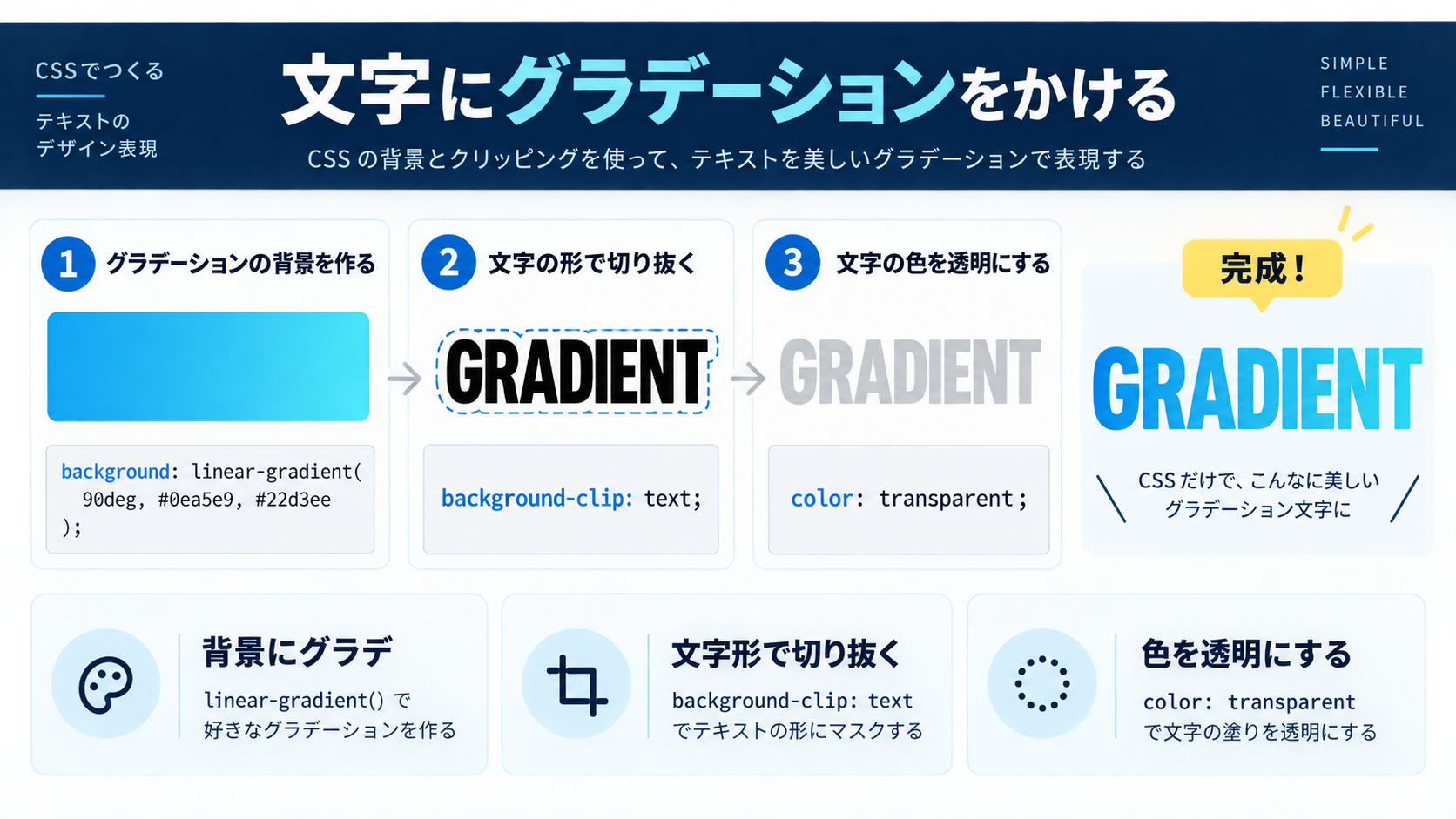
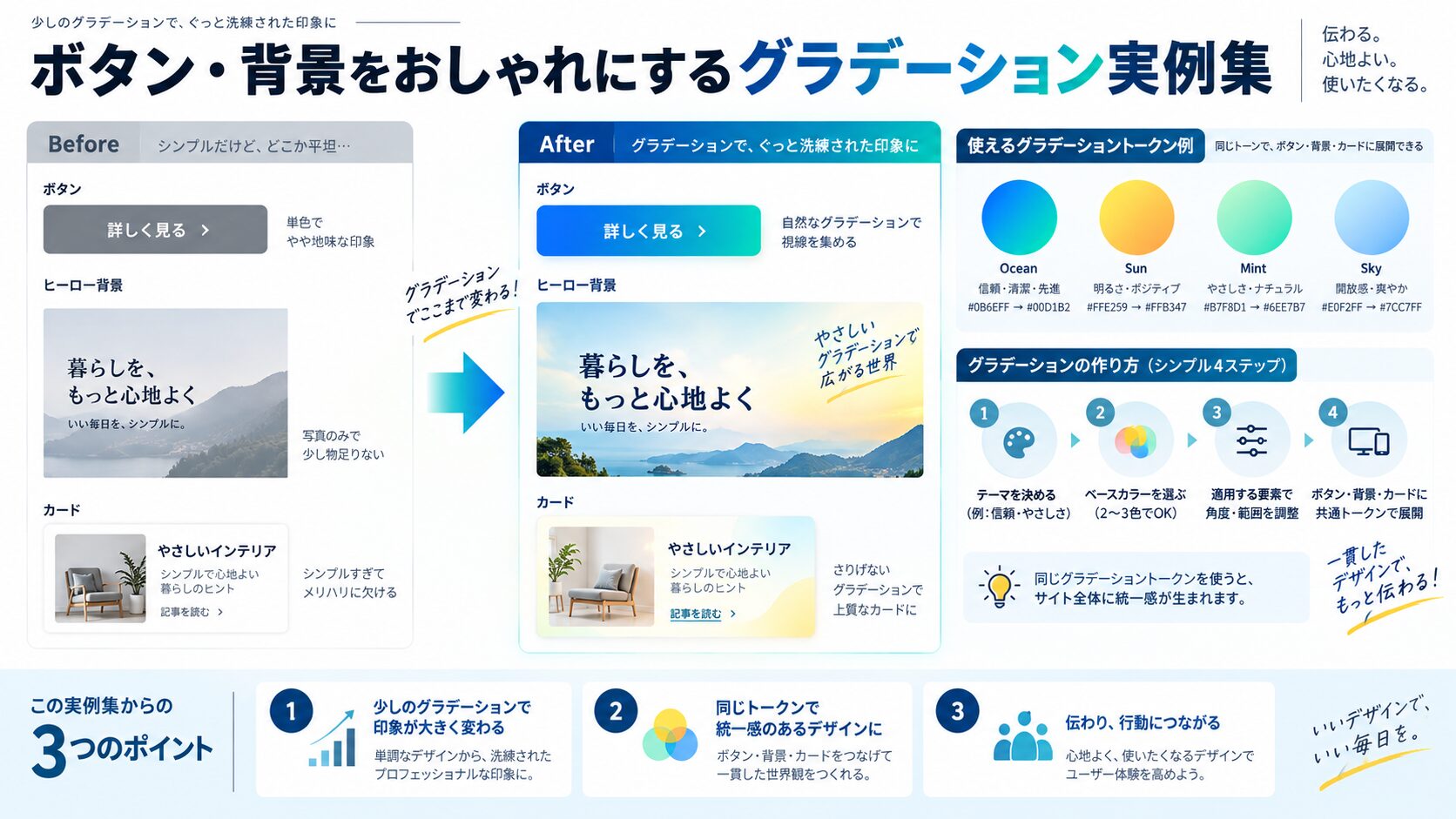
CSSには「テキストに直接グラデーションを指定するプロパティ」は存在しない。しかし、background-clip: textというテクニックを使うと、背景グラデーションを文字の形で切り抜いて表示できる。これが現時点での標準的な実装方法だ。
通常、background-imageは要素のボックス全体に描画される。background-clip: textを指定すると、背景の描画範囲がテキスト部分だけに切り抜かれる。さらに-webkit-text-fill-color: transparentでテキストの塗りを透明にすると、背景グラデーションが透けて見える——という仕組みだ。
/* テキストグラデーションの基本 */
.gradient-text {
  background: linear-gradient(to right, #d16176, #EFBDB7);
  -webkit-background-clip: text;
  background-clip: text;
  -webkit-text-fill-color: transparent;
  color: transparent; /* フォールバック */
  display: inline-block;
}注意点として、-webkit-プレフィックスのほうは現在も多くのブラウザで必要だ。両方セットで書くのがベストプラクティスだ。また、display: inline-block(またはblock)にしないと正しく動作しないケースがある。
/* h1見出しにグラデーション */
h1.gradient-heading {
  font-size: clamp(2rem, 5vw, 4rem);
  font-weight: 900;
  background: linear-gradient(135deg, #d16176 0%, #EFBDB7 50%, #51322b 100%);
  -webkit-background-clip: text;
  background-clip: text;
  -webkit-text-fill-color: transparent;
  color: transparent;
  display: inline-block;
  line-height: 1.2;
}

/* 斜め方向のグラデーション文字 */
h2.diagonal-heading {
  background: linear-gradient(45deg, #4A90D9, #d16176, #EFBDB7);
  -webkit-background-clip: text;
  background-clip: text;
  -webkit-text-fill-color: transparent;
  color: transparent;
  display: inline-block;
}background-sizeを大きく設定してbackground-positionをアニメーションすると、流れるようなグラデーションアニメーションが実現できる。
/* 流れるグラデーション文字アニメーション */
@keyframes gradient-flow {
  0% { background-position: 0% 50%; }
  50% { background-position: 100% 50%; }
  100% { background-position: 0% 50%; }
}

.animated-gradient-text {
  background: linear-gradient(
    270deg,
    #d16176,
    #EFBDB7,
    #4A90D9,
    #EFBDB7,
    #d16176
  );
  background-size: 400% 400%;
  -webkit-background-clip: text;
  background-clip: text;
  -webkit-text-fill-color: transparent;
  color: transparent;
  display: inline-block;
  animation: gradient-flow 6s ease infinite;
}background-clip: textはIE11では動作しない。IE11のサポートが必要な場合は、colorプロパティに通常の色を設定しておくとフォールバックになる。現代のプロジェクトでIE11を切っている場合は特に意識しなくてよい。
/* IE11フォールバック付き */
.gradient-text-safe {
  color: #d16176; /* IEはここだけ適用 */
  background: linear-gradient(to right, #d16176, #EFBDB7);
  -webkit-background-clip: text;
  background-clip: text;
  -webkit-text-fill-color: transparent;
  display: inline-block;
}
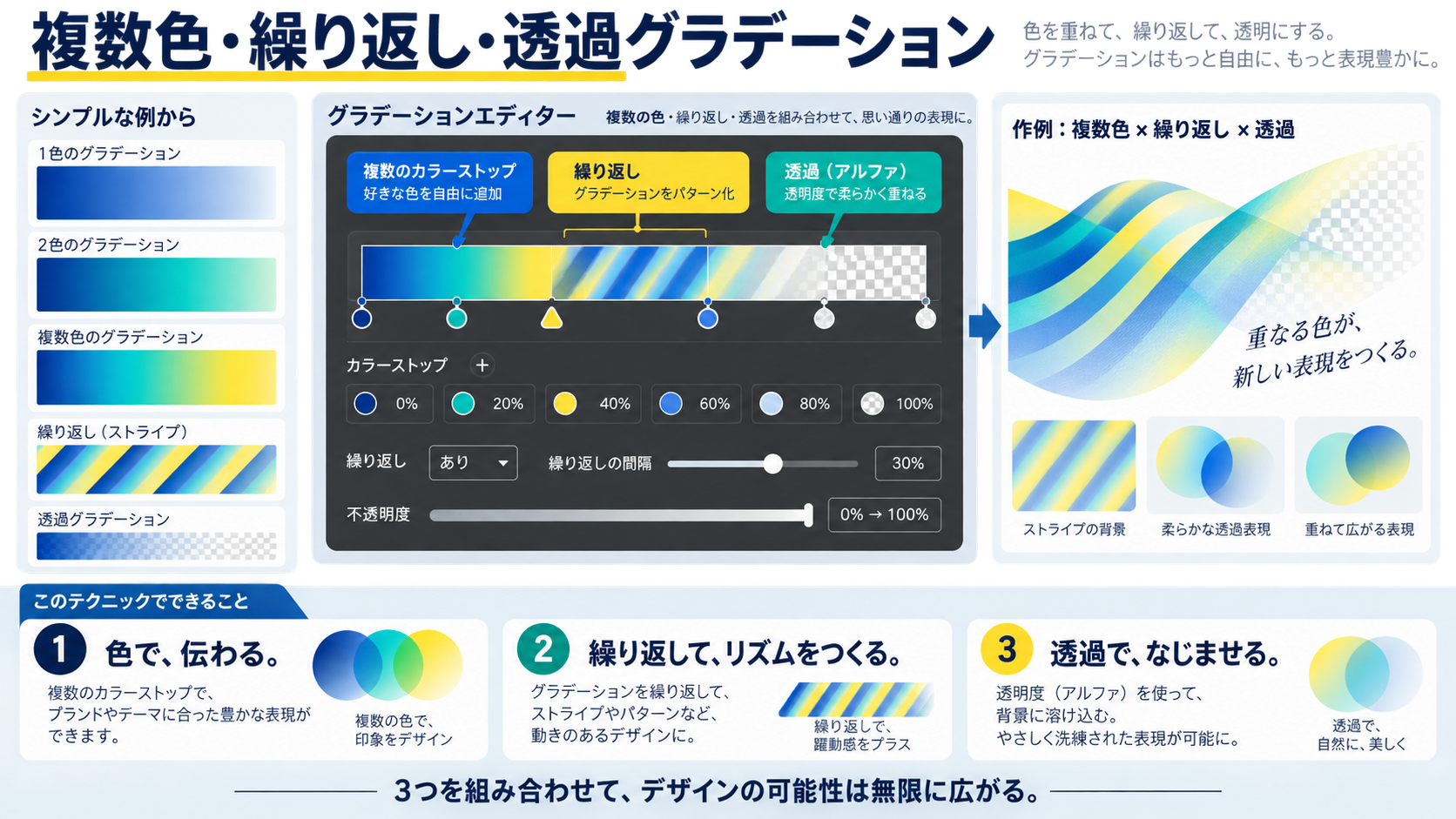
実務でそのまま使えるコピペサンプルをまとめた。ボタンのスタイルは用途とトーンに合わせて選んでほしい。
/* ピンク系グラデーションボタン */
.btn-gradient-pink {
  display: inline-block;
  padding: 14px 36px;
  background: linear-gradient(135deg, #d16176, #EFBDB7);
  color: #fff;
  font-size: 1rem;
  font-weight: 700;
  border: none;
  border-radius: 50px;
  cursor: pointer;
  text-decoration: none;
  transition: opacity 0.3s ease, transform 0.2s ease;
}

.btn-gradient-pink:hover {
  opacity: 0.85;
  transform: translateY(-2px);
}
/* ダークブランドカラーグラデーションボタン */
.btn-gradient-dark {
display: inline-block;
padding: 14px 36px;
background: linear-gradient(to right, #51322b, #d16176);
color: #fff;
font-size: 1rem;
font-weight: 700;
border: none;
border-radius: 8px;
cursor: pointer;
text-decoration: none;
letter-spacing: 0.05em;
transition: background 0.4s ease, box-shadow 0.3s ease;
}
.btn-gradient-dark:hover {
background: linear-gradient(to right, #d16176, #51322b);
box-shadow: 0 6px 20px rgba(209, 97, 118, 0.4);
}背景を透明にしてボーダーだけグラデーションにするテクニックだ。borderプロパティにはグラデーションを直接指定できないため、疑似要素を使って実現する。
/* ボーダーグラデーションボタン */
.btn-border-gradient {
  position: relative;
  display: inline-block;
  padding: 14px 36px;
  background: #fff;
  color: #d16176;
  font-size: 1rem;
  font-weight: 700;
  border: none;
  border-radius: 50px;
  cursor: pointer;
  text-decoration: none;
  z-index: 0;
}

.btn-border-gradient::before {
  content: '';
  position: absolute;
  inset: -2px;
  border-radius: 50px;
  background: linear-gradient(135deg, #d16176, #EFBDB7, #51322b);
  z-index: -1;
}

.btn-border-gradient:hover {
  background: linear-gradient(135deg, #d16176, #EFBDB7);
  color: #fff;
  transition: background 0.3s ease, color 0.3s ease;
}/* ヒーロー背景:柔らかいグラデーション */
.hero {
min-height: 100vh;
background: linear-gradient(160deg, #fff 0%, #EFBDB7 50%, #d16176 100%);
display: flex;
align-items: center;
justify-content: center;
}
/* ヒーロー背景:ダークトーン */
.hero-dark {
min-height: 100vh;
background: linear-gradient(135deg, #51322b 0%, #d16176 100%);
}
/* メッシュグラデーション風(複数のradial-gradient重ね) */
.mesh-gradient {
background:
radial-gradient(ellipse at 20% 20%, rgba(209, 97, 118, 0.6) 0%, transparent 50%),
radial-gradient(ellipse at 80% 80%, rgba(81, 50, 43, 0.5) 0%, transparent 50%),
radial-gradient(ellipse at 50% 50%, rgba(239, 189, 183, 0.8) 0%, transparent 70%),
#fff;
}/* グラデーションカード */
.gradient-card {
border-radius: 16px;
padding: 32px;
background: linear-gradient(135deg, #fff 0%, #EFBDB7 100%);
box-shadow: 0 4px 24px rgba(209, 97, 118, 0.15);
}
/* ガラスモーフィズム風カード */
.glass-card {
background: linear-gradient(
135deg,
rgba(255, 255, 255, 0.6),
rgba(239, 189, 183, 0.3)
);
backdrop-filter: blur(10px);
-webkit-backdrop-filter: blur(10px);
border: 1px solid rgba(255, 255, 255, 0.5);
border-radius: 16px;
padding: 32px;
}/* グラデーション区切り線 */
.gradient-divider {
height: 3px;
background: linear-gradient(to right, transparent, #d16176, transparent);
border: none;
margin: 40px auto;
max-width: 600px;
}
/* 見出し下のグラデーションライン */
.section-title {
position: relative;
padding-bottom: 16px;
}
.section-title::after {
content: '';
position: absolute;
bottom: 0;
left: 0;
width: 60px;
height: 3px;
background: linear-gradient(to right, #d16176, #EFBDB7);
}
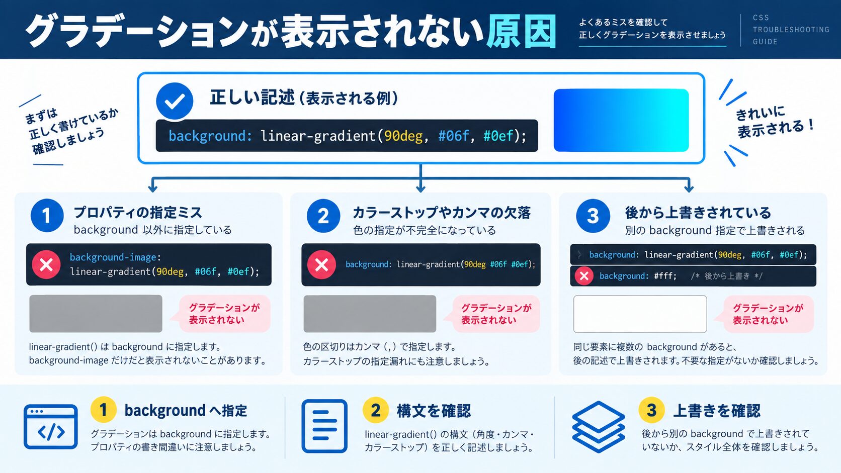
グラデーションの応用として、繰り返しパターンと透過を組み合わせた表現を紹介する。これらは実務でもデザインのアクセントとして頻繁に使われる。
repeating-linear-gradientはカラーストップの繰り返しを自動的に行う関数だ。斜めストライプやゼブラパターンが簡単に作れる。
/* 斜めストライプ背景 */
.stripes {
  background: repeating-linear-gradient(
    45deg,
    #d16176,
    #d16176 10px,
    #EFBDB7 10px,
    #EFBDB7 20px
  );
}

/* ゼブラ(横縞)パターン */
.zebra {
  background: repeating-linear-gradient(
    to bottom,
    #fff 0px,
    #fff 20px,
    #EFBDB7 20px,
    #EFBDB7 40px
  );
}

/* 薄い斜めラインのテクスチャ */
.subtle-lines {
  background-color: #fff;
  background-image: repeating-linear-gradient(
    -45deg,
    transparent,
    transparent 5px,
    rgba(209, 97, 118, 0.1) 5px,
    rgba(209, 97, 118, 0.1) 6px
  );
}/* 同心円パターン */
.concentric {
background: repeating-radial-gradient(
circle at center,
#fff 0px,
#fff 10px,
#EFBDB7 10px,
#EFBDB7 20px
);
}
/* ドットパターン */
.dots {
background-color: #fff;
background-image: repeating-radial-gradient(
circle at 0 0,
rgba(209, 97, 118, 0.4) 0px,
rgba(209, 97, 118, 0.4) 4px,
transparent 4px,
transparent 100%
);
background-size: 20px 20px;
}画像の上にかぶせるオーバーレイや、コンテンツの下端をぼかすフェードエフェクトに透過グラデーションが活躍する。
/* 画像の下部を暗くするオーバーレイ */
.image-overlay {
  position: relative;
}

.image-overlay::after {
  content: '';
  position: absolute;
  bottom: 0;
  left: 0;
  right: 0;
  height: 50%;
  background: linear-gradient(
    to bottom,
    transparent,
    rgba(81, 50, 43, 0.8)
  );
}

/* テキストブロックの下端をフェードさせる */
.fade-out-text {
  position: relative;
  max-height: 200px;
  overflow: hidden;
}

.fade-out-text::after {
  content: '';
  position: absolute;
  bottom: 0;
  left: 0;
  right: 0;
  height: 80px;
  background: linear-gradient(transparent, #fff);
}

/* 左右をフェードさせる横スクロールコンテナ用 */
.scroll-fade-left {
  -webkit-mask-image: linear-gradient(to right, transparent, black 10%);
  mask-image: linear-gradient(to right, transparent, black 10%);
}

.scroll-fade-both {
  -webkit-mask-image: linear-gradient(
    to right,
    transparent,
    black 10%,
    black 90%,
    transparent
  );
  mask-image: linear-gradient(
    to right,
    transparent,
    black 10%,
    black 90%,
    transparent
  );
}backgroundプロパティには複数の値をカンマで区切って並べられる。先に書いたものが上のレイヤーに来る。グラデーションを重ねて複雑な模様を作ることが可能だ。
/* 縦横のストライプを重ねてグリッド風 */
.grid-pattern {
  background:
    linear-gradient(rgba(209, 97, 118, 0.2) 1px, transparent 1px),
    linear-gradient(to right, rgba(209, 97, 118, 0.2) 1px, transparent 1px),
    #fff;
  background-size: 40px 40px;
}

/* ヘッダー背景:画像+グラデーションオーバーレイ */
.header-with-image {
  background:
    linear-gradient(to bottom, rgba(81,50,43,0.3), rgba(81,50,43,0.7)),
    url('header-bg.jpg') center/cover no-repeat;
}
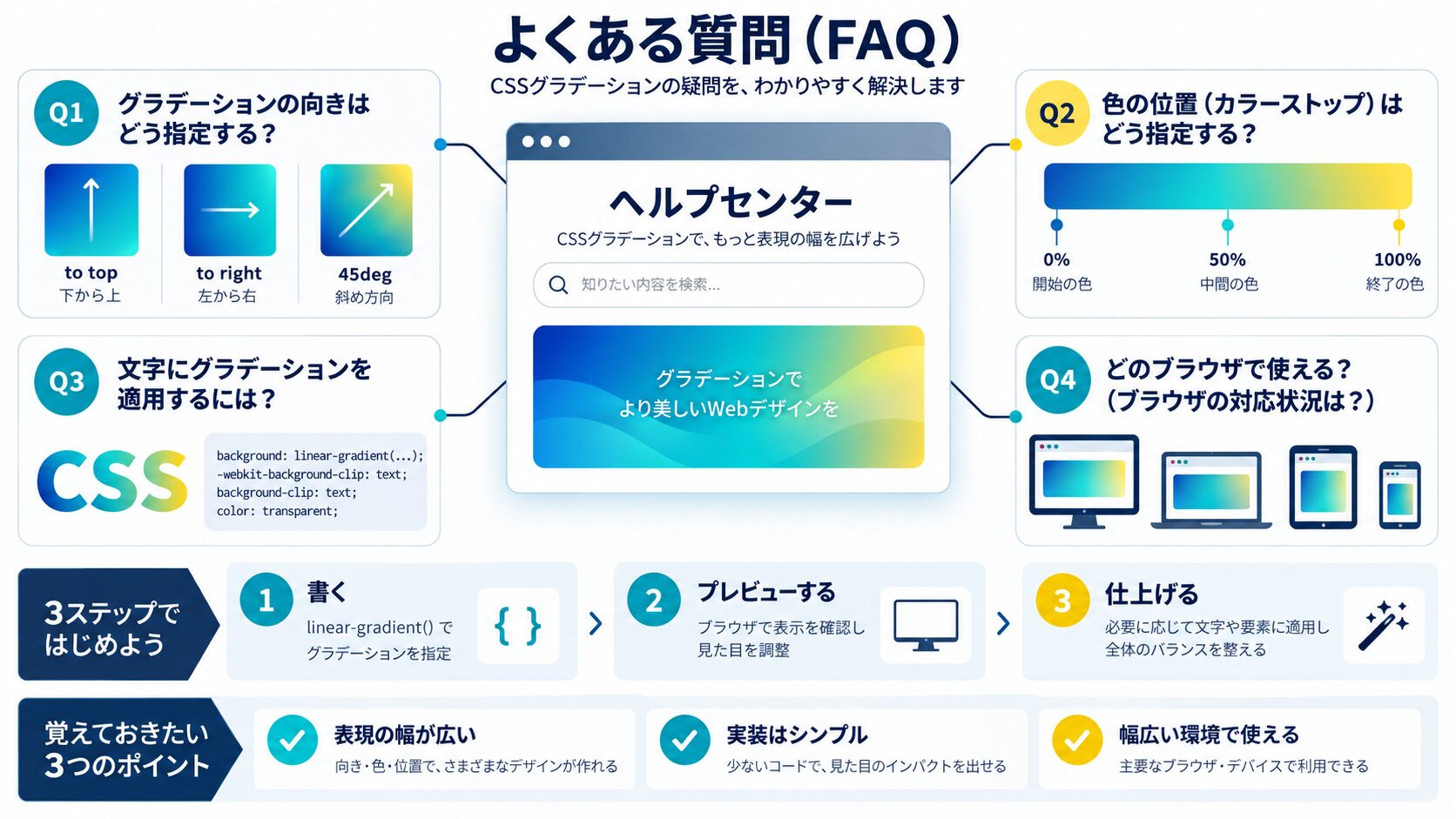
グラデーションを書いたのに反映されない、思った通りの見た目にならない——そういうトラブルの大半は、いくつかのよくあるミスに起因する。一つずつ確認していこう。
最も多いミスだ。background-colorや別のbackground指定がグラデーションより後に書かれていると上書きされる。あるいは、より詳細度の高いセレクタが別の場所でbackgroundを指定しているケースもある。
/* NG: background-colorが後に書かれていて上書きされる */
.box {
  background: linear-gradient(to right, #d16176, #EFBDB7);
  background-color: #fff; /* これが勝ってしまう */
}

/* OK: グラデーションのみ指定 */
.box {
  background: linear-gradient(to right, #d16176, #EFBDB7);
}displayがblockの要素でも、中身が空でheightを指定していないと高さが0になり、グラデーションが見えない。
/* NG: 高さがなくて見えない */
.box {
  background: linear-gradient(to right, #d16176, #EFBDB7);
}

/* OK: 高さを明示する */
.box {
  background: linear-gradient(to right, #d16176, #EFBDB7);
  height: 200px;
  /* または min-height: 200px; */
}現代のブラウザでは不要だが、古い対応が必要な環境では-webkit-プレフィックスが必要なことがある。
/* 古いWebkitブラウザへの対応が必要な場合 */
.box {
  background: -webkit-linear-gradient(left, #d16176, #EFBDB7); /* 古い書き方 */
  background: linear-gradient(to right, #d16176, #EFBDB7); /* 標準 */
}テキストグラデーションで表示されないとき、確認すべきポイントは3つある。
/* チェックリスト:すべて揃っているか確認 */
.gradient-text {
  background: linear-gradient(to right, #d16176, #EFBDB7); /* (1) background指定 */
  -webkit-background-clip: text; /* (2) -webkit-プレフィックスも必要 */
  background-clip: text;
  -webkit-text-fill-color: transparent; /* (3) 文字を透明に */
  color: transparent;
  display: inline-block; /* (4) blockまたはinline-blockが必要 */
}カラーストップにパーセントや長さを指定するとき、単位の書き忘れや開始・終了の指定が逆転していると意図しない表示になる。
/* NG: 単位なし(無効な値) */
.box {
  background: linear-gradient(to right, #d16176 30, #EFBDB7 70);
}

/* OK: %や px などの単位を付ける */
.box {
  background: linear-gradient(to right, #d16176 30%, #EFBDB7 70%);
}

/* NG: ストップ位置が逆転(グラデーション崩れ) */
.box {
  background: linear-gradient(to right, #d16176 70%, #EFBDB7 30%);
}

/* OK: 小さい値から大きい値の順 */
.box {
  background: linear-gradient(to right, #d16176 30%, #EFBDB7 70%);
}<span>などのインライン要素はbackground自体は適用されるが、background-clip: textとの組み合わせでうまくいかないことがある。display: inline-blockに変えることで解決するケースが多い。
標準のlinear-gradient()構文はIE10以降で使えます。ただし、IE9以下には対応していません。IE11までサポートが必要な場合、基本的なlinear-gradientは問題なく動作します。一方、conic-gradientはIE11では非対応です。また、background-clip: textもIE11では機能しません。IE11向けにはフォールバックとして通常のcolorプロパティを先に指定しておくのがベストプラクティスです。
CSSのtransitionはbackground-imageには直接効きません。グラデーションをアニメーションする場合は、background-position(background-sizeを大きくしてpositionを動かす)や、疑似要素のopacityをtransitionする方法、あるいはCSS Variables(カスタムプロパティ)の値をアニメーションする方法を使います。また、@keyframesでbackground-positionを変化させる手法が最も手軽です。
はい、可能です。backgroundプロパティにカンマ区切りで複数の値を指定できます。グラデーションを前に書くと画像の上に重なります。例:background: linear-gradient(rgba(0,0,0,0.5), rgba(0,0,0,0.5)), url('image.jpg') center/cover; のように書くと、画像の上に半透明の暗いオーバーレイをかけられます。
SVGには独自のグラデーション要素があります。<linearGradient>と<radialGradient>タグをSVGの<defs>内に定義し、fill="url(#グラデーションID)"で参照します。SVGグラデーションはCSS graidientとは別物ですが、インラインSVGの場合はCSSのグラデーションをfillに適用することも可能です。アイコンやイラストのグラデーションはSVGネイティブのグラデーションが推奨です。
はい、管理できます。ただしグラデーション全体を変数に入れるより、色だけを変数にする方が柔軟性が高いです。例えば--color-primary: #d16176;のように色をカスタムプロパティで定義しておき、linear-gradient(to right, var(--color-primary), var(--color-secondary))と書くとテーマ変更が一箇所で済みます。グラデーション関数全体を変数に格納することも技術的には可能ですが、ブラウザによって挙動が異なるケースがあるため、色の変数化にとどめるのが安全です。

CSSの実装テクニックを「レイアウト・装飾・アニメーション・基礎・トラブル解決」の目的別に探せる総まとめページを用意しています。実装で迷ったときの索引としてどうぞ。

目的に合わせて選べる「AI副業」「AI転職」「AI活用」の3コースを用意。副収入・キャリアチェンジ・日常の生産性アップまで、あなたのゴールに合わせてAIを学べます。
会員登録はカンタン30秒で完了します。まずは公式LINEから、無料でAI学習をスタートしましょう!
公式サイト より
今すぐ
無料カウンセリング
を予約!