





 生徒
生徒吹き出しって画像で作ると管理が大変ですよね。CSSだけで作れないですか?
 ペン博士
ペン博士CSSだけで作れるよ!::afterで三角のツノを作るのがコツ。LINE風やマンガ風までコピペで用意したから、好きなのを選んでね。
「吹き出しを使いたいけど、画像で作るのは管理が大変…」「コピペですぐ使えるCSSの吹き出しコードが欲しい」——そんな悩みを抱えているWeb制作者は多いはずです。
吹き出し(スピーチバブル)は、会話形式の解説・注目コメント・キャラクター演出など幅広い場面で使えるUIパーツです。しかし、::after擬似要素で三角形を作る仕組みを理解していないと、思い通りの位置にツノが出なかったり、ボーダー付きにしたときにずれたりと、細かい調整で詰まりがちです。
この記事では、CSSだけで作れる吹き出しデザインを10種以上、すべてコピペで動くコードとともに解説します。左向き・右向き・上向き・下向きの方向バリエーションから、LINE風チャットUI・アイコン付き会話・二重ボーダー吹き出しまで、実務ですぐ使えるパターンを網羅しました。
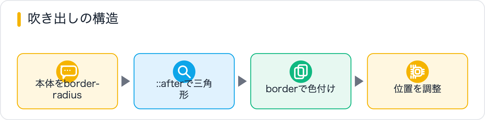
CSS吹き出しの「ツノ(三角形)」は、border(ボーダー)を使ったゼロサイズの擬似要素で作ります。まずこの原理を理解しておくと、向きの調整や位置変更がずっと楽になります。
ポイントは「widthとheightを0にして、borderだけ指定する」こと。4辺のborderが四角形の中心に向かって三角形を形成します。透明にしたい辺を transparent にすることで、1方向だけの三角が浮かび上がります。
/* 三角形の基本原理 */
.triangle {
  width: 0;
  height: 0;
  /* 上向き三角:上ボーダーを透明、左右を透明、下を有色に */
  border-left: 10px solid transparent;
  border-right: 10px solid transparent;
  border-bottom: 16px solid #4a90d9;
}

/* 下向き三角(吹き出しのツノに使う方向) */
.triangle-down {
  width: 0;
  height: 0;
  border-left: 10px solid transparent;
  border-right: 10px solid transparent;
  border-top: 16px solid #4a90d9;
}

/* 右向き三角 */
.triangle-right {
  width: 0;
  height: 0;
  border-top: 10px solid transparent;
  border-bottom: 10px solid transparent;
  border-left: 16px solid #4a90d9;
}

/* 左向き三角 */
.triangle-left {
  width: 0;
  height: 0;
  border-top: 10px solid transparent;
  border-bottom: 10px solid transparent;
  border-right: 16px solid #4a90d9;
}
吹き出しの本体(バルーン部分)に対して ::before や ::after 擬似要素で三角形を position: absolute で配置するのが基本パターンです。本体には必ず position: relative を指定します。
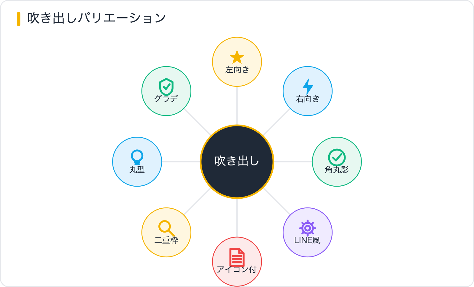
もっともシンプルな吹き出しです。テキストブロックの右側にツノが出て、右からセリフを言っているように見せます。
<div class="bubble bubble-left">
  こんにちは!CSSで吹き出しを作れます。
</div>
.bubble {
position: relative;
display: inline-block;
background: #4a90d9;
color: #fff;
padding: 12px 18px;
border-radius: 6px;
font-size: 15px;
line-height: 1.6;
max-width: 300px;
}
/* 右側にツノ(左向き吹き出し) */
.bubble-left::after {
content: "";
position: absolute;
top: 50%;
right: -14px;
transform: translateY(-50%);
width: 0;
height: 0;
border-top: 8px solid transparent;
border-bottom: 8px solid transparent;
border-left: 14px solid #4a90d9;
}左からセリフを言っているように見せる吹き出しです。左側にツノが出ます。
<div class="bubble bubble-right">
  左側にツノが出る吹き出しです。
</div>
/* 左側にツノ(右向き吹き出し) */
.bubble-right::after {
content: "";
position: absolute;
top: 50%;
left: -14px;
transform: translateY(-50%);
width: 0;
height: 0;
border-top: 8px solid transparent;
border-bottom: 8px solid transparent;
border-right: 14px solid #4a90d9;
}ツールチップやポップアップに使いやすい、下側にツノが出る吹き出しです。
<div class="bubble bubble-bottom">
  下向きのツノ(ポップアップやTooltipに)
</div>
/* 下側にツノ(上向き吹き出し) */
.bubble-bottom::after {
content: "";
position: absolute;
bottom: -14px;
left: 50%;
transform: translateX(-50%);
width: 0;
height: 0;
border-left: 10px solid transparent;
border-right: 10px solid transparent;
border-top: 14px solid #4a90d9;
}下から話しかけるUI・フキダシ演出に使います。上側にツノが出ます。
<div class="bubble bubble-top">
  上向きのツノが出る吹き出しです。
</div>
/* 上側にツノ(下向き吹き出し) */
.bubble-top::after {
content: "";
position: absolute;
top: -14px;
left: 50%;
transform: translateX(-50%);
width: 0;
height: 0;
border-left: 10px solid transparent;
border-right: 10px solid transparent;
border-bottom: 14px solid #4a90d9;
}border-radiusを大きくして、box-shadowで奥行きを出したモダンな吹き出しです。ブログやLPでよく使われます。
<div class="bubble bubble-shadow">
  角丸+影でリッチな見た目になります。
</div>
.bubble-shadow {
position: relative;
display: inline-block;
background: #ffffff;
color: #333;
padding: 16px 22px;
border-radius: 16px;
font-size: 15px;
line-height: 1.7;
max-width: 320px;
box-shadow: 0 4px 16px rgba(0, 0, 0, 0.12);
}
.bubble-shadow::after {
content: "";
position: absolute;
top: 50%;
left: -14px;
transform: translateY(-50%);
width: 0;
height: 0;
border-top: 8px solid transparent;
border-bottom: 8px solid transparent;
border-right: 14px solid #ffffff;
/* shadowはfilterで */
filter: drop-shadow(-2px 0 2px rgba(0,0,0,0.08));
}チュートリアルや事例紹介でよく使われる、LINEライクな会話UIです。左側がユーザー(グレー)、右側が返答(緑)というレイアウトをFlexboxで実現します。
<div class="chat-wrap">
  <!-- 左側(ユーザー) -->
  <div class="chat-row chat-left">
    <div class="chat-bubble bubble-gray">こんにちは!</div>
  </div>
  <!-- 右側(返答) -->
  <div class="chat-row chat-right">
    <div class="chat-bubble bubble-green">はい、いらっしゃいませ!</div>
  </div>
  <div class="chat-row chat-left">
    <div class="chat-bubble bubble-gray">CSSで吹き出し作れますか?</div>
  </div>
  <div class="chat-row chat-right">
    <div class="chat-bubble bubble-green">もちろんです!このページのコードをコピーしてください。</div>
  </div>
</div>
.chat-wrap {
display: flex;
flex-direction: column;
gap: 12px;
padding: 20px;
background: #f0f0f0;
border-radius: 12px;
max-width: 480px;
}
.chat-row {
display: flex;
}
.chat-left {
justify-content: flex-start;
}
.chat-right {
justify-content: flex-end;
}
.chat-bubble {
position: relative;
padding: 10px 16px;
border-radius: 18px;
font-size: 14px;
line-height: 1.6;
max-width: 70%;
}
/* 左吹き出し(グレー) */
.bubble-gray {
background: #ffffff;
color: #333;
border-bottom-left-radius: 4px;
}
.bubble-gray::before {
content: "";
position: absolute;
bottom: 6px;
left: -10px;
width: 0;
height: 0;
border-top: 6px solid transparent;
border-right: 12px solid #ffffff;
}
/* 右吹き出し(緑) */
.bubble-green {
background: #4cd964;
color: #fff;
border-bottom-right-radius: 4px;
}
.bubble-green::after {
content: "";
position: absolute;
bottom: 6px;
right: -10px;
width: 0;
height: 0;
border-top: 6px solid transparent;
border-left: 12px solid #4cd964;
}ブログの解説によく使われる、アバターアイコン付きの吹き出しです。Flexboxでアイコンとバルーンを横並びにします。
<div class="icon-bubble-wrap">
  <img class="icon-bubble-avatar" src="avatar.png" alt="キャラクター名" width="60" height="60">
  <div class="icon-bubble-balloon">
    アイコン付きの吹き出しです。Flexboxで簡単に横並びにできます。
  </div>
</div>

<!-- 右側(自分)のパターン -->
<div class="icon-bubble-wrap icon-bubble-reverse">
  <img class="icon-bubble-avatar" src="avatar2.png" alt="自分" width="60" height="60">
  <div class="icon-bubble-balloon balloon-me">
    右側に配置するパターンです。
  </div>
</div>
.icon-bubble-wrap {
display: flex;
align-items: flex-start;
gap: 12px;
margin-bottom: 20px;
}
/* 右側(自分)パターン */
.icon-bubble-reverse {
flex-direction: row-reverse;
}
.icon-bubble-avatar {
width: 60px;
height: 60px;
border-radius: 50%;
object-fit: cover;
flex-shrink: 0;
}
.icon-bubble-balloon {
position: relative;
background: #f0f0f0;
color: #333;
padding: 12px 16px;
border-radius: 10px;
font-size: 14px;
line-height: 1.7;
max-width: calc(100% - 84px);
}
/* 左ツノ(キャラクター側) */
.icon-bubble-balloon::before {
content: "";
position: absolute;
top: 18px;
left: -12px;
width: 0;
height: 0;
border-top: 8px solid transparent;
border-bottom: 8px solid transparent;
border-right: 12px solid #f0f0f0;
}
/* 右ツノ(自分側) */
.balloon-me {
background: #d9f5d6;
}
.balloon-me::before {
content: none;
}
.balloon-me::after {
content: "";
position: absolute;
top: 18px;
right: -12px;
width: 0;
height: 0;
border-top: 8px solid transparent;
border-bottom: 8px solid transparent;
border-left: 12px solid #d9f5d6;
}吹き出しにborderがある場合、ツノも白抜き+ボーダー色で二重にしないとデザインがちぐはぐになります。::before で大きい三角形(ボーダー色)、::after で小さい三角形(背景色)を重ねるのがポイントです。
<div class="bubble bubble-bordered">
  ボーダー付きの吹き出しです。ツノも二重になっています。
</div>
.bubble-bordered {
position: relative;
display: inline-block;
background: #fff;
color: #333;
padding: 14px 20px;
border-radius: 8px;
border: 2px solid #4a90d9;
font-size: 15px;
line-height: 1.7;
max-width: 320px;
}
/* ボーダー色の大きい三角(外側) */
.bubble-bordered::before {
content: "";
position: absolute;
top: 50%;
left: -17px;
transform: translateY(-50%);
width: 0;
height: 0;
border-top: 10px solid transparent;
border-bottom: 10px solid transparent;
border-right: 15px solid #4a90d9;
}
/* 背景色の小さい三角(内側で重ねる) */
.bubble-bordered::after {
content: "";
position: absolute;
top: 50%;
left: -13px;
transform: translateY(-50%);
width: 0;
height: 0;
border-top: 8px solid transparent;
border-bottom: 8px solid transparent;
border-right: 13px solid #fff;
}吹き出しのツノ位置を中央ではなく上寄り・下寄りにしたい場合は、top の値を変えます。アイコンが上部にある場合などに使います。
/* ツノを上20pxの位置に固定 */
.bubble-thorn-top::after {
  content: "";
  position: absolute;
  top: 20px; /* ← ここで上下位置を調整 */
  /* transform: translateY(-50%); は使わない */
  left: -14px;
  width: 0;
  height: 0;
  border-top: 8px solid transparent;
  border-bottom: 8px solid transparent;
  border-right: 14px solid #4a90d9;
}

/* ツノを下から20pxの位置に固定 */
.bubble-thorn-bottom::after {
  content: "";
  position: absolute;
  bottom: 20px; /* ← bottomで下からの位置 */
  left: -14px;
  width: 0;
  height: 0;
  border-top: 8px solid transparent;
  border-bottom: 8px solid transparent;
  border-right: 14px solid #4a90d9;
}

/* ツノを右端の位置に(ツノが端に) */
.bubble-thorn-right-end::after {
  content: "";
  position: absolute;
  bottom: -14px;
  right: 20px; /* ← 右から20px */
  width: 0;
  height: 0;
  border-left: 10px solid transparent;
  border-right: 10px solid transparent;
  border-top: 14px solid #4a90d9;
}border-radiusを50%に設定して楕円型にし、ツノをbottomに配置するとマンガ・アニメ風のフキダシになります。
<div class="bubble bubble-round">
  マンガ風の丸い吹き出し
</div>
.bubble-round {
position: relative;
display: inline-flex;
align-items: center;
justify-content: center;
background: #fffbe6;
color: #333;
padding: 20px 30px;
border-radius: 50%;
border: 2px solid #e8c200;
font-size: 14px;
font-weight: bold;
min-width: 120px;
min-height: 80px;
text-align: center;
line-height: 1.5;
}
.bubble-round::after {
content: "";
position: absolute;
bottom: -22px;
left: 30%;
width: 0;
height: 0;
border-left: 8px solid transparent;
border-right: 4px solid transparent;
border-top: 22px solid #fffbe6;
filter: drop-shadow(1px 2px 0 #e8c200);
}背景にgradientを使う場合、ツノ(::after)にはgradientを直接使えないため、clipを使うか、solidカラーで代用します。
.bubble-gradient {
  position: relative;
  display: inline-block;
  background: linear-gradient(135deg, #f857a6, #ff5858);
  color: #fff;
  padding: 14px 20px;
  border-radius: 10px;
  font-size: 15px;
  line-height: 1.7;
  max-width: 300px;
}

/* グラデーションの終端色(近似)でツノを作る */
.bubble-gradient::after {
  content: "";
  position: absolute;
  top: 50%;
  left: -13px;
  transform: translateY(-50%);
  width: 0;
  height: 0;
  border-top: 8px solid transparent;
  border-bottom: 8px solid transparent;
  border-right: 13px solid #ff5858; /* 右端の色に近い色を使う */
}モダンブラウザ対応であれば、clip-path: polygon() を使って擬似要素なしでツノ付きの吹き出しを作る方法もあります。
/* clip-pathで右向き吹き出し(左にツノ) */
.bubble-clip {
  display: inline-block;
  background: #34c9a0;
  color: #fff;
  padding: 16px 20px 16px 30px;
  font-size: 15px;
  line-height: 1.7;
  max-width: 300px;
  /* 左側の三角形:(0 0%) から (15px 50%) の突起 */
  clip-path: polygon(
    15px 0%,
    100% 0%,
    100% 100%,
    15px 100%,
    15px calc(50% + 12px),
    0px 50%,
    15px calc(50% - 12px)
  );
}

/* clip-pathで下向きツノ(Tooltipに) */
.bubble-clip-bottom {
  display: inline-block;
  background: #333;
  color: #fff;
  padding: 12px 20px;
  font-size: 14px;
  line-height: 1.6;
  border-radius: 6px 6px 0 0;
  clip-path: polygon(
    0% 0%,
    100% 0%,
    100% 75%,
    calc(50% + 12px) 75%,
    50% 100%,
    calc(50% - 12px) 75%,
    0% 75%
  );
  padding-bottom: 30px;
}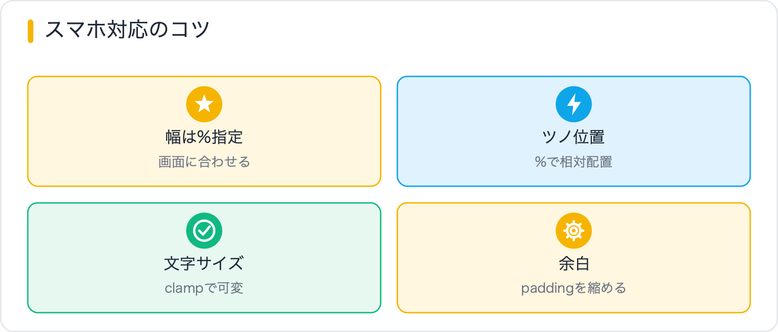
スマートフォン(640px以下)では、吹き出しの横幅を100%近くまで広げ、アイコン付きレイアウトも縦積みにならないよう注意します。ツノのサイズは小さくしすぎると見えにくいため、8px以上を維持しましょう。
/* レスポンシブ対応 */
@media (max-width: 640px) {
  .bubble,
  .chat-bubble,
  .icon-bubble-balloon {
    max-width: 90%;
    font-size: 14px;
  }

  /* アイコン付きレイアウトのアバターサイズを縮小 */
  .icon-bubble-avatar {
    width: 44px;
    height: 44px;
  }

  /* チャットUIの吹き出し幅を広く */
  .chat-bubble {
    max-width: 80%;
  }

  /* ツノサイズも少し小さく */
  .bubble-left::after {
    border-left-width: 10px;
    border-top-width: 6px;
    border-bottom-width: 6px;
  }
}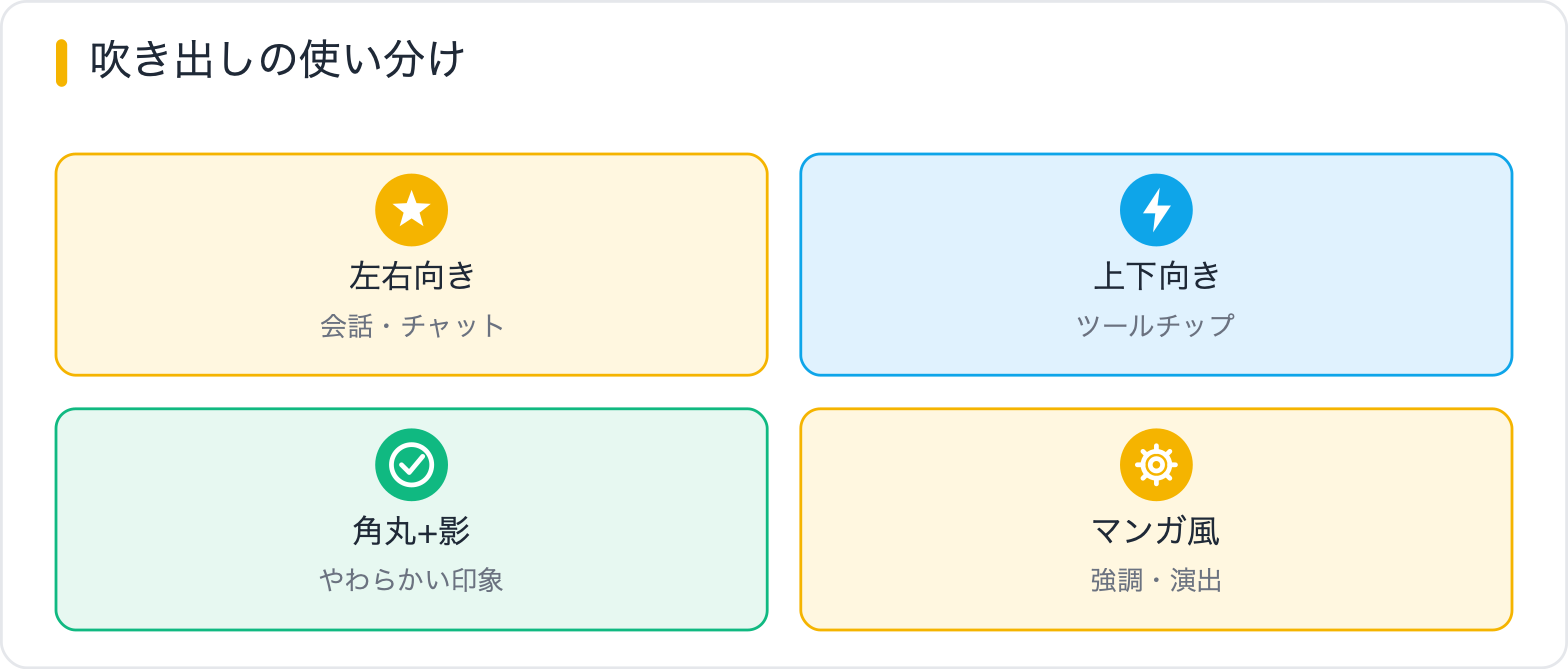
どのデザインをどの場面で使うか、まとめました。
| パターン | 向き・ツノ位置 | 使いどころ |
|---|---|---|
| 基本左向き吹き出し | 右側にツノ | 解説テキスト・注釈 |
| 基本右向き吹き出し | 左側にツノ | キャラクター・返答 |
| 上向き(下ツノ) | 下側にツノ | ポップアップ・Tooltip |
| 下向き(上ツノ) | 上側にツノ | 下からの吹き出し演出 |
| 角丸+影 | 左ツノ | LPのお客様の声・感想 |
| LINE風チャット | 左右どちらも | 会話形式の事例紹介 |
| アイコン付き会話 | 左右どちらも | ブログ解説・キャラ演出 |
| 二重ボーダー | 左ツノ | 囲み枠と吹き出しを組み合わせる |
| 丸型(マンガ風) | 下ツノ(斜め) | ポイント強調・アピール |
| グラデーション | 左ツノ | LPのビジュアル訴求 |
| clip-path | カスタム | モダンUI・アニメーション前提 |
吹き出しは、本体をborder-radiusで作り、::afterの三角形でツノを付けるのが基本です。ポイントは①ツノはボーダーの三角形テクニックで作る②左右・上下の向きはツノの位置で切り替える③アイコン付き会話はFlexboxで並べる、の3点。12種類以上を用意したので、チャットやレビュー、マンガ風など用途に合わせて使ってください。
吹き出し本体に position: relative が設定されているか確認してください。擬似要素の position: absolute は、最も近い position 指定済みの祖先要素を基準にします。本体に設定がないと、ページ全体やもっと上の親要素を基準にしてずれます。また、top: 50%; transform: translateY(-50%) の組み合わせで縦方向の中央揃えができます。
::before で背景色より2〜3px大きい三角形(ボーダー色)を作り、::after で背景色の三角形を重ねます。記事内【08】の二重ボーダー吹き出しのコードを参照してください。::before と ::after の位置を微調整して重ねるのがポイントです。
borderを使う三角形ではグラデーションを直接適用できません。グラデーションの終端色(右端の色)をツノのborder-colorに指定するのが現実的な対処法です。どうしてもグラデーションにしたい場合は、clip-pathを使う方法か、SVGで三角形を作る方法を検討してください。
top: 50% はバルーンの高さが変わると自動追従しますが、top: 20px のような固定値にしていると内容量によってずれます。長文対応させる場合は top: 50%; transform: translateY(-50%) でセンタリングするか、アイコン付きレイアウトのように align-items: flex-start でアイコンを上揃えにする設計にすると自然です。
SWELLには「ふきだし」カスタムブロックが標準搭載されています。管理画面でアバター画像とテキストを設定するだけで使えます。ただし、細かいデザインをカスタマイズしたい場合や独自の吹き出しを追加したい場合は、この記事のCSSを子テーマの style.css に追加して使うのが効果的です。
CSSの実装テクニックを「レイアウト・装飾・アニメーション・基礎・トラブル解決」の目的別に探せる総まとめページを用意しています。実装で迷ったときの索引としてどうぞ。

目的に合わせて選べる「AI副業」「AI転職」「AI活用」の3コースを用意。副収入・キャリアチェンジ・日常の生産性アップまで、あなたのゴールに合わせてAIを学べます。
会員登録はカンタン30秒で完了します。まずは公式LINEから、無料でAI学習をスタートしましょう!
公式サイト より
今すぐ
無料カウンセリング
を予約!