





 生徒
生徒WordPressのデフォルト見出しが地味で…CSSでおしゃれにする方法ってありますか?
 ペン博士
ペン博士あるよ!下線・左ボーダー・囲みボックス・番号付きなど、コピペで使えるパターンがたくさんある。今日は10種類以上まとめて渡すね。
WordPressテーマのデフォルト見出しをもっとおしゃれにしたい、コーポレートサイトらしい見出しに変えたい——そんなとき、CSSだけでhタグを自由にデザインできます。画像もJavaScriptも不要です。
見出しのデザインはWebページの第一印象を大きく左右します。読み手は無意識にh2・h3の装飾パターンからサイトの信頼性やブランドの雰囲気を判断しています。シンプルな左ボーダーから、グラデーション下線、リボン風、背景座布団まで、用途に合わせたパターンを選べるよう10種類以上を網羅します。
すべてコピペしてすぐ使えるコードで提供します。WordPressのSWELLやCocoonなど主要テーマのカスタムCSS欄にそのまま貼り付けて使えます。
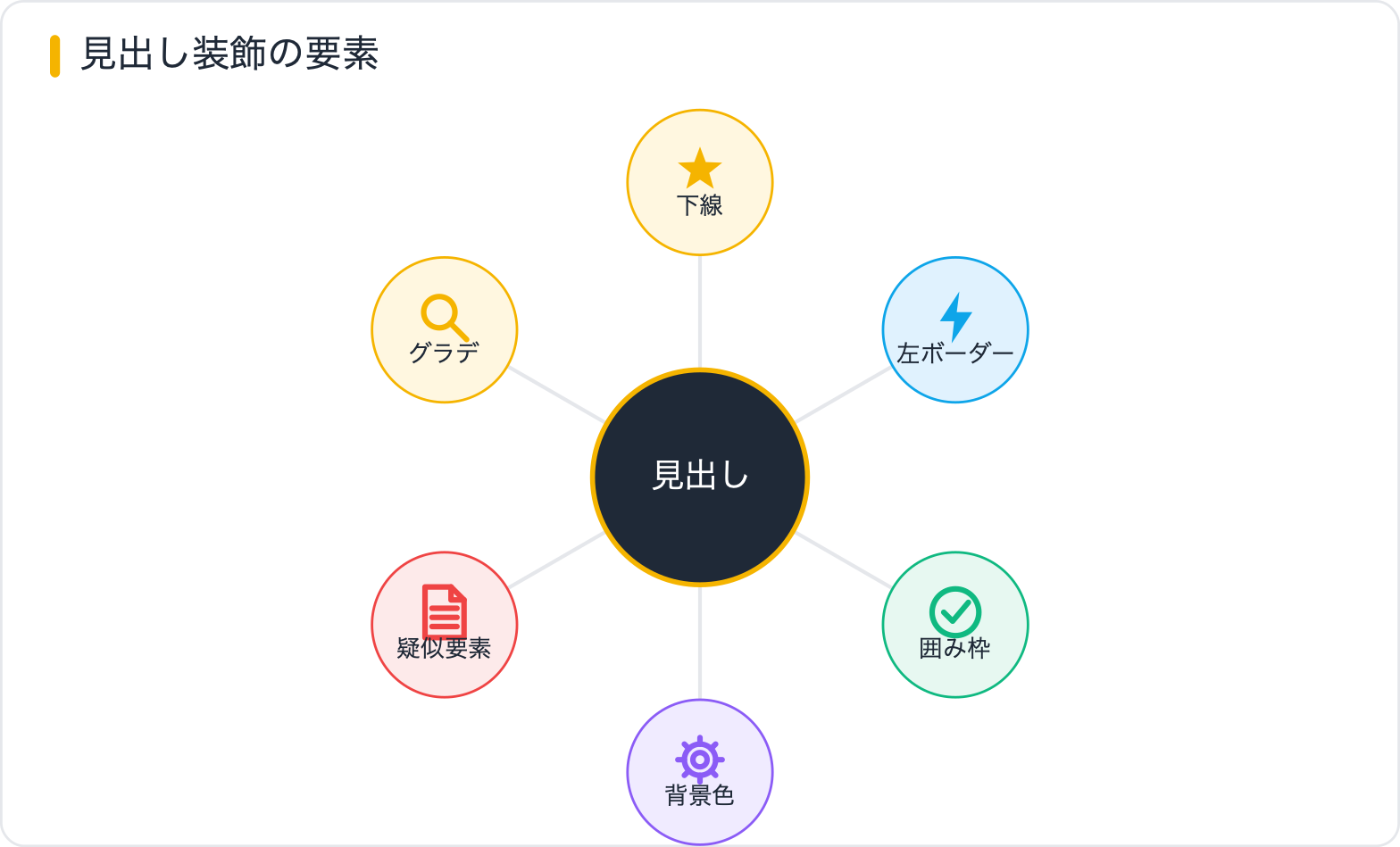
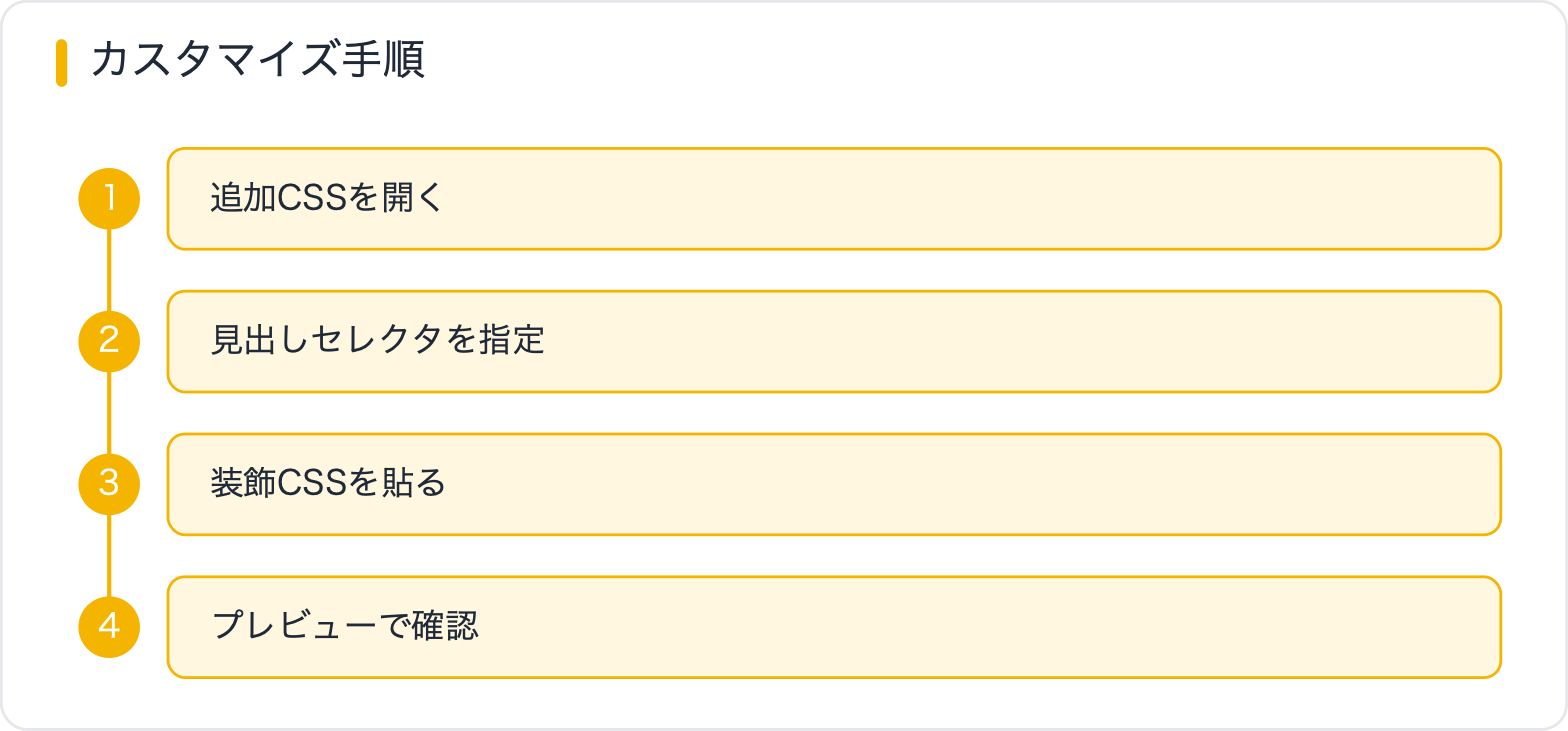
hタグの装飾はおもに4つの手段を使います。それぞれの特徴を理解してから実装に入りましょう。
| 手段 | 使う場面 | 代表的な表現 |
|---|---|---|
| border | 枠線・下線・左ライン | 左ボーダー、下線、囲み |
| ::before / ::after | アイコン・番号・装飾追加 | リボン、番号付き、アイコン見出し |
| background | 背景色・グラデーション | 座布団、グラデ下線、ハイライト |
| text-decoration | テキスト下線のスタイル変更 | 波線、点線、色付き下線 |
WordPressでカスタムCSSを使う場合は、テーマが出力するhタグのクラスより優先度が高いセレクターが必要になることがあります。.entry-content h2のように親クラスを加えるか、!importantを使います。
最もシンプルで汎用性が高いパターンです。border-bottomで下線を引きます。
h2.heading-underline {
  font-size: 1.5rem;
  font-weight: 700;
  padding-bottom: 12px;
  border-bottom: 2px solid #333;
  margin-bottom: 24px;
}h2.heading-double-line {
font-size: 1.5rem;
font-weight: 700;
padding-bottom: 10px;
/* 2本線 */
border-bottom: 4px double #333;
margin-bottom: 24px;
}
/* ::afterで細い下線を追加する二重下線パターン */
h2.heading-double-after {
position: relative;
font-size: 1.5rem;
font-weight: 700;
padding-bottom: 14px;
border-bottom: 3px solid #333;
margin-bottom: 24px;
}
h2.heading-double-after::after {
content: "";
position: absolute;
bottom: -7px;
left: 0;
width: 100%;
height: 1px;
background: #333;
}h2.heading-gradient-line {
position: relative;
font-size: 1.5rem;
font-weight: 700;
padding-bottom: 14px;
margin-bottom: 24px;
}
/* border-bottomはグラデーション不可なので::afterで代替 */
h2.heading-gradient-line::after {
content: "";
position: absolute;
bottom: 0;
left: 0;
width: 100%;
height: 3px;
background: linear-gradient(90deg, #d16176 0%, #fca5a5 50%, #93c5fd 100%);
border-radius: 2px;
}h2.heading-short-line {
position: relative;
display: inline-block; /* テキスト幅に収縮 */
font-size: 1.5rem;
font-weight: 700;
padding-bottom: 10px;
margin-bottom: 24px;
}
h2.heading-short-line::after {
content: "";
position: absolute;
bottom: 0;
left: 0;
width: 100%;
height: 3px;
background: #d16176;
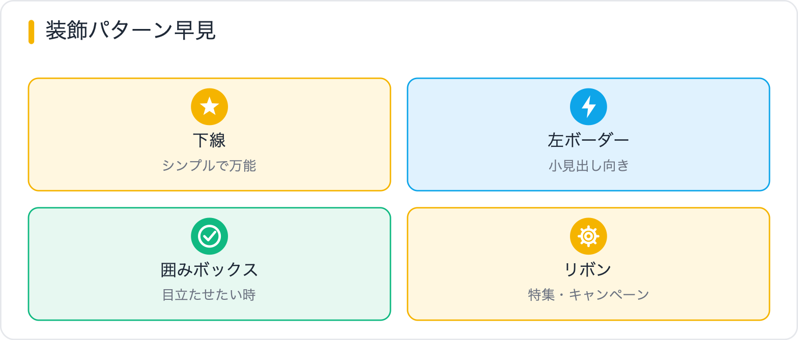
}ブログやコーポレートサイトで最も多く使われるパターンです。左のボーダーラインで視線を誘導します。
h2.heading-left-border {
  font-size: 1.5rem;
  font-weight: 700;
  padding: 4px 0 4px 16px;
  border-left: 4px solid #d16176;
  margin-bottom: 24px;
}h2.heading-left-bg {
font-size: 1.5rem;
font-weight: 700;
padding: 12px 16px;
border-left: 5px solid #d16176;
background: #fff0f2;
border-radius: 0 8px 8px 0;
margin-bottom: 24px;
}h2.heading-double-border {
position: relative;
font-size: 1.5rem;
font-weight: 700;
padding: 4px 0 4px 20px;
margin-bottom: 24px;
}
h2.heading-double-border::before {
content: "";
position: absolute;
left: 0;
top: 0;
height: 100%;
width: 6px;
background: #d16176;
border-radius: 3px;
}
h2.heading-double-border::after {
content: "";
position: absolute;
left: 10px;
top: 25%;
height: 50%;
width: 3px;
background: #efbdb7;
border-radius: 2px;
}h2.heading-gradient-border {
position: relative;
font-size: 1.5rem;
font-weight: 700;
padding: 4px 0 4px 18px;
margin-bottom: 24px;
}
h2.heading-gradient-border::before {
content: "";
position: absolute;
left: 0;
top: 0;
width: 5px;
height: 100%;
background: linear-gradient(180deg, #d16176 0%, #efbdb7 100%);
border-radius: 3px;
}
見出しを枠で囲むパターンです。サービスサイトやランディングページで存在感のある見出しを作るのに向いています。
h2.heading-box {
  font-size: 1.5rem;
  font-weight: 700;
  padding: 12px 20px;
  border: 2px solid #333;
  border-radius: 4px;
  display: inline-block;
  margin-bottom: 24px;
}h2.heading-filled-box {
font-size: 1.25rem;
font-weight: 700;
padding: 12px 24px;
background: #d16176;
color: #fff;
border-radius: 6px;
margin-bottom: 24px;
}
/* ダークバリエーション */
h2.heading-dark-box {
font-size: 1.25rem;
font-weight: 700;
padding: 12px 24px;
background: #51322b;
color: #fff;
border-radius: 6px;
margin-bottom: 24px;
letter-spacing: 0.05em;
}h2.heading-sandwiched {
font-size: 1.5rem;
font-weight: 700;
padding: 16px 0;
text-align: center;
border-top: 2px solid #d16176;
border-bottom: 2px solid #d16176;
margin-bottom: 24px;
}h2.heading-corner-box {
position: relative;
font-size: 1.4rem;
font-weight: 700;
padding: 16px 24px;
margin-bottom: 28px;
border: 1px solid #ccc;
}
/* 左上の角飾り */
h2.heading-corner-box::before {
content: "";
position: absolute;
top: -4px;
left: -4px;
width: 16px;
height: 16px;
border-top: 3px solid #d16176;
border-left: 3px solid #d16176;
}
/* 右下の角飾り */
h2.heading-corner-box::after {
content: "";
position: absolute;
bottom: -4px;
right: -4px;
width: 16px;
height: 16px;
border-bottom: 3px solid #d16176;
border-right: 3px solid #d16176;
}手順記事やFAQページでよく使われるパターンです。疑似要素にcounterやcontentで記号・数字を表示します。
h2.heading-icon::before {
  content: "▶";
  display: inline-block;
  margin-right: 10px;
  color: #d16176;
  font-size: 0.85em;
  vertical-align: middle;
}

/* 丸付き点 */
h3.heading-dot::before {
  content: "";
  display: inline-block;
  width: 10px;
  height: 10px;
  background: #d16176;
  border-radius: 50%;
  margin-right: 10px;
  vertical-align: middle;
  flex-shrink: 0;
}<div class="numbered-headings">
<h2 class="heading-numbered">見出し1</h2>
<h2 class="heading-numbered">見出し2</h2>
<h2 class="heading-numbered">見出し3</h2>
</div>.numbered-headings {
counter-reset: heading-counter; /* カウンターをリセット */
}
h2.heading-numbered {
position: relative;
font-size: 1.5rem;
font-weight: 700;
padding: 8px 0 8px 64px;
margin-bottom: 24px;
counter-increment: heading-counter; /* カウンターを加算 */
}
h2.heading-numbered::before {
content: counter(heading-counter, decimal-leading-zero);
/* 01, 02, 03 ... と表示 */
position: absolute;
left: 0;
top: 50%;
transform: translateY(-50%);
width: 48px;
height: 48px;
background: #d16176;
color: #fff;
border-radius: 50%;
display: flex;
align-items: center;
justify-content: center;
font-size: 0.9rem;
font-weight: 900;
line-height: 1;
}counter-resetを親要素に設定し、counter-incrementを見出しに設定します。content: counter(heading-counter, decimal-leading-zero)で「01、02…」の形式で表示されます。
.step-headings {
  counter-reset: step-counter;
}

h3.heading-step {
  position: relative;
  font-size: 1.2rem;
  font-weight: 700;
  padding: 4px 0 4px 80px;
  margin-bottom: 20px;
  counter-increment: step-counter;
  min-height: 36px;
  display: flex;
  align-items: center;
}

h3.heading-step::before {
  content: "STEP " counter(step-counter);
  position: absolute;
  left: 0;
  top: 50%;
  transform: translateY(-50%);
  background: #51322b;
  color: #fff;
  font-size: 0.7rem;
  font-weight: 900;
  letter-spacing: 0.05em;
  padding: 4px 8px;
  border-radius: 4px;
  white-space: nowrap;
}左端が三角に切れたリボン風の見出しは、LPやキャンペーンページでよく使われる演出です。::afterで三角形を作ります。
h2.heading-ribbon {
  position: relative;
  display: inline-block;
  font-size: 1.25rem;
  font-weight: 700;
  padding: 10px 20px 10px 24px;
  background: #d16176;
  color: #fff;
  margin-bottom: 24px;
  /* 右端に三角を付ける */
}

/* 右端の三角形 */
h2.heading-ribbon::after {
  content: "";
  position: absolute;
  right: -20px;
  top: 0;
  width: 0;
  height: 0;
  border-top: 22px solid transparent;
  border-bottom: 22px solid transparent;
  border-left: 20px solid #d16176;
}

/* 左端の折り返し(影) */
h2.heading-ribbon::before {
  content: "";
  position: absolute;
  bottom: -8px;
  left: 0;
  width: 0;
  height: 0;
  border-top: 8px solid #8b2e43;
  border-left: 8px solid transparent;
}h2.heading-band {
position: relative;
font-size: 1.3rem;
font-weight: 700;
text-align: center;
padding: 14px 40px;
background: #d16176;
color: #fff;
margin: 0 -20px 28px; /* 親の余白を飛び出す */
}
/* 左のギザギザ */
h2.heading-band::before {
content: "";
position: absolute;
left: 0;
top: 0;
width: 20px;
height: 100%;
background:
linear-gradient(135deg, #fff 25%, transparent 25%) 0 0,
linear-gradient(225deg, #fff 25%, transparent 25%) 0 0;
background-size: 20px 20px;
background-color: #d16176;
}
/* 右のギザギザ */
h2.heading-band::after {
content: "";
position: absolute;
right: 0;
top: 0;
width: 20px;
height: 100%;
background:
linear-gradient(315deg, #fff 25%, transparent 25%) 0 0,
linear-gradient(45deg, #fff 25%, transparent 25%) 0 0;
background-size: 20px 20px;
background-color: #d16176;
}テキストの背後に色付きの背景を敷いて強調する「座布団」スタイルです。見出しの格を上げるシンプルかつ効果的な手法です。
h2.heading-zabuton-inline {
  display: inline;
  font-size: 1.5rem;
  font-weight: 700;
  /* box-decorationを使うと複数行でも背景がつながる */
  background: linear-gradient(transparent 60%, #efbdb7 60%);
  box-decoration-break: clone;
  -webkit-box-decoration-break: clone;
  line-height: 1.9;
}h2.heading-zabuton-full {
font-size: 1.4rem;
font-weight: 700;
padding: 14px 20px;
background: #fff8f0;
border-radius: 8px;
margin-bottom: 24px;
}h2.heading-marker {
display: inline;
font-size: 1.5rem;
font-weight: 700;
/* 下半分だけ色を付けるマーカー効果 */
background: linear-gradient(transparent 55%, rgba(255, 220, 100, 0.7) 55%);
line-height: 1.8;
}h2.heading-stripe {
position: relative;
font-size: 1.4rem;
font-weight: 700;
padding: 16px 24px;
margin-bottom: 24px;
color: #fff;
overflow: hidden;
border-radius: 6px;
}
h2.heading-stripe::before {
content: "";
position: absolute;
inset: 0;
background: repeating-linear-gradient(
-45deg,
#d16176 0px,
#d16176 10px,
#b84d62 10px,
#b84d62 20px
);
z-index: -1;
}テキスト自体をグラデーションカラーにする手法です。モダンなSaaSサイトやポートフォリオでよく見られます。
h2.heading-gradient-text {
  font-size: 2rem;
  font-weight: 900;
  /* グラデーションをテキストに適用する3行セット */
  background: linear-gradient(90deg, #d16176 0%, #764ba2 100%);
  -webkit-background-clip: text;
  -webkit-text-fill-color: transparent;
  background-clip: text;
  margin-bottom: 24px;
}

/* アニメーション版 */
h2.heading-gradient-animated {
  font-size: 2rem;
  font-weight: 900;
  background: linear-gradient(270deg, #ff6b6b, #feca57, #48dbfb, #ff9ff3);
  background-size: 400% 400%;
  -webkit-background-clip: text;
  -webkit-text-fill-color: transparent;
  background-clip: text;
  animation: gradientTextMove 5s ease infinite;
}

@keyframes gradientTextMove {
  0% { background-position: 0% 50%; }
  50% { background-position: 100% 50%; }
  100% { background-position: 0% 50%; }
}
-webkit-background-clip: textと-webkit-text-fill-color: transparentの2行がセットです。background-clip: textだけでは古いChrome・Safariで効かない場合があるので-webkit-プレフィックス版も忘れずに書きます。
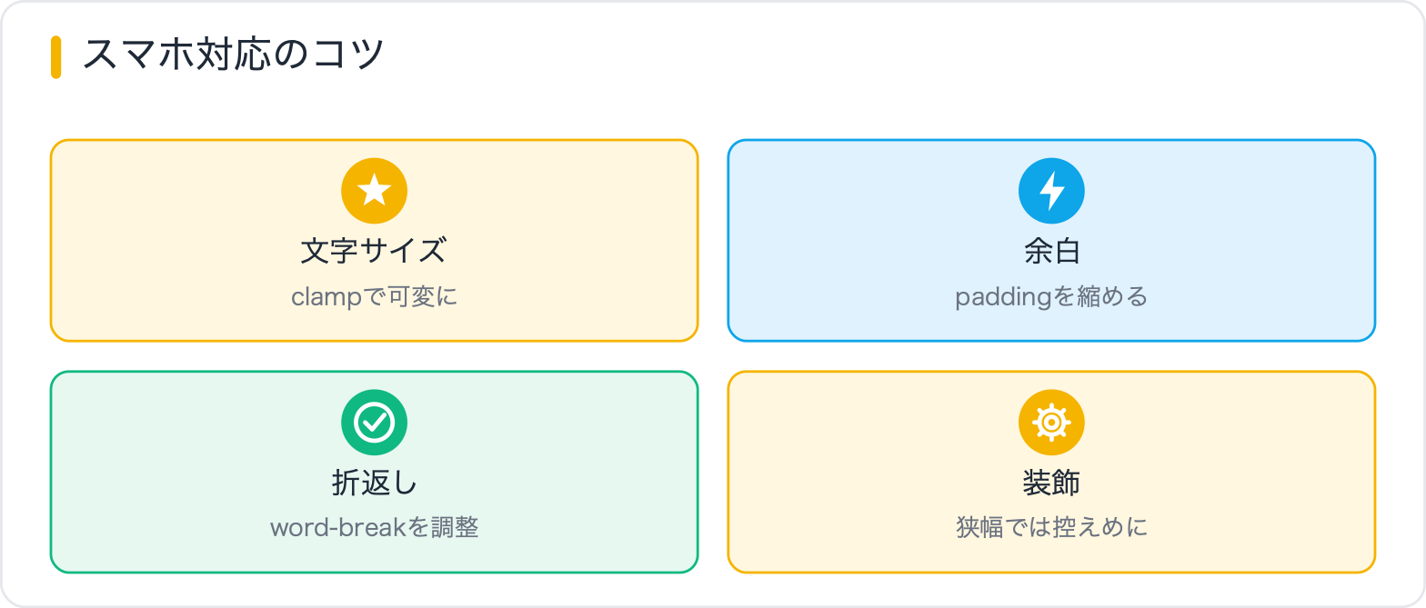
見出しデザインはPCでは問題なく見えても、スマートフォン表示で崩れることがあります。よくある問題と対策を整理します。
| 問題 | 原因 | 対処法 |
|---|---|---|
| リボンが画面外にはみ出す | margin負値を使っている | モバイルでmarginを0に戻す |
| 番号付き見出しの数字が見切れる | padding-leftが固定値 | padding-leftをモバイルで小さくする |
| フォントが小さすぎる | rem指定が大きい | モバイルで1.1rem〜1.25rem程度に調整 |
| 左ボーダーの比率がおかしい | border-leftが固定ピクセル | 相対値に変えるか、モバイルで細くする |
/* レスポンシブ対応の基本パターン */
h2.heading-left-bg {
  font-size: 1.5rem;
  font-weight: 700;
  padding: 14px 20px;
  border-left: 5px solid #d16176;
  background: #fff0f2;
  border-radius: 0 8px 8px 0;
  margin-bottom: 24px;
}

@media (max-width: 640px) {
  h2.heading-left-bg {
    font-size: 1.15rem;
    padding: 10px 14px;
    border-left-width: 4px;
  }
}

/* 番号付き見出しのモバイル対応 */
@media (max-width: 640px) {
  h2.heading-numbered {
    padding-left: 52px;
    font-size: 1.1rem;
  }

  h2.heading-numbered::before {
    width: 36px;
    height: 36px;
    font-size: 0.75rem;
  }
}
SWELLやCocoonなどのWordPressテーマに適用する場合、テーマが持つ既存のh2スタイルと競合することがあります。セレクターを強くするか、優先度の高い書き方を使います。
/* 投稿本文内のh2に限定して適用 */
.entry-content h2 {
  font-size: 1.5rem;
  font-weight: 700;
  padding: 12px 16px;
  border-left: 5px solid #d16176;
  background: #fff0f2;
  border-radius: 0 8px 8px 0;
  margin-bottom: 24px;
}

/* SWELLの場合 */
.swell-block-heading h2,
.entry-content h2 {
  border-left: 5px solid #d16176;
  padding-left: 16px;
}

/* テーマのリセットが強い場合は!importantを使う(最終手段) */
.entry-content h2 {
  border-left: 5px solid #d16176!important;
  background: #fff0f2!important;
}
SWELLには見出しデザインを管理画面から設定できる機能があるため、まずはテーマ設定を確認してからCSSカスタマイズに進む方が管理しやすいです。
見出しデザインは、下線・左ボーダー・囲みボックス・グラデーション・リボンなど型がいくつもあります。ポイントは①サイト全体でトーンを揃える②::beforeや::afterで装飾を足す③H2とH3で強弱をつける、の3点。コピペしたら色とサイズだけ自分のブランドに合わせれば、統一感のある見出しが作れます。
h2はページ内の大見出し(主要セクション)、h3はそのサブ見出しです。デザインの基本は「h2の方が視覚的に強く、h3は控えめ」にすることです。例えばh2に左ボーダー+背景色を使うなら、h3はシンプルな左ボーダーのみにします。フォントサイズもh2を1.4〜1.6rem、h3を1.1〜1.3rem程度に設定すると情報の階層が明確になります。
border-bottomは要素の外側に線を引くのに対し、text-decorationはテキスト自体に装飾を付けます。border-bottomの方がpadding-bottomで線とテキストの距離を自由に調整でき、色・太さ・style(solid/dashed)の制御もしやすいです。text-decorationはtext-underline-offsetで位置を調整できます。デザインの自由度が高いのはborder-bottomです。
慣習として「見出しの前(左)に付く装飾はbefore、後(右)や下に付く装飾はafter」を使うことが多いです。ただし技術的にはどちらでも同じことができます。左ボーダーの装飾はbefore、下線の装飾はafterを使うとコードが読みやすくなります。両方同時に使う場合(角の装飾など)はbefore=左上、after=右下という割り当てが一般的です。
-webkit-background-clip: textと-webkit-text-fill-color: transparentのセットが必要です。background-clip: textだけではSafariで効かない場合があります。また、colorプロパティを同時に指定していると競合することがあるので、colorの指定は削除してください。
使えます。content: "見出し"のように直接文字列を書けます。ただし、SEO的には疑似要素のcontentはGoogleに読まれない場合があるとされています。SEO上重要なテキスト(見出しキーワードなど)は本文のHTMLに書き、疑似要素は装飾目的の記号や番号に限定するのが適切です。
CSSの実装テクニックを「レイアウト・装飾・アニメーション・基礎・トラブル解決」の目的別に探せる総まとめページを用意しています。実装で迷ったときの索引としてどうぞ。
目的に合わせて選べる「AI副業」「AI転職」「AI活用」の3コースを用意。副収入・キャリアチェンジ・日常の生産性アップまで、あなたのゴールに合わせてAIを学べます。
会員登録はカンタン30秒で完了します。まずは公式LINEから、無料でAI学習をスタートしましょう!
公式サイト より
今すぐ
無料カウンセリング
を予約!