







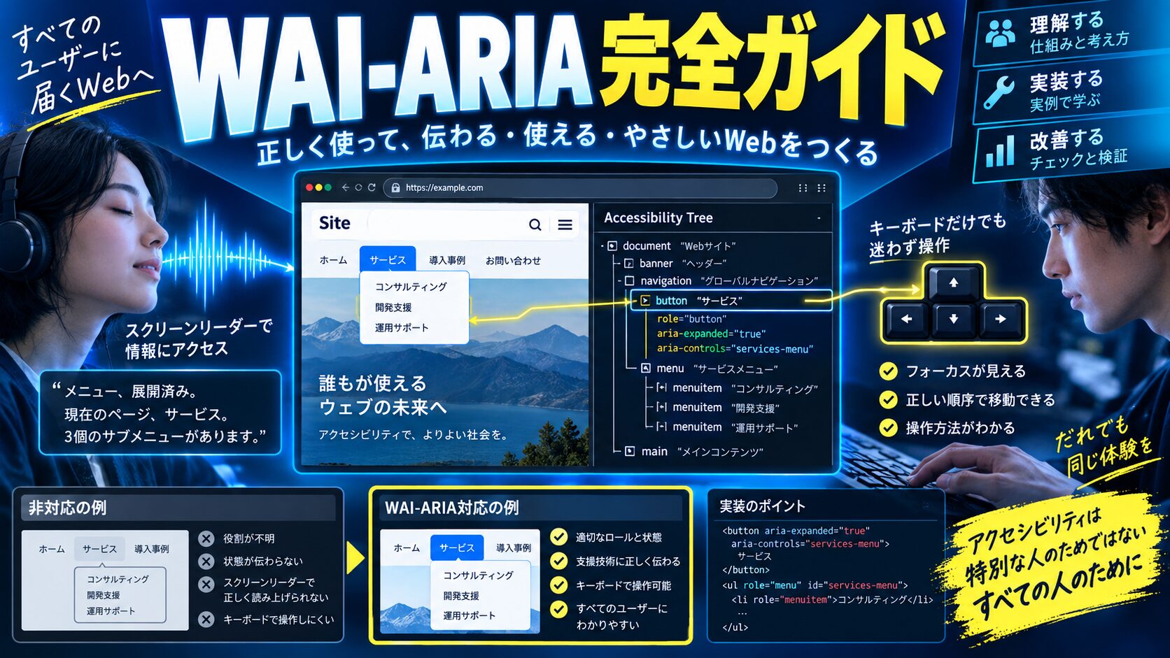
 生徒
生徒アイコンだけのボタンをスクリーンリーダーで読み上げると「ボタン」としか言わなくて、視覚障害のあるユーザーに何のボタンか伝わらないんです……
 ペン博士
ペン博士それはaria-label属性で解決できるんじゃ!スクリーンリーダーが読み上げるラベルをHTMLの属性で指定することで、視覚的なテキストがなくてもアクセシブルな名前を提供できるんじゃ。さらにaria-live・フォーカス管理・キーボードナビゲーションを組み合わせることで完全にアクセシブルなUIが実現できるぞ!
結論:WAI-ARIAはHTMLのセマンティクスを補完し、スクリーンリーダーなどの支援技術に正確な情報を伝える仕組みです。aria-label・aria-labelledby・aria-describedbyを使い分け、aria-liveで動的コンテンツを通知し、フォーカス管理でキーボードナビゲーションを完結させることで、すべてのユーザーが使えるWebアプリを実現できます。
本記事では、WAI-ARIAの概要・アクセシブルな名前の仕組み・aria-label/labelledby/describedbyの違いと使い分け・aria-live(ライブリージョン)・aria-hidden・フォーカス管理・キーボードナビゲーション・フォーム/モーダル/テーブル/アコーディオンのアクセシビリティパターン・ReactのuseId・jest-axeによる自動テスト・よくある間違いと修正方法を完全解説します。
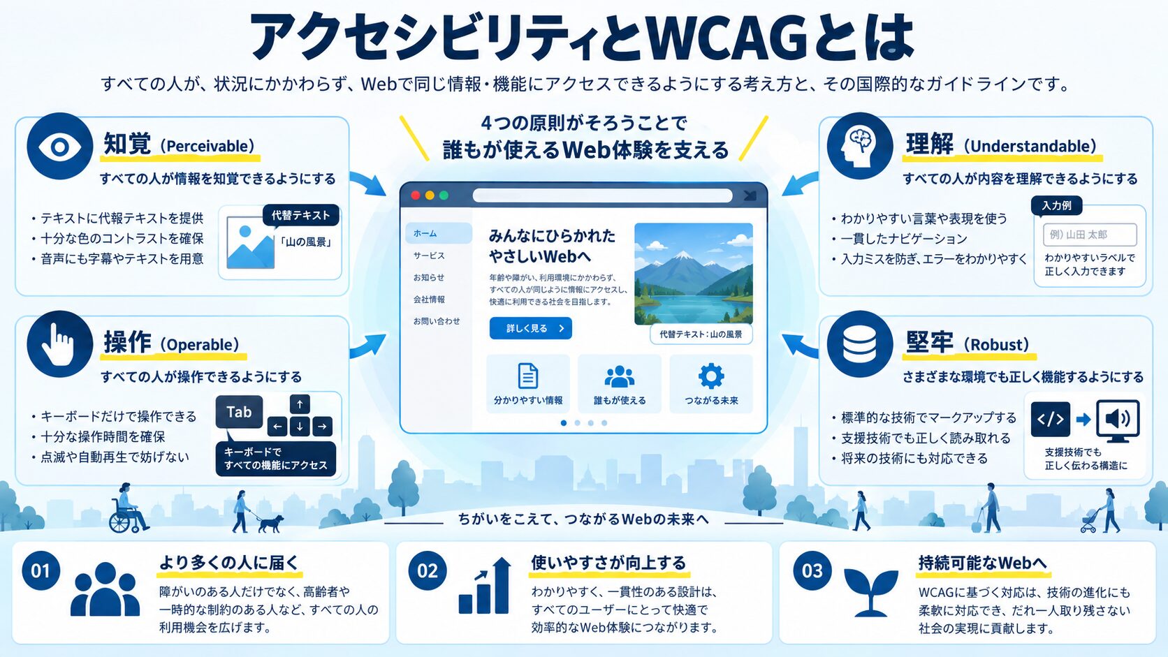
>【アクセシビリティ(a11y)とは】

Webアクセシビリティ:障害のあるユーザーを含むすべての人が、
                   Webサイトやアプリを使えるようにすること

対象となる障害の種類:
→ 視覚障害(全盲・弱視)→ スクリーンリーダー使用
→ 運動障害(手の震えなど)→ キーボードのみ操作
→ 認知・学習障害 → 明確な言語・一貫したUIが必要
→ 聴覚障害 → 動画の字幕・音声コンテンツのテキスト代替

【WCAG(Web Content Accessibility Guidelines)】
Webアクセシビリティの国際標準。4つの原則を持つ:
1. 知覚可能(Perceivable): すべてのコンテンツを知覚できる
2. 操作可能(Operable): UIを操作できる(キーボードのみでも)
3. 理解可能(Understandable): コンテンツを理解できる
4. 堅牢性(Robust): 支援技術でも正しく動作する

達成レベル:
→ Level A: 最低限の対応
→ Level AA: 推奨(公共機関は義務化の流れ)
→ Level AAA: 最高レベル(すべての対応が難しい場合も)

【日本の法的背景】
→ 障害者差別解消法の改正(2024年)により、合理的配慮が義務化
→ JIS X 8341-3(WCAG 2.1対応)が国内標準規格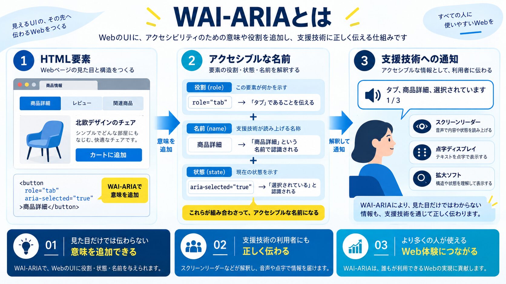
>【WAI-ARIA(Web Accessibility Initiative - Accessible Rich Internet Applications)】

目的:HTML要素の意味(role)・状態(state)・プロパティ(property)を補完して、
     スクリーンリーダー等の支援技術に正確な情報を伝える

3つのカテゴリー:
1. Roles(役割): role="button", role="dialog", role="navigation" 等
   → 要素が何であるかを定義
2. Properties(プロパティ): aria-label, aria-required, aria-invalid 等
   → 要素の特性・設定を定義(変わらない情報)
3. States(状態): aria-expanded, aria-pressed, aria-checked 等
   → 要素の現在の状態(動的に変化する情報)

「アクセシブルな名前(Accessible Name)」の計算順序:
1. aria-labelledby → 参照する別の要素のテキスト
2. aria-label → 属性値をそのまま名前として使う
3. title属性(ツールチップ)
4. テキストコンテンツ(button内のテキスト等)
5. alt属性(画像の場合)

WAI-ARIAの3大原則(ARIAを使う前に確認!):
1. セマンティックなHTMLで実現できることはARIAを使わない
2. 視覚的な表示に合わせてARIAも変更する(同期させる)
3. インタラクティブなARIAウィジェットはキーボード操作可能にする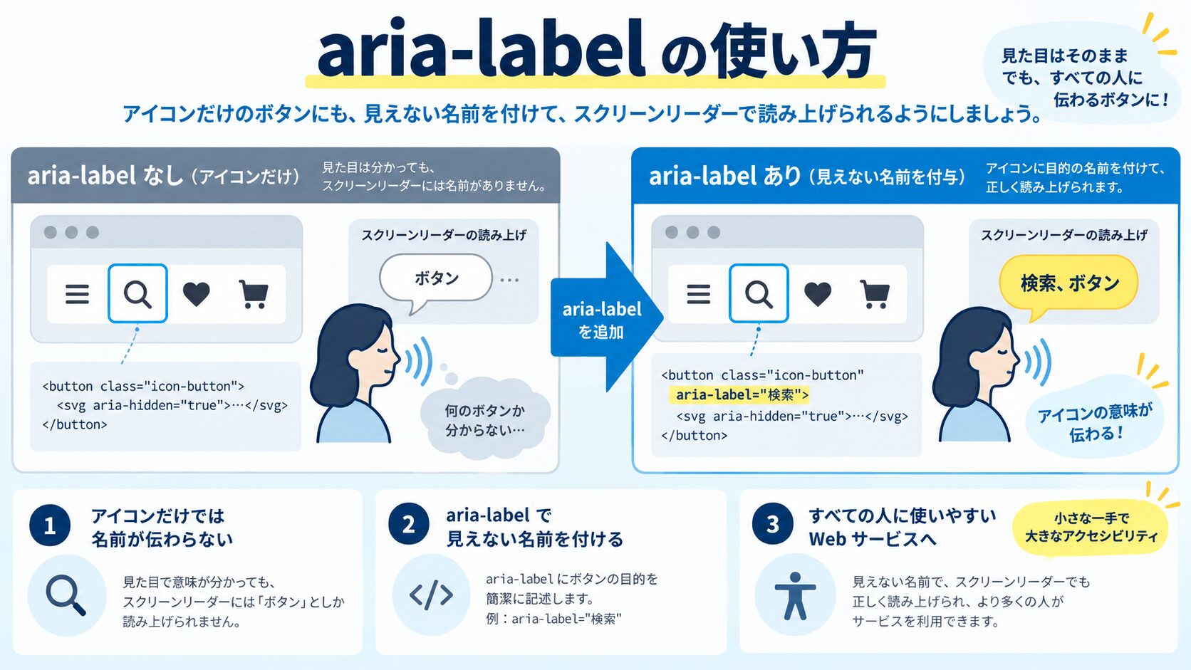
><!-- ===== アイコンボタンの正しい実装 ===== -->

<!-- ❌ 問題のある実装 -->
<button type="button">
  <svg viewBox="0 0 24 24">
    <path d="M21 21l-6-6m2-5a7 7 0 11-14 0 7 7 0 0114 0z"/>
  </svg>
</button>
<!-- スクリーンリーダー: "ボタン" → 何のボタン? -->

<!-- ✅ aria-label で名前を提供 -->
<button type="button" aria-label="検索">
  <svg aria-hidden="true" focusable="false" viewBox="0 0 24 24">
    <!-- aria-hidden="true": スクリーンリーダーから隠す(ボタンのラベルが読まれるため) -->
    <!-- focusable="false": IEでSVGにフォーカスが当たる問題を防ぐ -->
    <path d="M21 21l-6-6m2-5a7 7 0 11-14 0 7 7 0 0114 0z"/>
  </svg>
</button>
<!-- スクリーンリーダー: "検索 ボタン" -->

<!-- ✅ 閉じるボタン -->
<button type="button" aria-label="ダイアログを閉じる">
  <svg aria-hidden="true" focusable="false" viewBox="0 0 24 24">
    <path d="M6 18L18 6M6 6l12 12"/>
  </svg>
</button>

<!-- ✅ テキスト + アイコンのボタン(aria-labelは不要) -->
<button type="button">
  <svg aria-hidden="true" focusable="false" viewBox="0 0 24 24">
    <path d="M12 4v16m8-8H4"/>
  </svg>
  <span>追加</span>
</button>
<!-- スクリーンリーダー: "追加 ボタン"(テキストが読まれる) -->

<!-- ✅ テキストとアイコンで、アイコンに意味を追加したい場合 -->
<button type="button" aria-label="カートに追加">
  <svg aria-hidden="true" focusable="false"><!-- カートアイコン --></svg>
  <span aria-hidden="true">追加</span>
  <!-- 視覚的には「追加」と表示、ARIAでは「カートに追加」と読む -->
</button>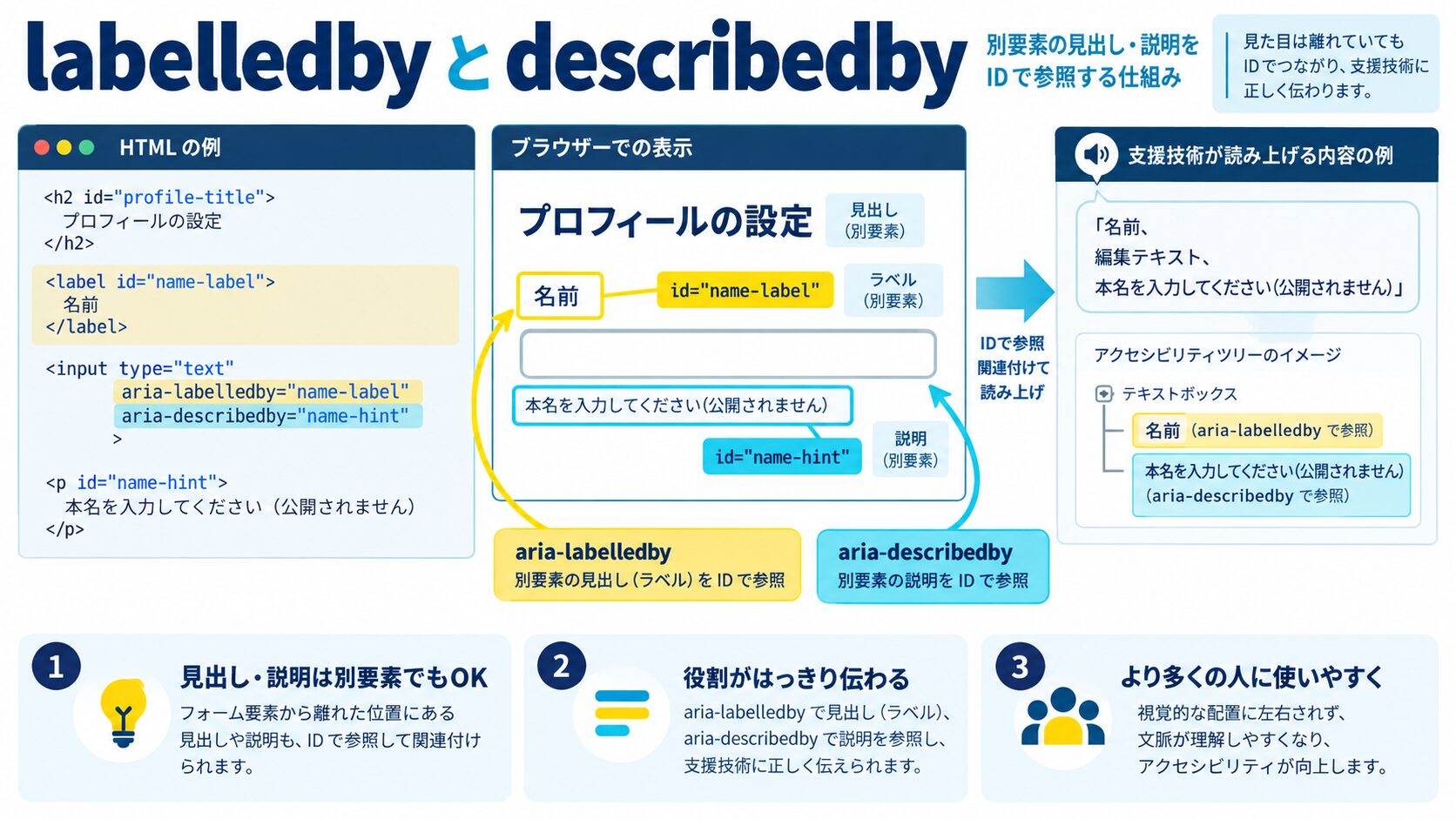
><!-- ===== aria-labelledby ===== -->
<!-- 別要素のIDを参照してその要素のテキストをラベルにする -->

<!-- モーダルダイアログ -->
<div role="dialog"
     aria-labelledby="modal-title"
     aria-describedby="modal-desc"
     aria-modal="true">
  <h2 id="modal-title">ご注文の確認</h2>
  <p id="modal-desc">以下の内容でご注文しますか?注文後のキャンセルはできません。</p>
  <div>
    <!-- 注文内容 -->
  </div>
  <div>
    <button type="button">注文確定</button>
    <button type="button" aria-label="ダイアログを閉じる">×</button>
  </div>
</div>
<!-- スクリーンリーダー: "ご注文の確認 ダイアログ (説明)以下の内容で..." -->

<!-- セクションのラベリング(同じ名前のセクションが複数ある場合) -->
<section aria-labelledby="news-heading">
  <h2 id="news-heading">最新ニュース</h2>
  <!-- ... -->
</section>
<section aria-labelledby="popular-heading">
  <h2 id="popular-heading">人気記事</h2>
  <!-- ... -->
</section>

<!-- 複数の要素を組み合わせてラベルにする(スペース区切りで複数ID指定可能) -->
<table aria-labelledby="table-title table-subtitle">
  <caption>
    <span id="table-title">2026年1〜3月</span>
    <span id="table-subtitle">売上実績</span>
  </caption>
  <!-- ... -->
</table>
<!-- スクリーンリーダー: "2026年1〜3月 売上実績 テーブル" -->
><!-- ===== aria-describedby ===== -->
<!-- ラベル(名前)ではなく補足説明を提供する -->
<!-- フォームの入力要件を説明 -->
<div>
<label for="password">
パスワード <span aria-hidden="true">*</span>
<span class="sr-only">(必須)</span>
</label>
<input type="password"
id="password"
aria-describedby="password-hint"
aria-required="true"
autocomplete="new-password">
<p id="password-hint" class="hint">
8文字以上、大文字・数字・記号を少なくとも1文字ずつ含めてください
</p>
</div>
<!-- バリデーションエラーとの連携 -->
<div>
<label for="email">メールアドレス</label>
<input type="email"
id="email"
aria-describedby="email-error"
aria-invalid="true">
<p id="email-error" role="alert">
<!-- role="alert": コンテンツが変わったときにスクリーンリーダーが自動で読み上げる -->
有効なメールアドレスを入力してください(例: user@example.com)
</p>
</div>
<!-- ツールチップの説明 -->
<button type="button"
aria-describedby="copy-tooltip"
id="copy-btn">
コピー
</button>
<div id="copy-tooltip" role="tooltip">
テキストをクリップボードにコピーします
</div>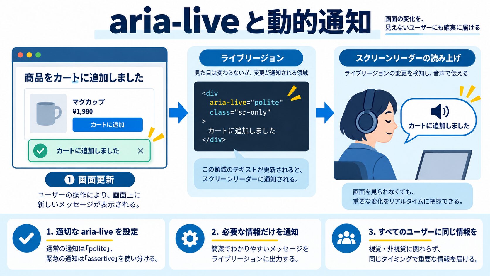
><!-- ===== ライブリージョン(aria-live) ===== -->
<!-- 動的に変化するコンテンツをスクリーンリーダーに通知する仕組み -->

<!-- aria-live="polite": 現在の読み上げが終わったら通知(非緊急) -->
<div aria-live="polite" aria-atomic="true">
  <!-- コンテンツが変わると自動的にスクリーンリーダーが読み上げる -->
</div>

<!-- aria-live="assertive": 即座に読み上げを中断して通知(緊急) -->
<div aria-live="assertive" id="error-message">
  <!-- エラーメッセージなど、即時の通知が必要な場合 -->
</div>

<!-- role="status": polite と同等(ステータス更新用) -->
<div role="status">読み込み中...</div>

<!-- role="alert": assertive と同等(エラー・警告用) -->
<div role="alert">入力内容にエラーがあります</div>

<!-- aria-atomic: trueなら領域全体を再読み上げ、falseなら変更部分のみ -->
<!-- aria-relevant: 変更の種類を指定(additions, removals, text, all) -->

<!-- 実装例1: フォーム送信後のフィードバック -->
<div role="status" aria-live="polite" aria-atomic="true" id="form-feedback">
  <!-- JSでメッセージを挿入する -->
</div>

<!-- 実装例2: カート更新の通知 -->
<div role="status" aria-live="polite" aria-atomic="true" class="sr-only">
  <!-- 視覚的には非表示だがスクリーンリーダーは読む -->
</div>
>// JavaScript でライブリージョンを更新する
const liveRegion = document.getElementById('form-feedback')
async function submitForm(data) {
try {
await api.submit(data)
// 成功メッセージをライブリージョンに設定
liveRegion.textContent = 'フォームの送信が完了しました。'
liveRegion.setAttribute('role', 'status') // polite
// 3秒後にクリア
setTimeout(() => { liveRegion.textContent = '' }, 3000)
} catch (error) {
// エラーメッセージをライブリージョンに設定
liveRegion.textContent = `送信に失敗しました: ${error.message}`
liveRegion.setAttribute('role', 'alert') // assertive(即座に読み上げ)
}
}
><!-- ===== tabindex ===== -->

<!-- tabindex="0": キーボードフォーカスの対象に加える(通常の順序) -->
<div role="button" tabindex="0" onclick="doSomething()">
  カスタムボタン
</div>

<!-- tabindex="-1": プログラムでフォーカスを当てられるが、Tabキーでは飛ばない -->
<div id="modal" tabindex="-1">
  <!-- モーダルがオープンしたときにJSでfocus()する -->
</div>

<!-- tabindex="正の数"(非推奨): フォーカス順序を指定するが複雑になりがち -->
<!-- ページのDOM順序でフォーカスが自然に移動するよう設計することが推奨 -->

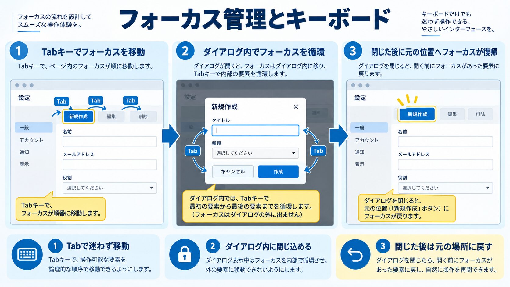
<!-- ===== フォーカストラップ(モーダル内でフォーカスを閉じ込める)===== -->
<!-- モーダルが開いているときは、Tabキーでフォーカスがモーダル内だけを移動する必要がある -->
>// フォーカストラップの実装
class FocusTrap {
constructor(container) {
this.container = container
this.focusableSelectors = [
'a[href]', 'button:not([disabled])', 'input:not([disabled])',
'select:not([disabled])', 'textarea:not([disabled])',
'[tabindex]:not([tabindex="-1"])',
].join(', ')
}
getFocusableElements() {
return [...this.container.querySelectorAll(this.focusableSelectors)]
}
trap = (event) => {
if (event.key !== 'Tab') return
const focusable = this.getFocusableElements()
const first = focusable[0]
const last = focusable[focusable.length - 1]
if (event.shiftKey) {
// Shift+Tab: 後ろ向きに移動
if (document.activeElement === first) {
event.preventDefault()
last.focus()
}
} else {
// Tab: 前向きに移動
if (document.activeElement === last) {
event.preventDefault()
first.focus()
}
}
}
activate() {
document.addEventListener('keydown', this.trap)
// モーダルの最初のフォーカス可能要素にフォーカスを移す
const focusable = this.getFocusableElements()
if (focusable.length > 0) focusable[0].focus()
}
deactivate(returnFocusTo) {
document.removeEventListener('keydown', this.trap)
// モーダルを閉じたら、モーダルを開いたボタンにフォーカスを戻す
if (returnFocusTo) returnFocusTo.focus()
}
}
// モーダルダイアログの実装例
const modalEl = document.getElementById('modal')
const openBtn = document.getElementById('open-modal')
const closeBtn = document.getElementById('close-modal')
const focusTrap = new FocusTrap(modalEl)
openBtn.addEventListener('click', () => {
modalEl.removeAttribute('hidden')
focusTrap.activate() // フォーカストラップを開始
})
closeBtn.addEventListener('click', () => {
modalEl.setAttribute('hidden', '')
focusTrap.deactivate(openBtn) // 元のボタンにフォーカスを戻す
})
// Escapeキーで閉じる
document.addEventListener('keydown', (e) => {
if (e.key === 'Escape' && !modalEl.hidden) {
closeBtn.click()
}
})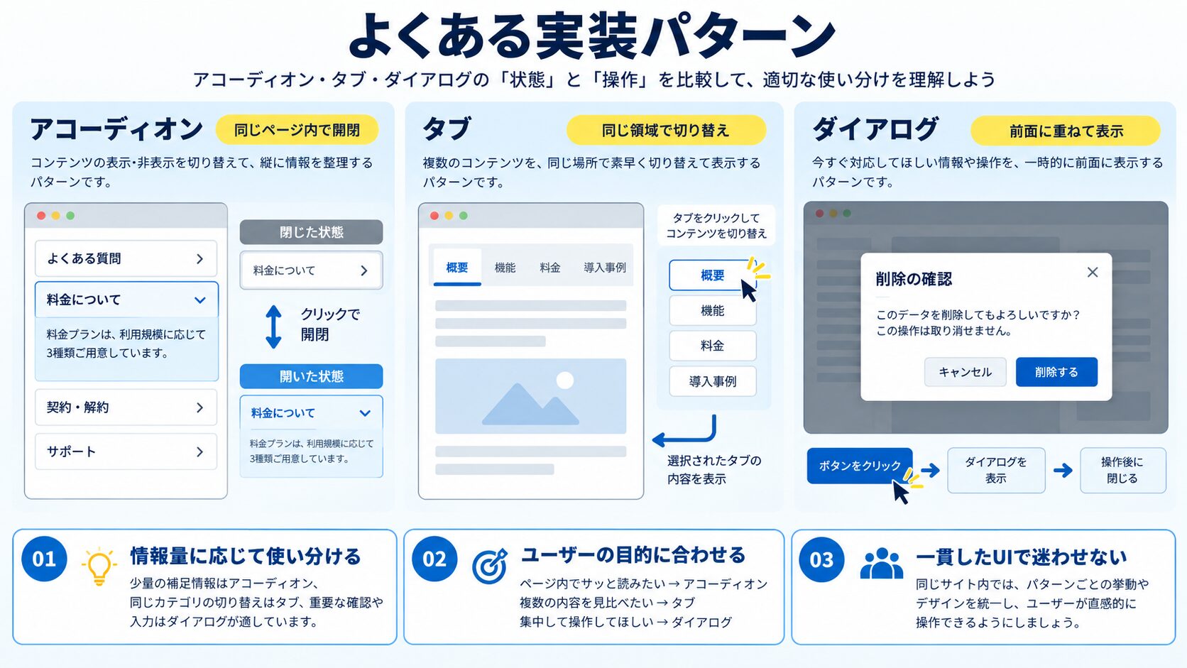
><!-- アコーディオン -->
<div class="accordion">
  <!-- aria-expanded: 展開状態を示す -->
  <button type="button"
          aria-expanded="false"
          aria-controls="accordion-panel-1"
          id="accordion-header-1">
    Q. よくある質問1
  </button>
  <!-- aria-controls: このボタンが操作する要素のIDを指定 -->
  <div id="accordion-panel-1"
       role="region"
       aria-labelledby="accordion-header-1"
       hidden>
    <p>回答テキスト...</p>
  </div>
</div>

<!-- JavaScriptでのトグル -->
button.addEventListener('click', () => {
  const isExpanded = button.getAttribute('aria-expanded') === 'true'
  button.setAttribute('aria-expanded', String(!isExpanded))
  panel.toggleAttribute('hidden')
})><!-- 完全にアクセシブルなフォーム実装 -->
<form novalidate>
<fieldset>
<legend>ログイン情報</legend>
<div>
<label for="username">
ユーザー名
<span aria-hidden="true">*</span>
</label>
<!-- aria-required: 必須フィールドを示す -->
<!-- aria-invalid: バリデーションエラーを示す(初期はfalse) -->
<!-- aria-describedby: エラーメッセージへの参照 -->
<input type="text"
id="username"
name="username"
autocomplete="username"
aria-required="true"
aria-invalid="false"
aria-describedby="username-error">
<!-- role="alert": 動的に現れるエラーを自動で読み上げ -->
<span id="username-error" role="alert" aria-live="polite"></span>
</div>
<div>
<label for="current-password">パスワード</label>
<input type="password"
id="current-password"
name="password"
autocomplete="current-password"
aria-required="true"
aria-describedby="password-hint password-error">
<p id="password-hint">半角英数字8文字以上</p>
<span id="password-error" role="alert" aria-live="polite"></span>
</div>
<!-- チェックボックスグループ -->
<fieldset>
<legend>通知設定 <span class="required" aria-hidden="true">*</span></legend>
<div>
<input type="checkbox" id="notify-email" name="notify" value="email">
<label for="notify-email">メール通知</label>
</div>
<div>
<input type="checkbox" id="notify-sms" name="notify" value="sms">
<label for="notify-sms">SMS通知</label>
</div>
</fieldset>
</fieldset>
<!-- aria-busy: 送信中の状態を示す -->
<button type="submit" id="submit-btn" aria-busy="false">
ログイン
</button>
</form>
<style>
/* スクリーンリーダーのみに表示(視覚的に隠す) */
.sr-only {
position: absolute;
width: 1px;
height: 1px;
padding: 0;
margin: -1px;
overflow: hidden;
clip: rect(0, 0, 0, 0);
white-space: nowrap;
border: 0;
}
</style>><!-- ランドマーク要素でページ構造を明確化する -->
<!-- セマンティックなHTML要素はデフォルトでroleを持つ -->
<header><!-- role="banner" (ページ全体のヘッダー)--></header>
<nav aria-label="メインナビゲーション"><!-- role="navigation" --></nav>
<main><!-- role="main" --></main>
<aside aria-label="サイドバー"><!-- role="complementary" --></aside>
<footer><!-- role="contentinfo" --></footer>
<search><!-- role="search" (HTML5.3+)--></search>
<!-- 同じ種類のランドマークが複数ある場合は区別する -->
<nav aria-label="グローバルナビゲーション">
<!-- ヘッダーのナビゲーション -->
</nav>
<nav aria-label="パンくずリスト">
<ol>
<li><a href="/">ホーム</a></li>
<li><a href="/category">カテゴリー</a></li>
<li>
<!-- aria-current="page": 現在のページを示す -->
<span aria-current="page">現在のページ</span>
</li>
</ol>
</nav>
<!-- スキップリンク(キーボードユーザーのメインコンテンツへの直接移動) -->
<a href="#main-content" class="skip-link">メインコンテンツへスキップ</a>
<nav><!-- ナビゲーション(スキップ対象)--></nav>
<main id="main-content" tabindex="-1">
<!-- メインコンテンツ -->
</main>
<style>
.skip-link {
position: absolute;
top: -100%;
left: 1rem;
background: #000;
color: #fff;
padding: 0.5rem 1rem;
z-index: 9999;
border-radius: 0 0 4px 4px;
}
.skip-link:focus {
top: 0; /* フォーカス時だけ表示 */
}
</style>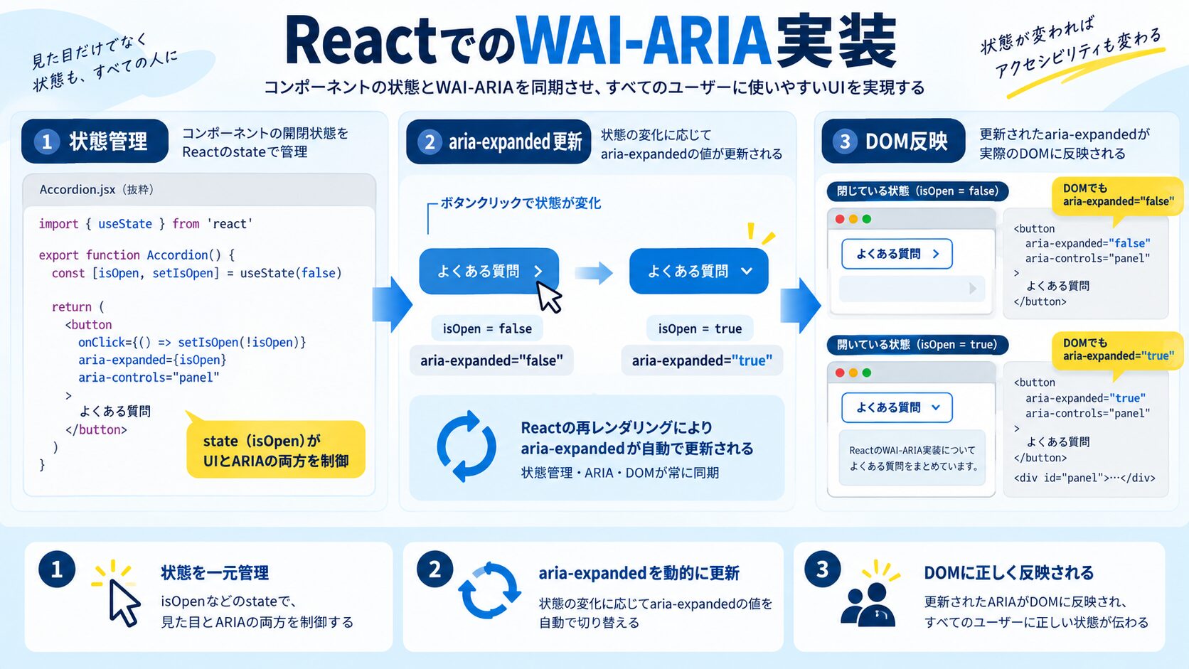
>// React 18+ の useId を使ったアクセシブルなフォームコンポーネント
import { useId, useState, useRef } from 'react'

interface FormFieldProps {
  label: string
  type?: 'text' | 'email' | 'password'
  required?: boolean
  hint?: string
  error?: string
}

export function FormField({ label, type = 'text', required, hint, error }: FormFieldProps) {
  // useId: サーバーサイドレンダリングでも一意なIDを生成
  const id = useId()
  const hintId = hint ? `${id}-hint` : undefined
  const errorId = error ? `${id}-error` : undefined

  const describedBy = [hintId, errorId].filter(Boolean).join(' ') || undefined

  return (
    <div>
      <label htmlFor={id}>
        {label}
        {required && <span aria-hidden="true"> *</span>}
      </label>
      <input
        type={type}
        id={id}
        aria-required={required}
        aria-invalid={!!error}
        aria-describedby={describedBy}
      />
      {hint && <p id={hintId}>{hint}</p>}
      {error && (
        <p id={errorId} role="alert" style={{ color: 'red' }}>
          {error}
        </p>
      )}
    </div>
  )
}
>// アクセシブルなトグルボタン
import { useState } from 'react'
interface ToggleButtonProps {
label: string
defaultPressed?: boolean
onChange?: (pressed: boolean) => void
}
export function ToggleButton({ label, defaultPressed = false, onChange }: ToggleButtonProps) {
const [isPressed, setIsPressed] = useState(defaultPressed)
const handleClick = () => {
const newState = !isPressed
setIsPressed(newState)
onChange?.(newState)
}
return (
<button
type="button"
aria-pressed={isPressed}
onClick={handleClick}
style={{
backgroundColor: isPressed ? '#3B82F6' : 'transparent',
color: isPressed ? 'white' : 'inherit',
}}
>
{label}
</button>
)
}
// アクセシブルなモーダルダイアログ
import { useEffect, useRef } from 'react'
interface ModalProps {
isOpen: boolean
title: string
onClose: () => void
children: React.ReactNode
triggerRef: React.RefObject<HTMLElement>
}
export function Modal({ isOpen, title, onClose, children, triggerRef }: ModalProps) {
const titleId = useId()
const modalRef = useRef<HTMLDivElement>(null)
useEffect(() => {
if (isOpen && modalRef.current) {
// モーダルが開いたら最初のフォーカス可能要素にフォーカス
const firstFocusable = modalRef.current.querySelector<HTMLElement>(
'button, [href], input, select, textarea, [tabindex]:not([tabindex="-1"])'
)
firstFocusable?.focus()
} else if (!isOpen && triggerRef.current) {
// モーダルが閉じたら元のトリガーにフォーカスを戻す
triggerRef.current.focus()
}
}, [isOpen])
if (!isOpen) return null
return (
<div
role="dialog"
aria-modal="true"
aria-labelledby={titleId}
ref={modalRef}
>
<h2 id={titleId}>{title}</h2>
{children}
<button type="button" onClick={onClose} aria-label="ダイアログを閉じる">
×
</button>
</div>
)
}
>// jest-axe を使った自動アクセシビリティテスト
// npm install --save-dev jest-axe

import { render } from '@testing-library/react'
import { axe, toHaveNoViolations } from 'jest-axe'
import { Button } from './Button'
import { FormField } from './FormField'

expect.extend(toHaveNoViolations)

describe('Button アクセシビリティ', () => {
  it('アイコンのみのボタンにはaria-labelが必要', async () => {
    const { container } = render(
      <button type="button" aria-label="検索">
        <svg aria-hidden="true"><!-- 検索アイコン --></svg>
      </button>
    )
    const results = await axe(container)
    expect(results).toHaveNoViolations()
  })

  it('aria-labelなしのアイコンボタンはaxe違反になる', async () => {
    const { container } = render(
      <button type="button">
        <svg><!-- 検索アイコン --></svg>
      </button>
    )
    const results = await axe(container)
    // 違反があることを確認(テストが失敗することを確認)
    expect(results.violations.length).toBeGreaterThan(0)
  })
})

describe('FormField アクセシビリティ', () => {
  it('labelとinputが正しく関連付けられている', async () => {
    const { container } = render(
      <FormField label="メールアドレス" type="email" required />
    )
    const results = await axe(container)
    expect(results).toHaveNoViolations()
  })
})
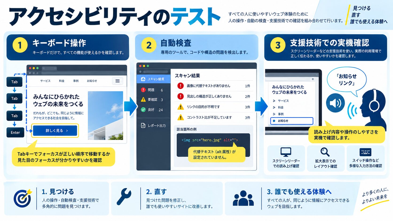
>【アクセシビリティテスト方法一覧】
1. 自動テスト(コードレビュー時):
→ jest-axe (Vitest用: @axe-core/vitest)
→ Storybook Accessibility addon (a11y)
→ eslint-plugin-jsx-a11y(JSX記述のlint)
2. ブラウザDevTools(開発時):
→ Chrome: Accessibility Tree(DevTools > Elements > Accessibility)
→ Chrome: Lighthouse の Accessibility スコア
→ axe DevTools Chrome拡張機能(無料版で十分な検出)
3. キーボード操作テスト(手動):
→ Tabキーで全インタラクティブ要素を順番に巡回できるか
→ EnterキーとSpaceキーでボタン・チェックボックス操作できるか
→ Escapeキーでモーダル・ドロップダウンを閉じられるか
→ フォーカスが視覚的に確認できるか(フォーカスリングが見える)
4. スクリーンリーダーテスト:
→ macOS/iOS: VoiceOver (Command + F5でオン)
→ Windows: NVDA(無料)/ JAWS
→ Android: TalkBack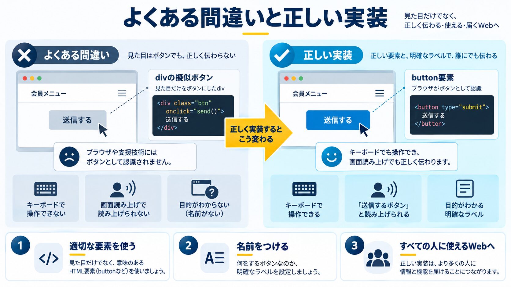
>【よくある間違いパターン】

❌ 間違い1: divやspanをクリック可能にする(roleなし・keydown未対応)
<div onclick="doSomething()">クリックしてください</div>
→ キーボード操作不可・スクリーンリーダーがボタンと認識しない

✅ 修正: button要素を使う(または適切なrole + tabindex + keydown)
<button type="button" onclick="doSomething()">クリックしてください</button>

---

❌ 間違い2: alt属性の代わりにaria-labelを画像に使う
<img src="hero.jpg" aria-label="ヒーロー画像">
→ imgのアクセシブルな名前はalt属性が正しい方法

✅ 修正: altを使う
<img src="hero.jpg" alt="桜の花が咲いている公園の写真">

---

❌ 間違い3: aria-hidden="true"のまま子要素にフォーカスを残す
<div aria-hidden="true">
  <button tabindex="0">このボタンはaria-hidden親の中</button>
</div>
→ スクリーンリーダーは読まないがキーボードフォーカスは可能(混乱を生む)

✅ 修正: aria-hiddenの要素内のフォーカス可能要素もtabindex="-1"にする
<div aria-hidden="true">
  <button tabindex="-1">このボタン(フォーカス不可)</button>
</div>

---

❌ 間違い4: aria-labelとテキストコンテンツの不一致
<button aria-label="削除する">送信</button>
→ 音声入力ユーザーが「送信をクリック」と言っても動かない場合がある

✅ 修正: aria-labelにはテキストコンテンツを含めるか、テキストを変える
<button aria-label="ファイルを削除する">削除</button>

---

❌ 間違い5: aria-required を使わずrequired属性のみ
<input type="text" required>
→ required属性はブラウザのネイティブバリデーション用。ARIAで明示的に伝えるには必須

✅ 修正: aria-required も追加(または両方使う)
<input type="text" required aria-required="true">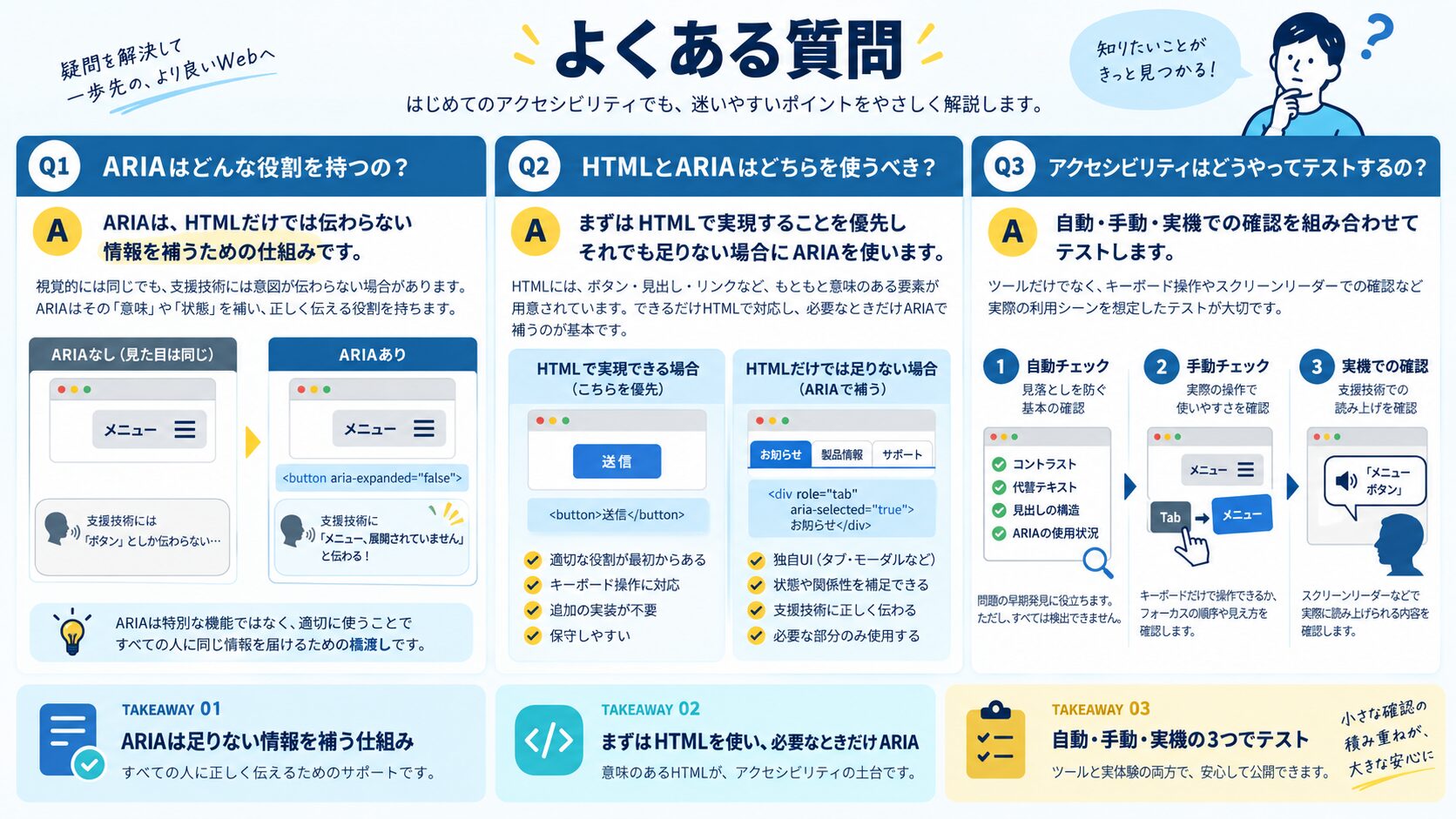
A. title属性はホバー時にツールチップとして表示され、アクセシブルな名前の計算にも使われますが、優先順位がaria-labelより低く、タッチデバイスやキーボードでは表示されないという問題があります。aria-labelはスクリーンリーダーに確実に名前を提供し、titleのようなビジュアル表示はしません。アイコンボタンへの名前提供にはaria-labelを使用し、ツールチップとして視覚的に表示したい場合はaria-describedbyとJavaScript製のツールチップを組み合わせることが推奨されます。
A. display: noneやvisibility: hiddenはCSSで要素を非表示にし、同時にスクリーンリーダーからも隠れます。aria-hidden=”true”はスクリーンリーダーのアクセシビリティツリーから要素を除外しますが、視覚的には表示されたままです。例えば装飾的なアイコンSVGは視覚的に表示しつつ読み上げから除外するためにaria-hidden=”true”を使います。hidden属性(HTML5)はdisplay: noneと同等で、見た目とアクセシビリティ両方で非表示になります。
A. CSSの疑似要素(::before/::after)でcontentプロパティを使った文字(「*」「必須」等)は、一部のスクリーンリーダーで読み上げられます。一方、絵文字・アイコンフォント(FontAwesome等)のcontent値は環境によって読み上げが不安定です。重要な情報をCSSのcontentで表現することは避け、HTMLに適切にaria属性を使って意味を提供することが推奨されます。
A. role="presentation"(またはrole="none")はその要素のロール(意味)を削除しますが、テキストコンテンツは読み上げられます。aria-hidden="true"は要素全体をアクセシビリティツリーから除外するため、テキストも含めて読まれなくなります。レイアウト目的のテーブル(<table role="presentation">)などにはrole=”presentation”を使い、完全に隠したい装飾要素にはaria-hiddenを使います。
A. キーボードのみで操作するユーザーは、ページを訪問するたびにTabキーでナビゲーションメニューを1つずつ通過する必要があります。スキップリンクは「メインコンテンツへスキップ」というリンクをページ先頭に配置し、キーボードユーザーがナビゲーションを飛ばして直接コンテンツに到達できるようにするものです。通常はfocus時のみ表示(CSSで制御)し、WCAG 2.1のLevel Aで必須要件とされています。
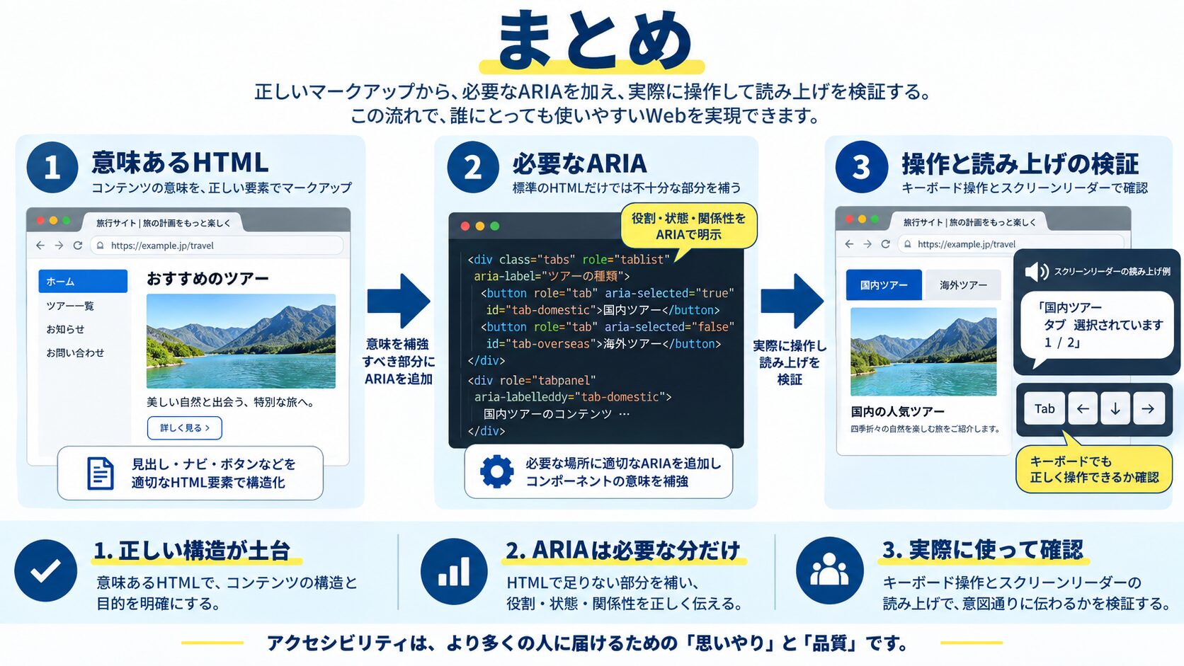
アクセシビリティはすべてのユーザーのためのものです。「まずaria-labelをアイコンボタンに追加する」「フォームのlabelをinputに関連付ける」というシンプルな実装から始めるだけでも、多くのユーザーの体験が改善します。jest-axeを開発フローに組み込めば、意図せずアクセシビリティを壊すことを防ぎ、継続的に改善できます。
目的に合わせて選べる「AI副業」「AI転職」「AI活用」の3コースを用意。副収入・キャリアチェンジ・日常の生産性アップまで、あなたのゴールに合わせてAIを学べます。
会員登録はカンタン30秒で完了します。まずは公式LINEから、無料でAI学習をスタートしましょう!
公式サイト より
今すぐ
無料カウンセリング
を予約!